Meet Awesome...
Awesome plays a crucial role in Islington, providing free, fully-supervised play opportunities for children and young people aged six to thirteen. Their adventure playgrounds give children from different backgrounds and age groups the chance to learn about each other, as well as the world around them. Islington has the second fewest areas of open space in the country – so not only are these incredible spaces for young adventurers fun, they’re vital too. They’re hubs within the borough’s community, exciting learning environments for schools, and places where skills, imaginations and ideas can be nurtured.
The challenge
When Awesome came to us they had a dated logo, an underdeveloped brand, and a website that needed rethinking and redesigning. Their logo was overcomplicated and corporate, which contradicted their ethos and the child-led services they offered. In addition to this, their voice and tone lacked energy, consistency and direction. Although Awesome’s name was great from a brand perspective, they’d had problems communicating what they did and where they operated. And their existing website was preventing them from achieving some of their organisational objectives, such as promoting venue hire, improving visibility of their impact, communicating the breadth of their services and encouraging children to visit new playgrounds. It was clear that the website had become very unwieldy and its rigidity had even influenced some of their business processes.
Scoping The Project
We were initially approached by Awesome to develop a new website, but through our meetings and discussions we helped them to recognise that for the project to be successful, we would need to explore identity, positioning and brand. We proposed a rebrand and expansion of their brand toolkit for use across social media, online content, printed design and in the development of a new website.
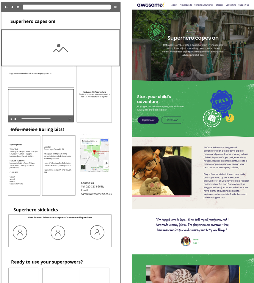
For the website development phase of the project, we were asked to design a site with custom features and a strong identity that separated them from their competitors. We helped Awesome to scope the project, reviewing the pitfalls of their existing website, user journeys, site architecture and content strategy.
Rebrand
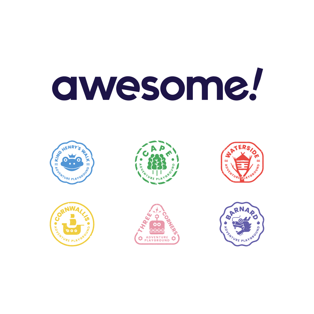
Awesome was given their name by the children and young people who visit their adventure playgrounds. It was certainly something we wanted to retain and celebrate, so we stripped back the existing logo and allowed the name to shine, adding an exclamation point for energy.
To establish the tone of voice, we started by drawing inspiration from the organisation name and photography archive. We removed the corporate jargon, and introduced an imaginative, energetic voice that was developed in tandem with, and informed elements of the visual design.
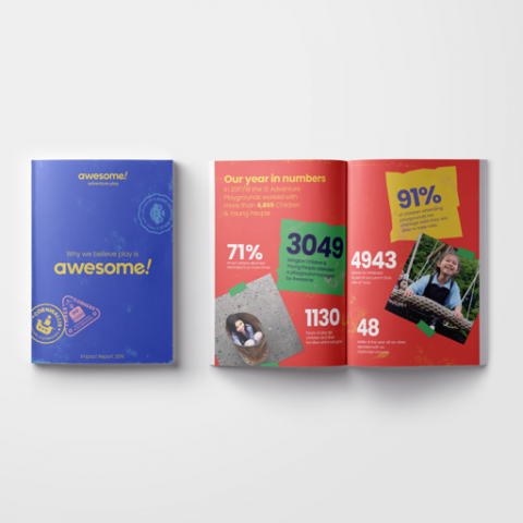
Scrapbooks, stamps, paint and collaged photographs - the materials that the children play with at Awesome everyday - were all sources of inspiration for the brand.

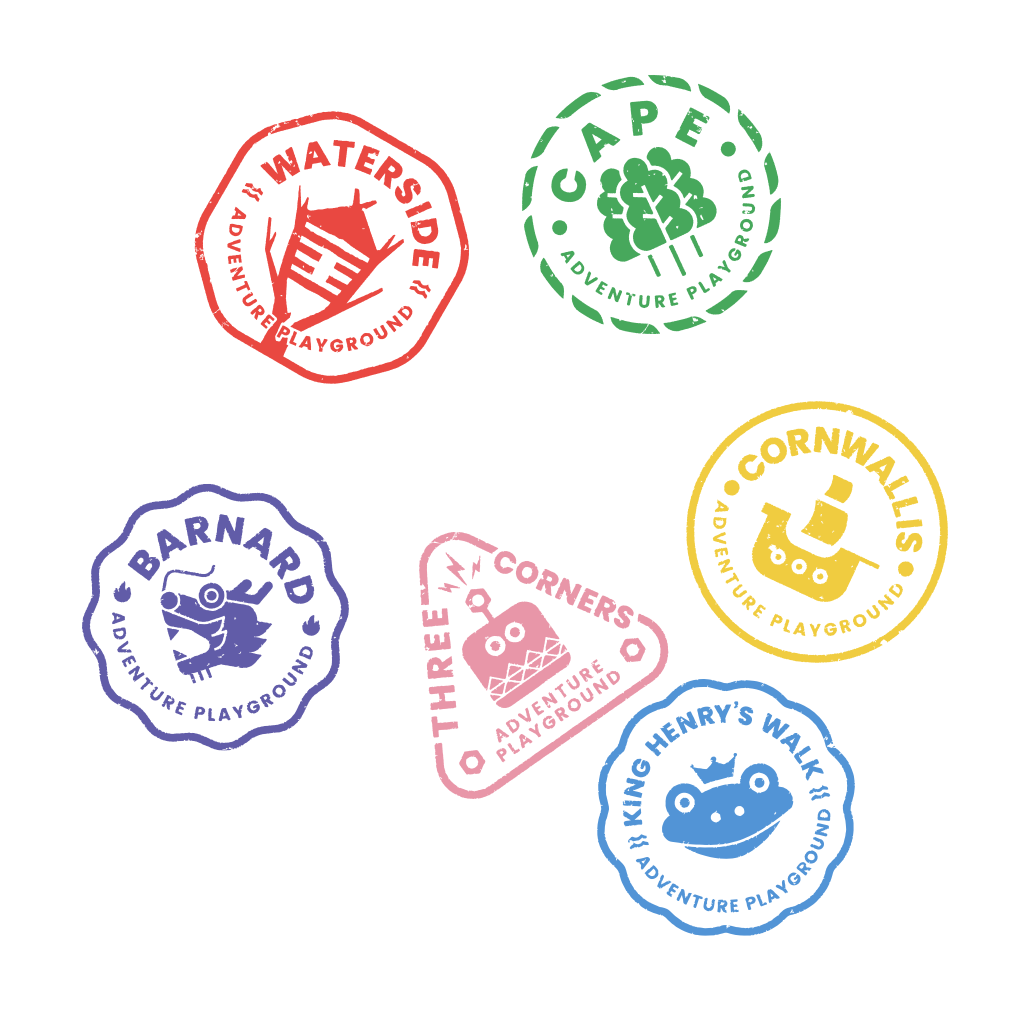
Stamps
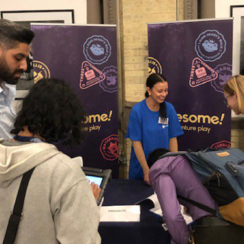
Inspired by our own adventures, travelling and collecting passport stamps, we created a set of stamps, each capturing the spirit of Awesome’s six adventure playgrounds. Designed in collaboration with the children, each stamp felt consistently and independently powerful, while working harmoniously within the brand family. We loved the idea that each playground could have its own stamp that the children could collect. And this also tied in to one of the project aims – to encourage children to visit the different adventure playgrounds.


A bespoke website
Awesome’s website needed to feel trustworthy and easy for busy parents to use, and fun for children and young people. We started by looking at the user journeys of key audiences and establishing hierarchical content. While Awesome’s primary audiences are parents and guardians, venue hire is an important revenue stream for the organisation, so it was essential that the brand and website felt relevant to prospective customers and information was easy to locate.
To encourage children to visit different playgrounds and raise parents’ awareness of them, we frequently referred users to the colourful playground stamps, challenging them to ‘explore new lands’.
We also worked with Awesome to simplify their online registration form and consolidate data, which simplified internal processes and made it easier for parents to register their children at multiple playgrounds.
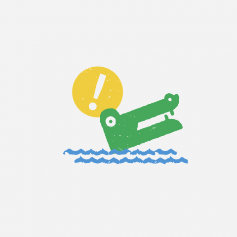
Awesome’s incredible library of photography, which had not been used to great effect in the past, is at the heart of the new website, inspiring the language and helping to tell Awesome’s story. We complemented this with other playful elements, including the team’s ‘superhero personas’ which are revealed when you hover over their photographs, the site’s 404 page which helps you to ‘get out of the swamp’, and some handwritten ‘corrections’ throughout the site.
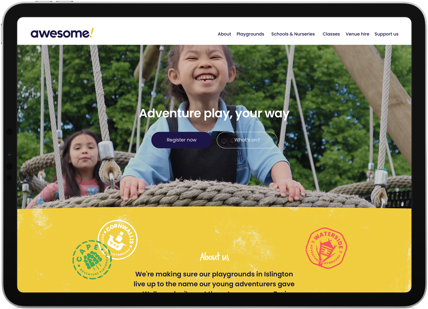
Awesome’s new website is simple, clear and playful, with clear calls to action throughout the site which encourage the user to discover more about Awesome’s services and support the organisation’s work.
“Wired Canvas helped us to see beyond just updating our website. They challenged us to think differently about our brand to ensure the essence of who we are as an organisation was threaded throughout our website. We can't thank the team enough for taking on the challenges we presented them with and the expertise they brought to problem-solving. We are so happy with our new website, but more importantly, the positive comments from children, parents, carers and partners confirms we chose the right design team.”
Guy Lawrence, Managing Director, Awesome
