
4th February 2021 by Chloe Roach

In the last part of this blog series I wrote about how we developed SkyWay’s new strapline, but I want to go back a few steps now and discuss the importance of understanding your audience.
The challenge
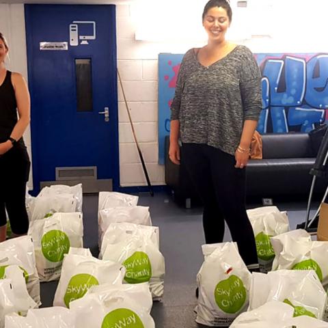
When it comes to a rebrand, ensuring the new brand resonates with your key audience(s) is absolutely essential, but in SkyWay’s case, this was also one of their biggest challenges. Having recently transitioned from solely supporting young people to also supporting their communities, SkyWay needed a new identity that would speak to both audiences in a meaningful way and shift the current perception of their work.
Another really important aspect of this was defining whether or not they should continue to be identified as a ‘young person’s charity’, or whether they had moved to become a ‘charity for the community’. After several discussions with the team it became clear it was the former; the rationale being that while young people are still at the heart of what they do, the two audiences are inextricably linked. Young people don’t exist in a vacuum, and the communities they are part of have the power to strongly influence their lives. This made the brand positioning much more challenging, as we needed to put the emphasis on young people, without the community audience feeling like an ‘add on’, but we also knew the messaging and brand needed to lean more towards young people.
This meant that the project became a pretty delicate balancing act. We didn’t want the brand to alienate the community, nor did we want the young people to feel disengaged from it, or dilute it to a point where it became dull and indistinct!
And the other important consideration was clarity and simplicity of message. We needed to work out how we could define SkyWay without overcomplicating the message or making it a catch all.
What we did
Sounds tricky eh? Well, fortunately at Wired Canvas we’re not afraid of a challenge!
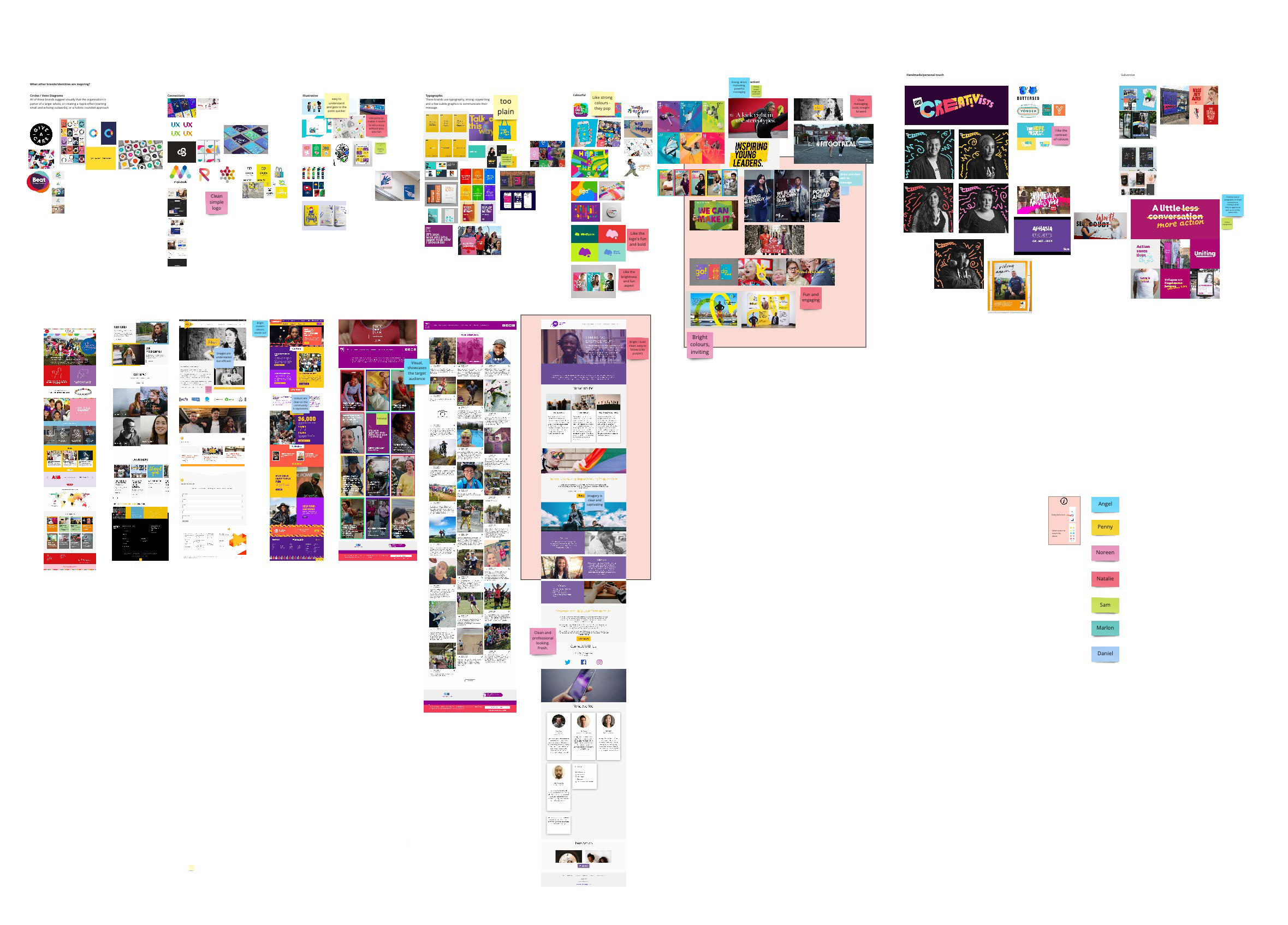
We ran a brilliant online workshop with the team to define SkyWay’s key audiences, what the barriers to engagement were, how these could be overcome and how the brand perception needed to shift to increase engagement and raise SkyWay’s profile. This collaborative exercise was really useful as we started to understand SkyWay’s relationship with the people they worked with - and that’s so important when it comes to brand authenticity. ‘Brand authenticity’ sounds like a buzzword I know, but it’s entirely possible to deliver an awesome brand that just isn’t the right fit for an organisation.
We also knew SkyWay didn’t feel clear on voice and tone, so during the online workshop we also gave everyone the chance to start thinking specifically about how they want to be heard by their stakeholders. Using a series of characteristics, we asked the team to share their thoughts on our online whiteboard and discuss the results as a group.
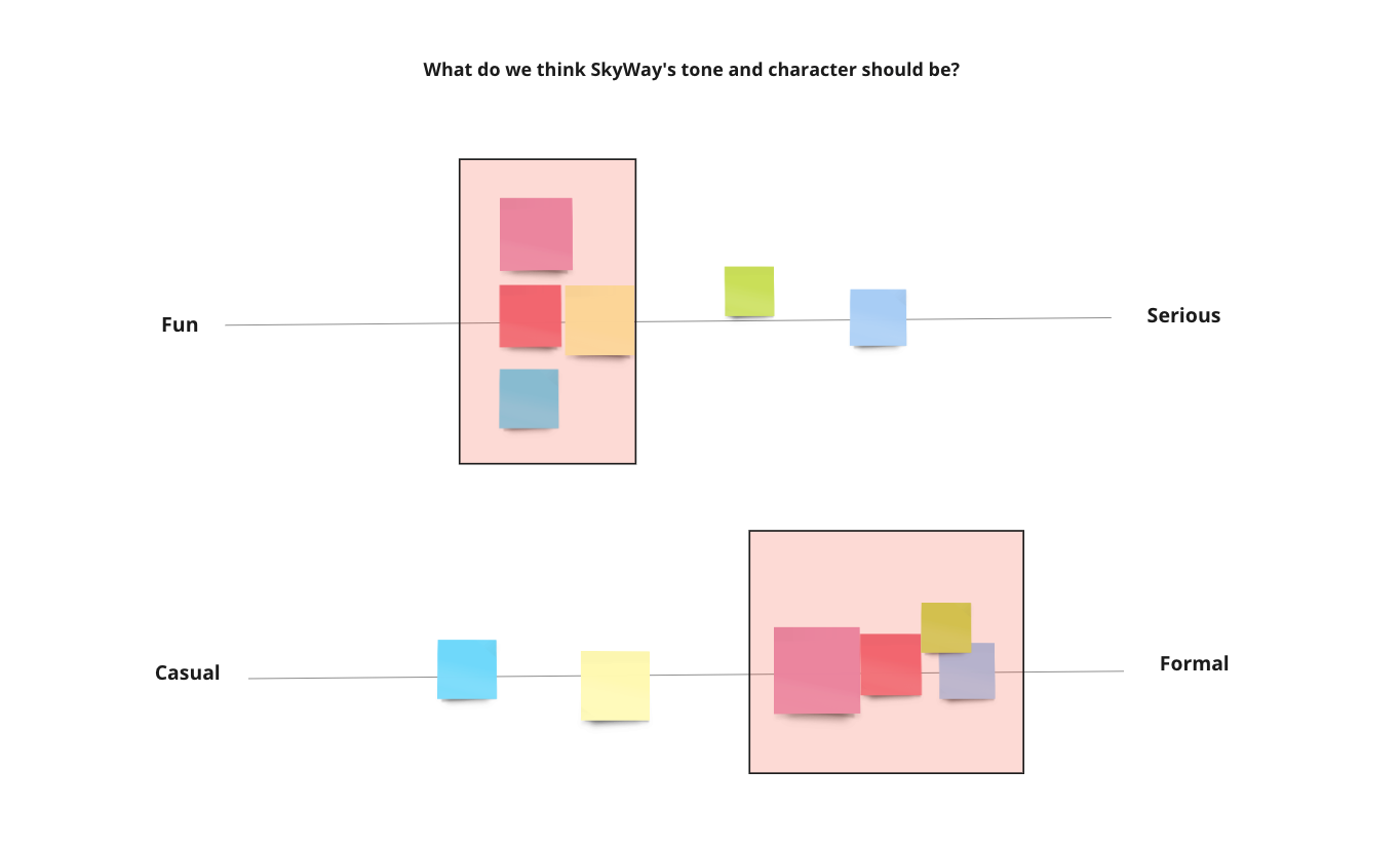
And we also looked at what kind of images might support this voice and tone. How could they feel relatable to the audience, inclusive and confident?
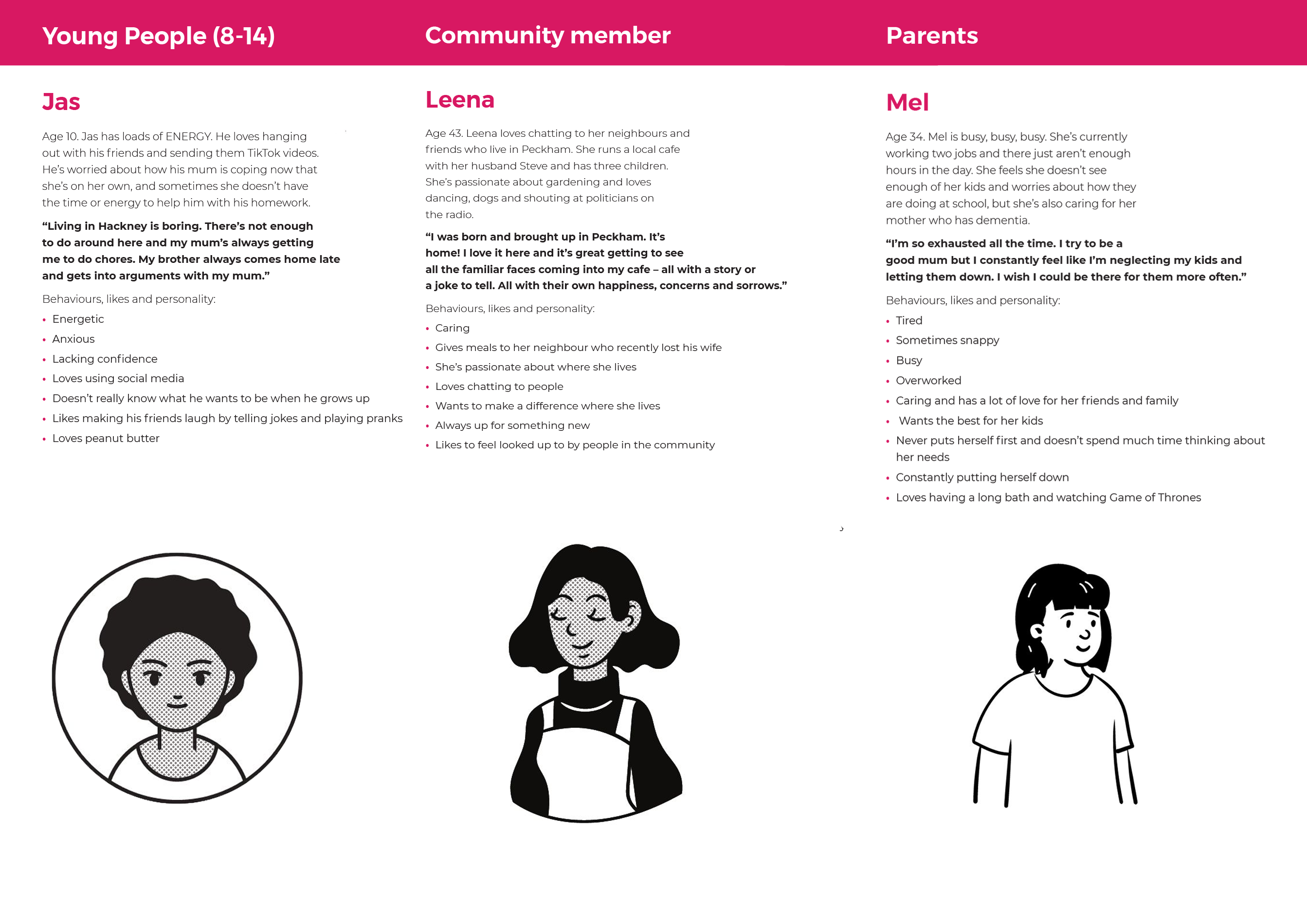
Following the team session, we started crafting user personas to help us get a better understanding of audiences and tailor the new brand to them.
To develop the brand pillars, we spent time really pushing the team to define:
who they helped
how they helped
what they did
and most importantly - WHY they did it
We challenged them to stay away from words like ‘empower’, ‘engage’ and ‘inspire’ in order to really articulate what they did in a simple, concise way that their audience would actually understand and not perceive as patronising, overcomplicated or tokenistic.
SkyWay gives young people in London the skills and confidence to take ownership of their future, while working with and strengthening the communities they are part of.
After developing the mission statement, we went on to develop the vision, values, purpose, positioning and values proposition in tandem, with lots of feedback and thoughts from SkyWay.
Stay tuned for the next blog when we release the Kraken… I mean SkyWay’s new visual identity. No Kraken involved. Sorry.