
15th October 2020 by Chloe Roach

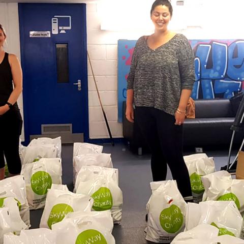
A few weeks ago we started working with the charity SkyWay on a rebrand - you can read about the initial challenges we had identified in our previous blog.
We started where we do with any project - by undertaking some serious research, understanding the audience, and getting our head around who exactly the charity is and why they do what they do.
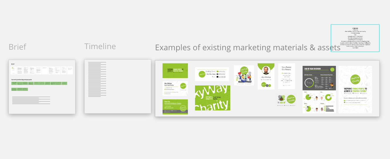
SkyWay had already done some work on their brand pillars, but were eager to push this further, to really get to the heart of what they do, and capture the essence of what makes them special and unique.
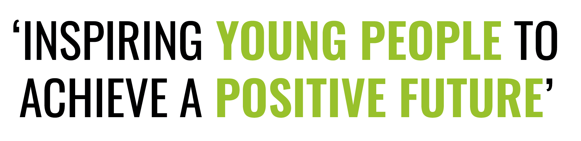
SkyWay’s current strapline is ‘Inspiring young people to achieve a positive future’.
Obviously with SkyWay’s change in remit (working with the community that young people were part of, as well as young people themselves) it needed to be inclusive of both audiences. But we also felt that explicitly saying an organisation ‘inspires’ doesn’t (sorry SkyWay!) sound inspirational. We felt that the strapline was relying on generic terms that were applicable to the work of lots of organisations in the sector, rather than being specific, memorable and distinctive. We wanted to find a creative approach to the strapline that helped unlock what they did and sounded empowering. We also felt the tone of the strapline felt a bit austere - almost as if it wasn’t part of the community it served.
So, again, by exploring what wasn’t working, we started to create a list of requirements for the strapline. It needed to communicate a lot, without explicitly saying it.
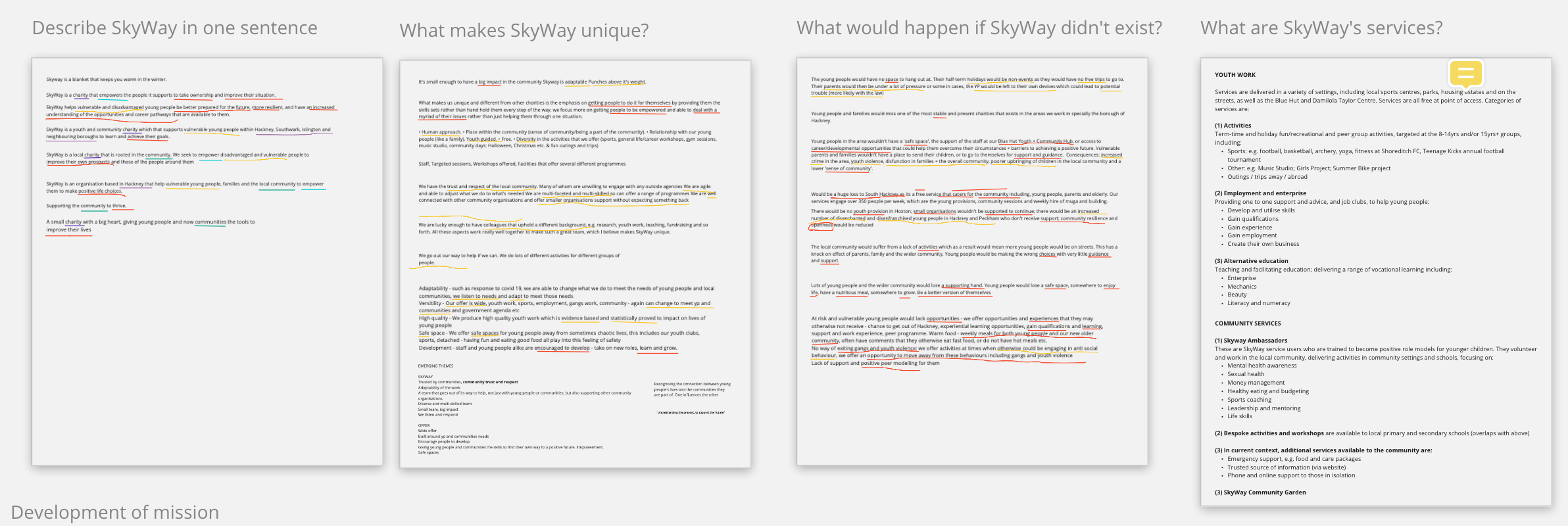
We were really keen to find out what people thought about SkyWay, particularly as the emotive angle seemed to be missing from the strapline and key messaging. We ran a series of surveys, gathered testimonials and spoke to the team about their perception of the organisation. Through this process we started to get a clearer picture of SkyWay and recognised the importance of their beneficiaries ‘doing it for themselves’. Sure, SkyWay helped and supported them on their path, but the key was in giving them the skills to take control of their lives, make independent decisions, to understand what the possibilities were and have the confidence and self-belief to do it.
This is how we arrived at the strapline: ‘Your future. Own it.’
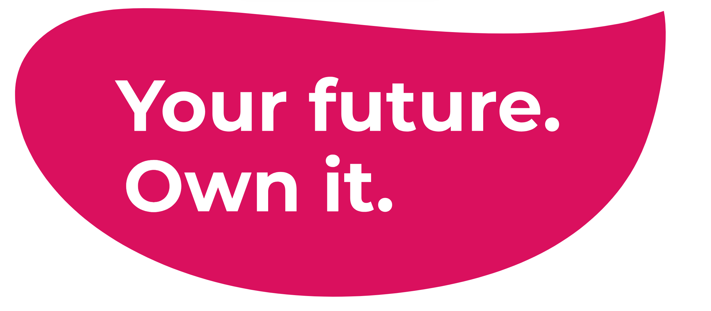
It speaks directly to the audience, conveys confidence and positivity, and doesn’t feel elite. We also explored how the rhythm and structure of the words could be used for alternative key messaging for different types of projects and audiences.
In part three, I'll be discussing how we explored audiences and their relationship with the SkyWay brand.