
15th October 2020 by Chloe Roach

Over the last few weeks, we’ve been busy getting to know our new client - SkyWay. SkyWay is a charity based in London that does great work with young people and the communities they are part of.
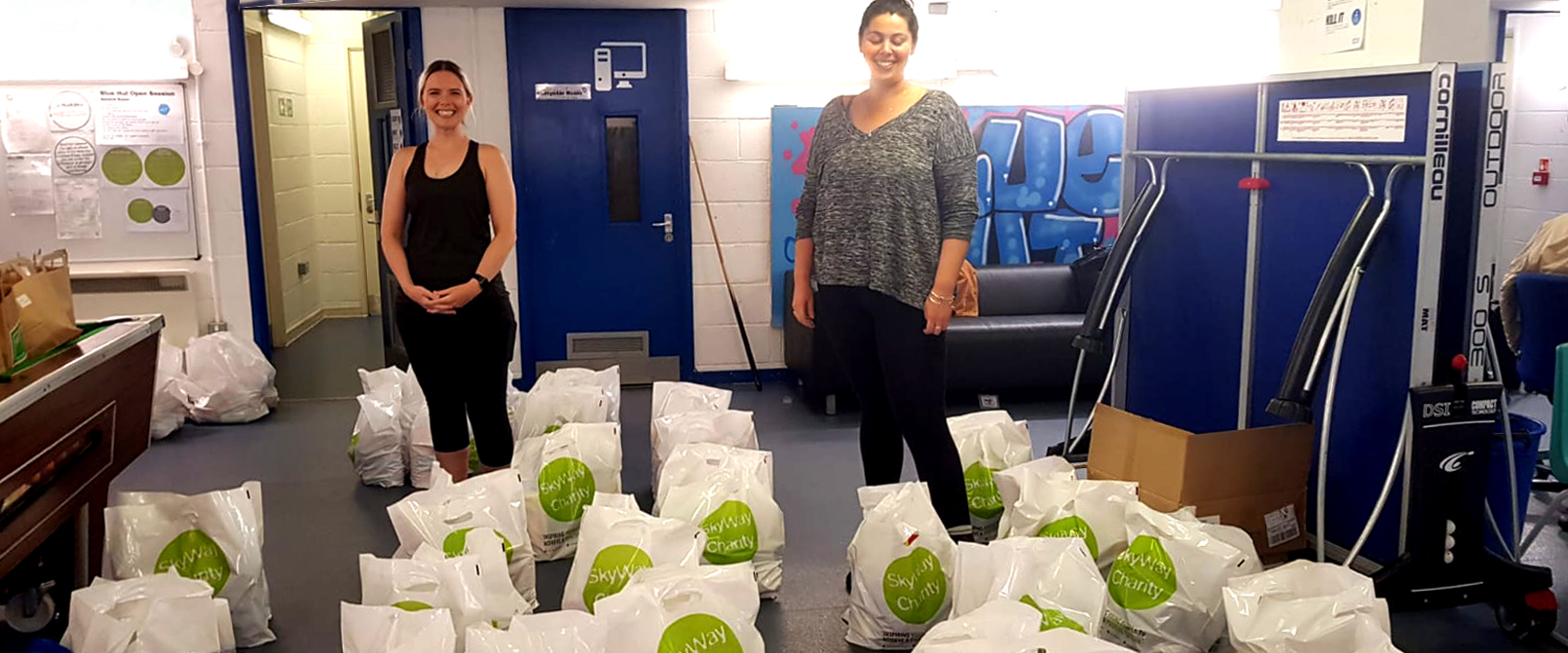
They’ve also been doing absolutely fantastic work during the pandemic, supporting families and vulnerable members of the community remotely, and delivering care packages around the neighbourhood. Shout out to team SkyWay!
SkyWay approached us because they were in need of a rebrand, and they had good reasons why - which is something that we always emphasise to our clients: for a successful rebrand you have to understand why your brand needs changing in the first place.
Change of remit
In the past, SkyWay exclusively worked with young people, but as the organisation developed and evolved, they started to broaden their delivery to the communities that young people were part of as well. SkyWay recognised the important role a community plays in a young person’s development, as well as a young people’s contribution to it - so supporting young people in isolation was only ever going to accomplish so much. This means, they need to reposition themselves to be inclusive of and identifiable to the community members they support.
Distinct, inspiring and powerful
SkyWay wants to have a more distinct identity that reflects who they truly were and what they do. Their brand needs to have more character, feel more relatable to the people it serves, and articulate the strength and impact of what they are doing.
Modernising
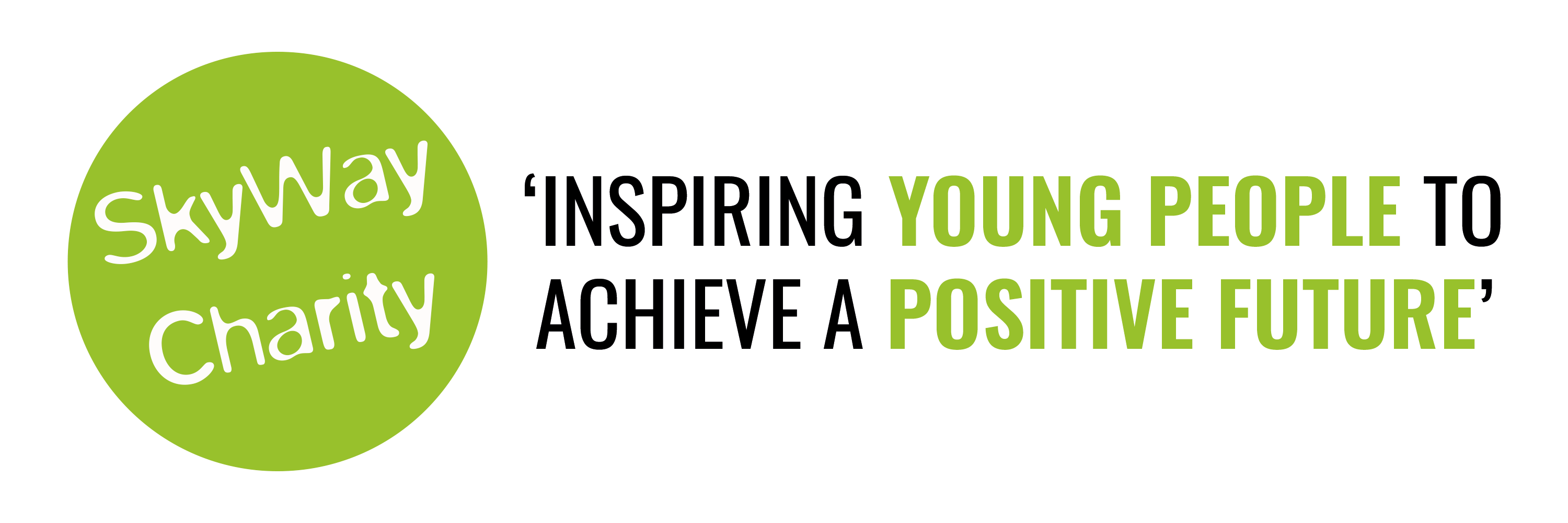
SkyWay’s current logo feels a bit retro. While young people and young adults are no longer exclusively SkyWay’s key audience, they are still their primary demographic, so the brand needed to feel relevant to them. And for all it’s audiences, the brand needs to communicate that SkyWay is current, forward thinking and not stuck in the past.
Professionalising
SkyWay also wants a fresh new brand that reflects their professionalism and expertise as a young person’s organisation and within the broader charity sector/VCS. In the past people had misread them as a youth club, and it was important that their new brand clearly made that distinction.
Consistency and looking beyond the logo
Like many charities, SkyWay used a very logo-centric approach when it came to their brand. This meant that their identity didn’t feel hugely consistent in voice and tone, messaging and visual communication.
The great news is that we knew exactly how to take SkyWay’s brief and produce a new brand that they could be proud of. Stay tuned for part 2 of our project.
If you would like to support SkyWay’s work with a donation - you can do so here.