Sorry, you need to enable JavaScript to visit this website.

St Katharine's Precinct

A historic charity opening its doors to the community.

St Katharine's Precinct Case Study

Charity Branding Logo Design

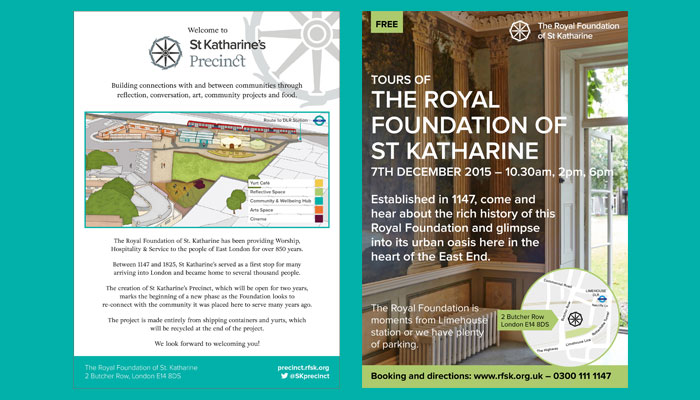
An extraordinary urban oasis in the East End.

Founded by Queen Matilda in 1147, the Royal Foundation of St Katharine has served as a centre for worship, hospitality and service over many centuries, and is one of the oldest charities in the UK.

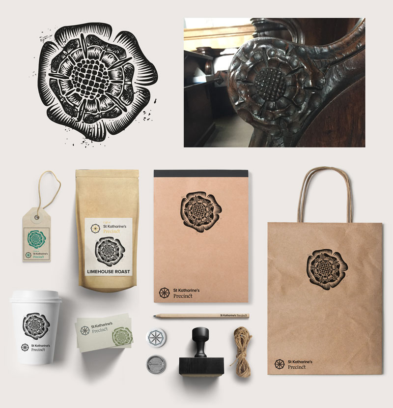
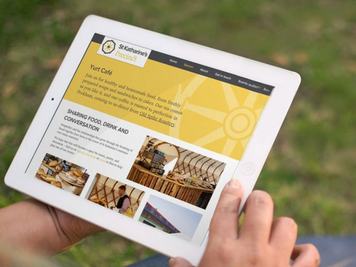
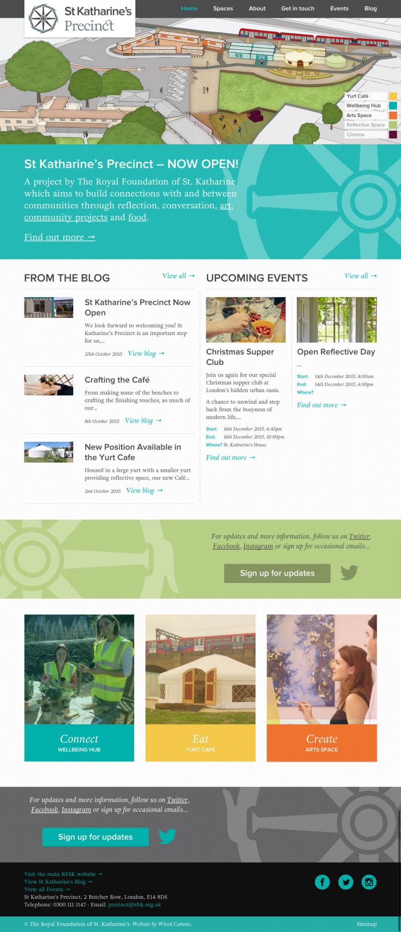
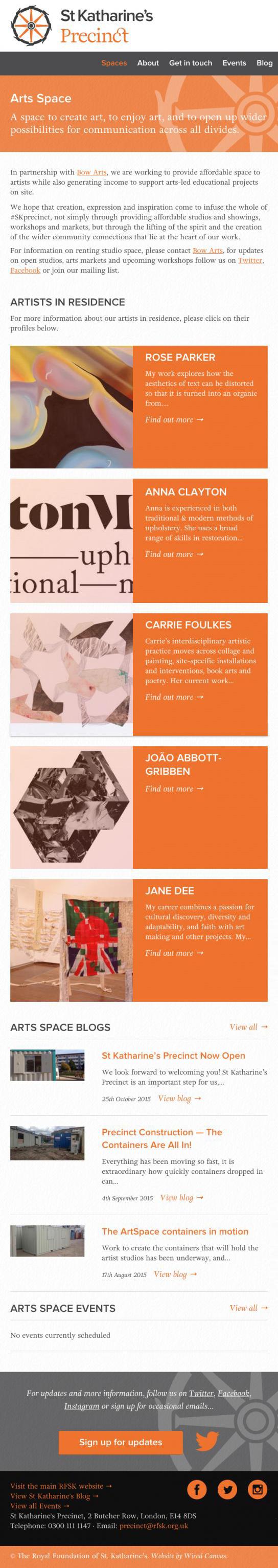
St Katharine's asked us to help them deliver a new brand for their new Precinct project, as well as associated print and marketing materials and a fresh new website. We were thrilled to be involved in a project with such a strong community and creative focus.

3
websites
6
sub-brands
900
years of history
1
amazing space

Connect, Eat, Create, Reflect

The Royal Foundation of St Katharine have expanded into the additional land alongside their current Butcher Row site in Limehouse, developing a space for enterprise, events and community, where people can come and be peaceful, social and creative, for spiritual wellbeing.

The area has been transformed from a disused wasteland into St Katharine’s Precinct – an open space to build connections with and between communities through reflection, conversation, art, community projects and food. It includes an Arts Space made up of artists' studios housed in repurposed containers, managed by our friends at Bow Arts. There is also a community workspace, a beautiful yurt café and reflective space, with an outdoor cinema due to open next year.

Before

Before

After

After


The Goal

The new marketing output (including brand, signage, print and digital) needed to complement the existing output, communicating the sense of calm and peace of St Katharine's House, as well as the open, welcoming and vibrant feeling of St Katharine's Precinct.

A key goal of the project was community focus; by creating personas we ensured that we focussed on the community as well as the needs of St Katharine's.

Charity Signage Design

Brand Development

Knowing that the Precinct is likely to evolve and develop over time, we needed to make sure the brand was flexible enough to grow with the Precinct, working on new applications and marketing materials as they arise. But, we also wanted to reference the monastic nature and history of The Royal Foundation of St Katharine, and make it the unique selling point of the Precinct.

In order to find a good balance between these two goals within the brief, we took inspiration from the amazing space that St Katharine's has in its Limehouse location. We pulled out details of the wooden pews in the chapel, using them as visual icons within the branding, to help reference the history behind the Foundation, but by applying a modern and vibrant colour palette alongside it, to appeal to a new audience. The hand-drawn illustrated icons and prints were each different and therefore flexible in that they could be developed and altered where needed in the future.

Brand design mockups
Charity Branding Logo Development

Logo Development

We introduced a new serif typeface that gave a nod to St Katharine's ancient historical past as an organisation, and retained the wheel emblem as it is so synonymous with the existing brand. The wheel itself is a graphic reference to history, as well as a fitting metaphor for everything that St Katharine's is about; inclusivity, wholeness and embracing connections.

Signage Design

As the project developed, we also designed and advised on the production and placement of signage and way-finding designs around the Precinct site, to invite members of the community to explore this new area of Limehouse.

This involved researching and designing a plan for signs, wooden boards and temporary signage. We liaised with suppliers on the delivery of outdoor boards and custom laser cut signage.

Charity Signage Design
St Katharine's Precinct Charity Website Design

Website Design

We built three web platforms for St Katharine's, which share content with one another. The main Precinct website has colour coded "subsections" for each of the areas of the Precinct. We also built an Events listings platform and a Blog, which synchronises listings with the main Royal Foundation website.

The websites are running on Wordpress open-source CMS, allowing St Katharine's to manage their online content with ease. They are fully responsive and work on mobile and tablet devices, making them ideally suited for use by visitors to the café or precinct site.

Winner at TimeOut #LoveLondon Awards

We were thrilled when the Precinct Cafe won Best Cafe at Poplar, Shadwell & Wapping at the TimeOut #LoveLondonAwards 2016. In the first year of opening, the Precinct has grown into a hub of creativity and connection within the local community. We are delighted to continue supporting this fantastic project!

Winner TimeOut Love London Awards
St Katharine's Precinct Mobile Desktop Design
St Katharine's Precinct Mobile Website Design
St Katharine's Precinct Mobile Tablet Design

“Beyond the excellence of the work you produced for us, you were all a pleasure to work with and I greatly enjoyed all of our meetings! Thanks so much for your awesomeness, it is working beautifully.”

Andrea Gibbons, Royal Foundation of St Katharine Andrea Gibbons, Royal Foundation of St Katharine

Project Research Booklet Design
St Katharine's Precinct Signage Design
St Katharine's Precinct Cafe Branding
St Katharine's Precinct Interactive Map
Cafe Branding Flyer Design
Cafe Signage Design
St Katharine's Precinct Yurt Cafe
Charity Branding Logo Design
Custom Illustrated Map Design
Signage Design
Charity Branding Logo Design
Charity Signage Design