
26th May 2020 by Chloe Roach

Over the last few months we’ve been working on a rebrand for the wonderful London-based charity SkyWay. A big part of the preparatory work was learning about the people they help - what their stories were and the difference the charity made to their lives. Through our research, we looked at other brands that successfully captured the ‘human’ aspect of their work and told a story - the kind of thing we want to be present in SkyWay’s new brand. Here are just a handful of them.
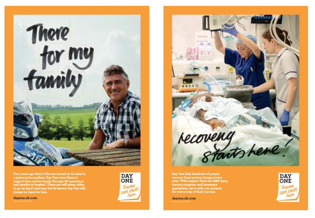
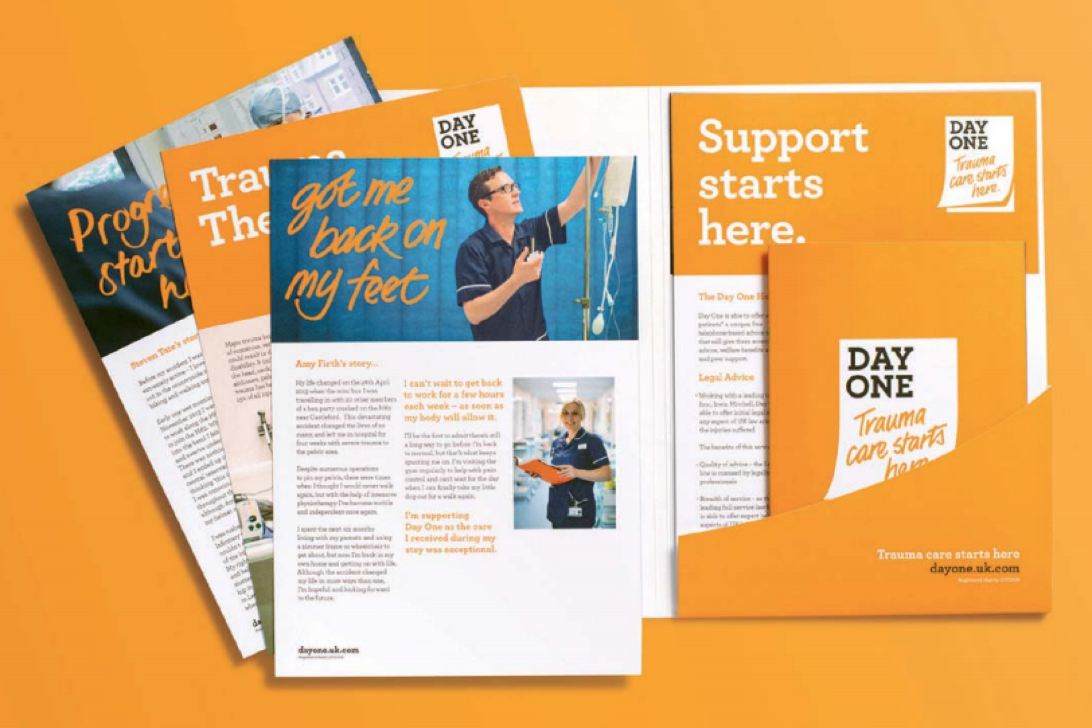
1. Day One
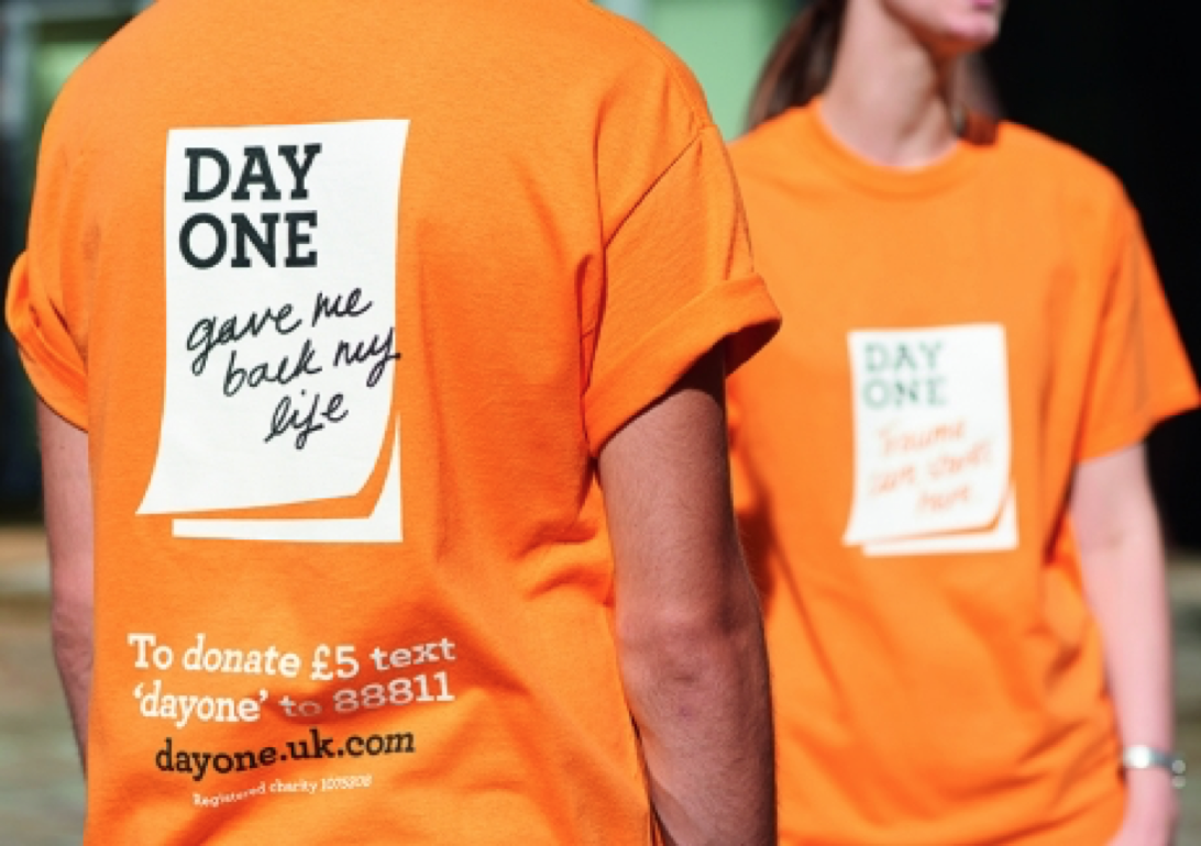
Yorkshire Trauma Services help people who are recovering from serious accidents and are committed to making a positive impact on trauma care. Their big challenge was to generate enough publicity and brand awareness to raise £100k of vital donations in the first 12 months following their rebrand. They needed a brand that could compete with larger charities and stand out from other medical charities. They were rebranded as Day One.
What makes it good?
Firstly, it’s distinctive. But more importantly, it captures the essence of what the charity is about. It’s representative of the journey patients who’ve had a serious accident take towards recovery - and it’s optimistic. The emphasis is moved towards the individual experience and away from medical terminology or jargon. It uses the symbol of the diary as part of its brand identity – conveying ‘one day at a time’ – and focuses on the positive and the personal.
The brand supports and works harmoniously with personal and genuine stories. Sometimes brands can feel imposing, forced or unsympathetic, but the handwritten, branded images that document the personal milestones accomplished by individuals feel congruous and authentic.
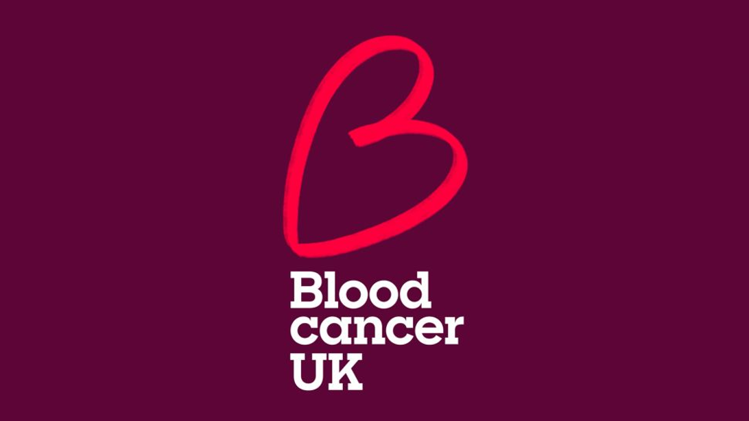
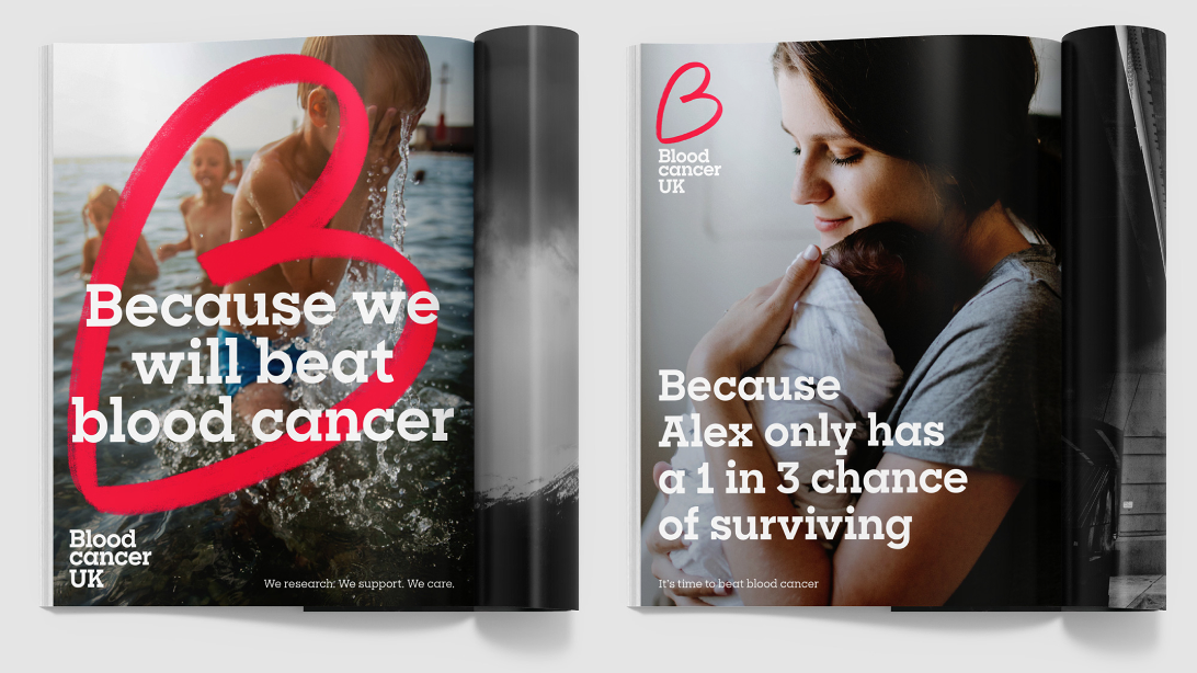
2. Blood Cancer UK
Bloodwise recently rebranded as Blood Cancer UK. It’s the second rebrand the charity’s had in five years, following its name change from Leukaemia & Lymphoma Research in 2015, so I would imagine this wasn’t the easiest decision for the charity. Two rebrands in five years isn’t ideal - but I certainly believe it was the right decision. Their mission as a charity was unclear from their existing name, and the market research revealed they were perceived as a blood donation service, rather than a blood cancer charity. This wasn’t only affecting their donations - it was also a barrier to their beneficiaries accessing support.
What makes it good?
When we first saw this brand, it seemed reminiscent of the rebrand we did for young people’s charity Our Time. We liked the boldness and simplicity of the brand, which carefully finds a balance between emotive and authoritative. It aligns personal stories with the organisation’s mission and links it all together using the hand drawn letter B, which can also be read as a heart shape. This softens the brand and stops the ‘blood red’ colour from feeling too alarming. The B is also used in their poster campaign to emphasise why they are doing their work - ranging from the individual stories ‘Because Alex only has a one in three chance of surviving’ to the charity’s mission ‘Because we will beat blood cancer’. It’s clear, simple, strong and emotive.
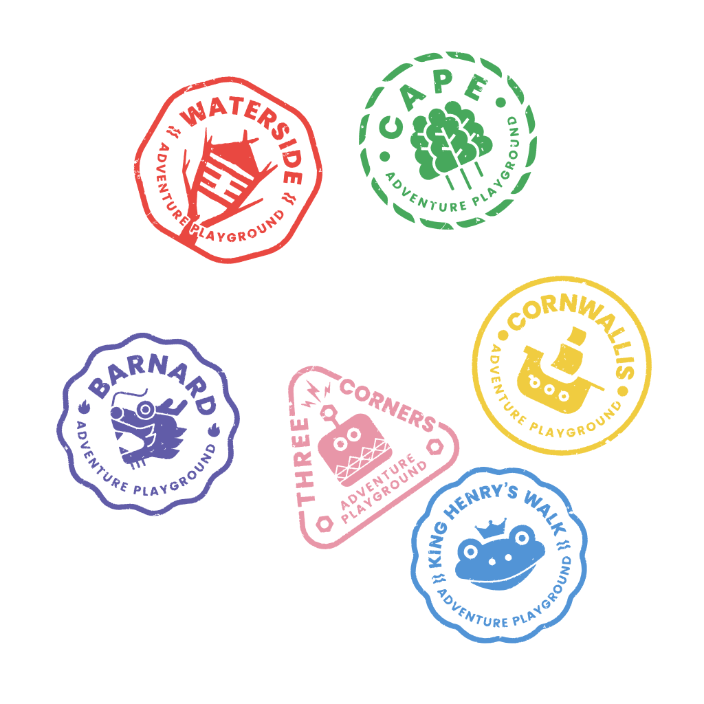
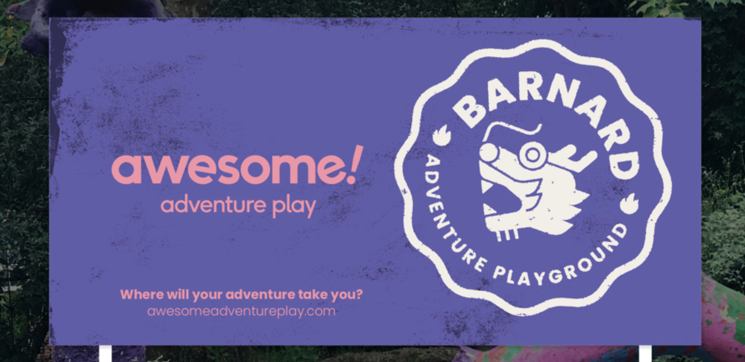
3. Awesome
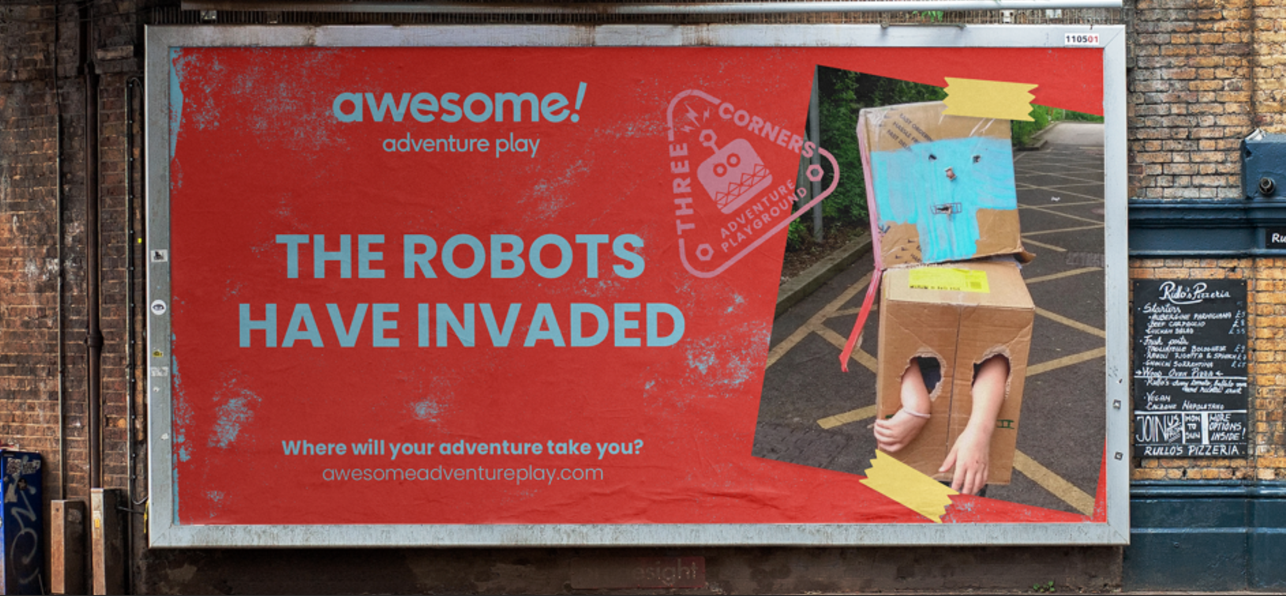
Last year Awesome got... well... an awesome rebrand! Awesome is a social enterprise that provides free, fully-supervised play opportunities for children and young people aged six to thirteen in Islington. Their ethos is all about giving children a space where they can explore, have fun, learn, test their physical limits and meet new people. We worked with them to create a brand that actually communicates the fun and adventure they bring to children and young people's lives.
 What makes it good?
Awesome was named by the people who know it best - the children. And as all the play opportunities Awesome provides are child-led too, we knew that getting the children and young people involved in the rebrand was an absolute must. Awesome has a total of six playgrounds which we created sub-brands for, drawing inspiration from the photos children sent us of their playgrounds and capturing what made it special and unique for them. The brand we developed is not only playful, eye-catching and fun, it also builds upon the children's a sense of ownership and pride in Awesome.
The child-led approach also influenced Awesome's voice and tone. We developed each of the adventure playgrounds' individual identities using language that's reminiscent of adventure stories, while emphasising the sub-brands' themes and complimenting the excellent array of photographs that were supplied by Awesome.
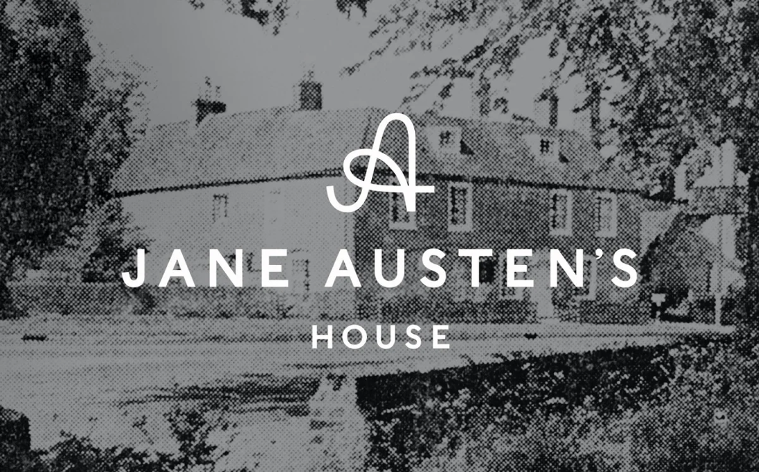
4. Jane Austen’s House
Now for something completely different. Jane Austen’s House. This rebrand was all about creating a fresh new identity for the museum. The existing brand had become rather tired and cliched - in short, they were in need of something fresh and inventive to re-engage the public.
What makes it good?
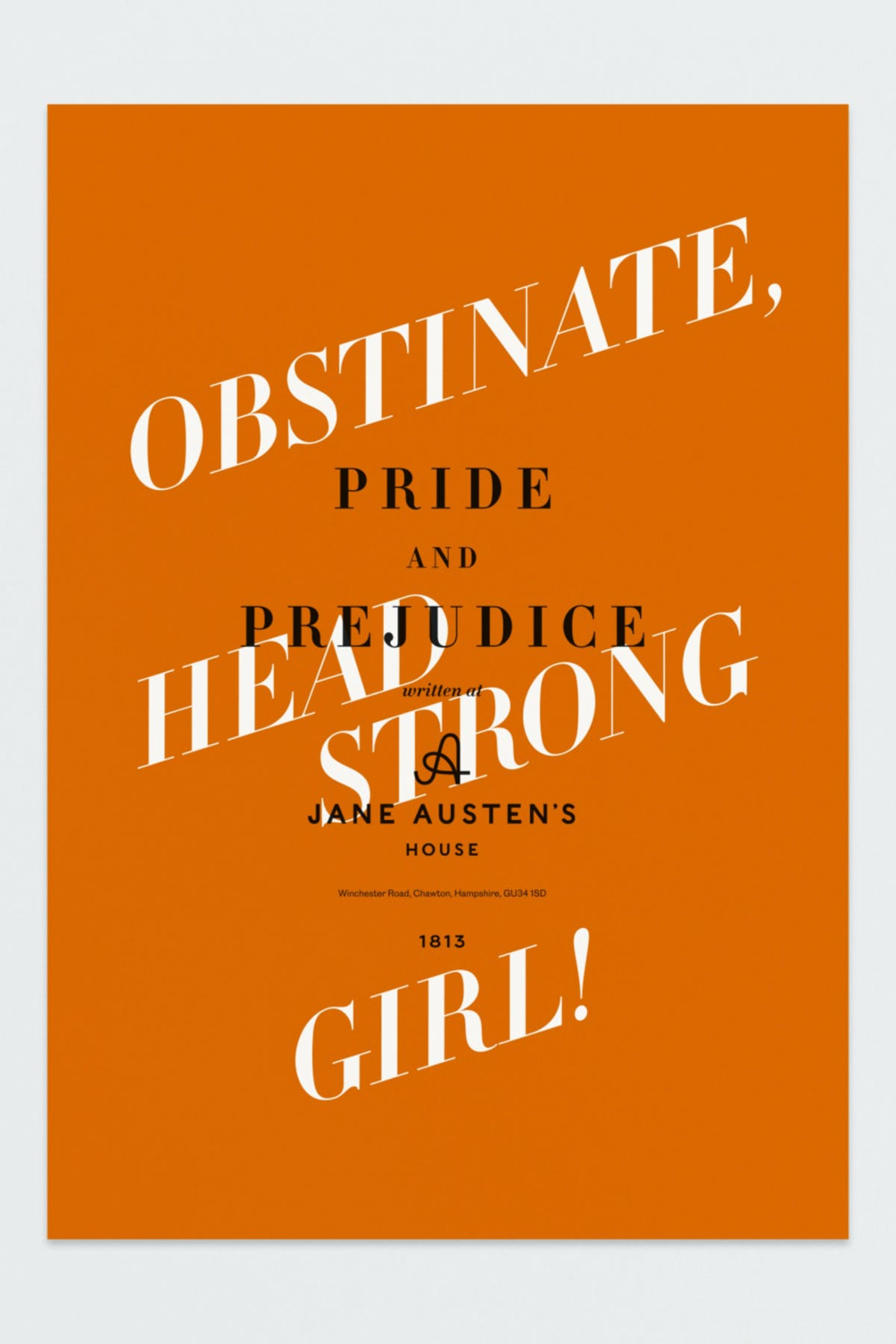
When people think of Jane Austen, aside from thinking about Mr Darcy (as my secondary school English Literature teacher clearly was), they tend to conjure up a pretty traditional 18th-century image in their head. So, it’s interesting that Jane Austen’s House was treated to a very contemporary rebrand. Rather than using the period as the inspiration for the rebrand, the handwritten initials 'J' and ‘A’ are a celebration of Austen's beautiful handwriting and form the basis of the primary logo. The brand also captures several other personal elements of the house, including a colour palette inspired by her wallpaper, and a secondary logo which incorporates the dodecagon shape of Jane Austen’s writing desk. The brand steers clearly away from stereotypes and presents the museum as modern and relevant, while embodying multiple, personal elements of the space within which Jane Austen lived.