
3rd June 2020 by Chloe Roach

1. Girls Who Code
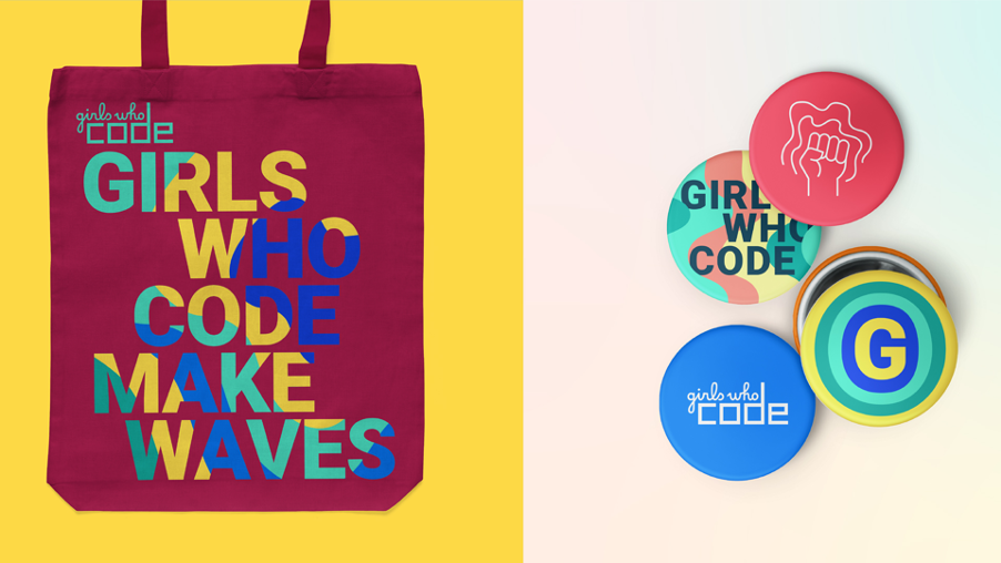
Established in 2012 on the other side of the pond, Girls Who Code was set up with the ambition to teach 20 girls how to code. Today they’ve slightly surpassed that target, teaching a massive 185,000 girls around the world. That sounds pretty impressive, but they’re certainly not resting on their laurels - by 2027, they aim to level the gender playing field in the area of coding.
Why their brand works
Their new identity uses waves. Aside from the obvious connotations like ripple effects, ‘making waves’ and progression - in their field of work, these waves are also representative of the pattern that coding scripts create when you’re writing code. So it has a nice resonance, connecting their mission and the actual work they do.
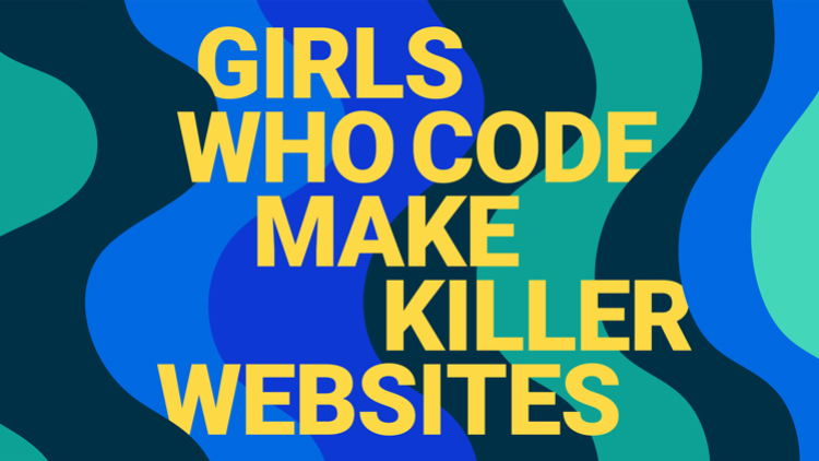
Their language is youthful, positive and inspiring - it makes you want to be a part of what they’re doing and join the ‘sisterhood’. Being smart or interested in science, maths or engineering as a girl can sometimes feel isolating; so accessible, inclusive, positive language is an absolute must. And, I mean, who wouldn’t want to be ‘a girl who makes killer websites’?
Another big consideration was their growth and the subsequent reach of their programmes over the last eight years. With their brand being rolled out around the globe and the emergence of multiple Girls Who Code communities, they wanted an accessible typography - so they went for Google’s open source Roboto font.
2. MindSpace
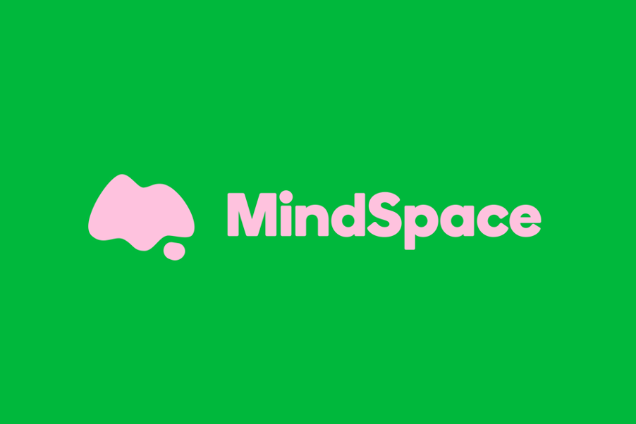
MindSpace is a mental health charity which helps 11 to 16-year-olds understand, discuss and manage their feelings. MindSpace began life in Barnsley as a regional charity called 4:thought, but they needed a rebrand to help them reposition the organisation on a national level.
Why their brand works
Their new name is much less ambiguous than its predecessor, giving people an immediate understanding of the field they work in - and it’s also no longer the name of a Radio 4 programme. You might be thinking ‘what’s that weird blob next to the name’, but actually I really like the word mark on the logo. It’s got an ambiguity to it, but when it’s juxtaposed with the word MindSpace, it really comes alive with associations. It feels like a loose ‘M’ shape, but also a thought bubble, and has a landscape (‘space’) quality to it. While it’s none of these things and all of them at once, I think these associations just add to the character of the brand.
They’ve wisely chosen to go with a brand that’s bold and pronounced, which is in keeping with its work to destigmatise mental health and be open about potentially ‘awkward topics’. Unlike many other brands, MindSpace has a really broad palette to reflect the many moods and feelings young people have. Can this enormous palette be used wisely without ending up as a psychedelic soup? Time will tell, but so far, so good.
3. YoungMinds
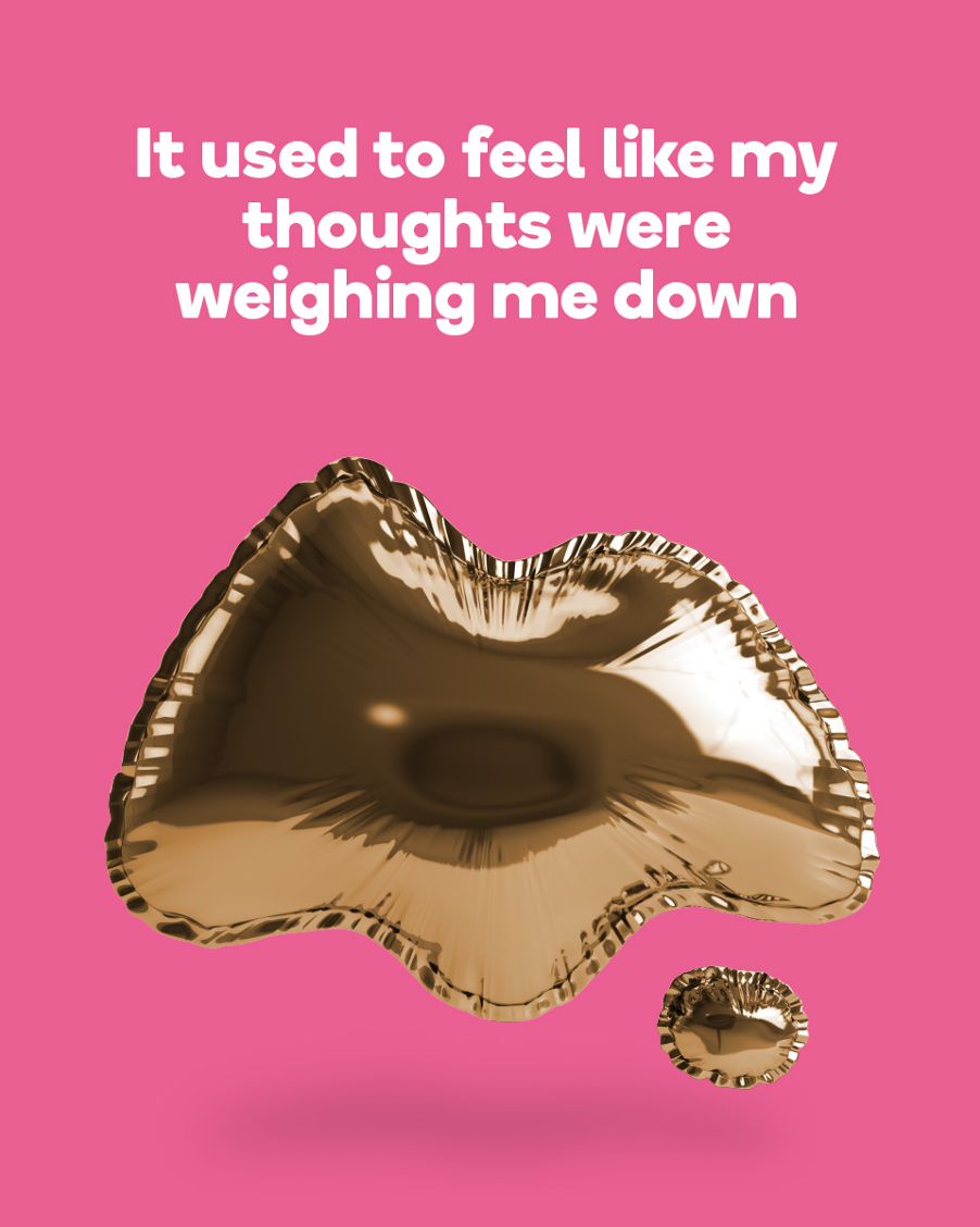
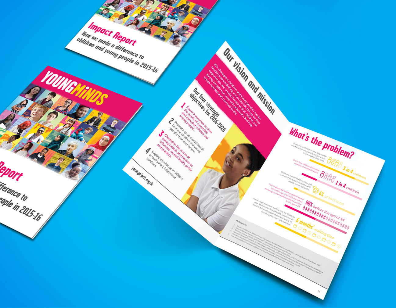
YoungMinds is the UK’s leading charity fighting for children and young people’s mental health. Their brand was in desperate need of a refresh, and they asked if we could do something about it. The logo itself had become dated and lacked personality. However, they did have strong brand recognition - clearly something you don’t just kick to the curb - so we knew this project would be about putting a new but authentic spin on their brand, rather than completely redesigning it.
Why their brand works
Who says a brand can’t feel youthful and professional at the same time? Not us! YoungMinds’ previous logo, other than the name, didn’t really tell you much about the people it was fighting for. It felt muted and uninspiring - so we injected it with some life and distinctivity.
We developed the dot of the 'i' so that it became a feature that can act as a standalone icon, representing an individual young person or a head full of ideas - a flexible icon and mascot. We put together a flexible brand toolkit of colour schemes, textures, iconography, graphics, and imagery that could be used for their wide audience.
We are so proud of YoungMinds’ fresh, vibrant brand and they are too. It’s unmistakably YoungMinds.
4. Massive
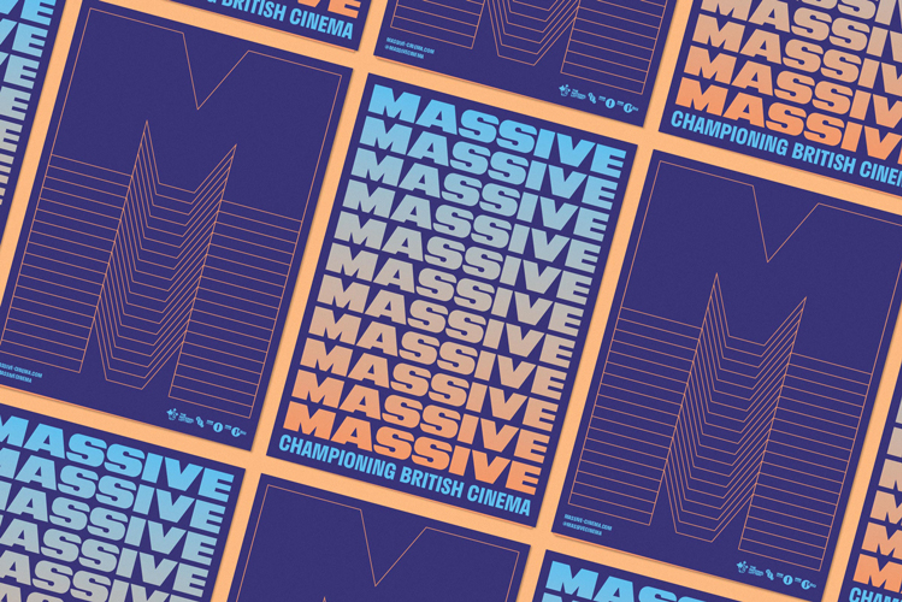
Remember the days when we could go to the cinema before lockdown? Well, for some people cinema was never really a big deal. With the rise in streaming services such as Netflix and ‘binge-worthy’ series, interest from teenagers and young adults was at an all time low. Back in 2018, website and poster campaign MASSIVE was established to help this lost audience find its love for British Cinema.
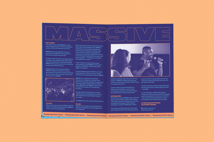
Why their brand works
My first thought about this brand was how modern it looks - even though it’s now two years old. It has that lo-fi, slick, minimal aesthetic that wouldn’t be out of place pasted up on billboards around the trendy parts of London I’m no longer accepted in. To me, as a 34-year-old woman (hey, step aside grandma) it feels youthful and current. It also really captures the mood of a festival, and while that’s not specifically what it’s marketing, it does convey this sense of an unmissable event or experience.
Sad Girls Club
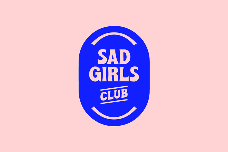
Sad Girls Club is an online community for young women of colour who have struggles with their mental health. It’s all about normalising the conversation around mental health in an environment that’s safe, supportive and free from judgement. Formed in 2017, it’s now got over 300,000 followers.
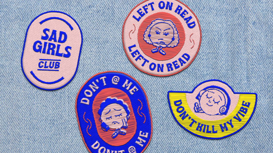
Why their new brand works
With a name like ‘Sad Girls Club’, it’s easy to see how the wrong branding could go really very wrong, alienating and disengaging its key audience. Fortunately for Sad Girls Club, their fresh new look is right on the money. It’s strong and unapologetic. They may be ‘sad’ but they sure as hell don’t want your pity, and it communicates that to you. ‘Sad’ does not equal pathetic or ‘damsel in distress’, and there’s absolutely no confusion there. It’s about being ‘real’, and this is also emphasised through their new strapline ‘Small Talk, Real Talk’.
The new brand embraces the word ‘club’ in its name, bringing in badge designs and even a jacket, and the new logo riffs on the sad/happy motif and proudly announces its name using bold 70s typography.
If you’re thinking about a rebrand, a new brand or just a bit of a refresh, get in touch with us. We’re always happy to listen and learn about your project and tell you more about our approach.