29th January 2016 by Alice Ralph
In our last blog, Rob talked about our new purpose and brand (and a hallucinogenic pear), but he has left me the tricky job of trying to explain how we turned that purpose into a fully functioning brand.
Tricky, because rebranding ourselves wasn’t a smooth process. Turns out developing a strong brand for yourself is really hard.
Looking in from the outside
It is much easier to develop a brand for a client. When you are an ‘outsider’, you can look at a business or organisation from the outside in.
A brand should be authentic, suitable for the audience, and consider all applications. As an outsider, you can see a business as they are perceived by their users, and it’s usually possible to quickly spot the strongest elements of their company and build the brand around that.
But doing this for yourself is a whole other ball-park. Not because you don’t know your audience, or the applications, but because it’s hard to know how you are perceived. Do people get our jokes? (Occasionally not.) Will this appeal to potential clients, or will it scare them off? (A mixture of both.) Does this feel too serious, or too boring, or too bonkers? (Too bonkers is better than too boring)
Add into the mix a combination of ‘no deadline’ and ‘endless possibility’, and you have a designer’s playground. Constraints might be frustrating, but they make things a lot simpler.
No budget + no deadline + no rules = chaos
Imagine you walk into a giant department store with a million pounds in your pocket. You can try every outfit you like until you find the perfect outfit - but you don’t really know what will look best until you try it on (and trying it on is part of the fun). This is what it feels like when you are designers in the process of rebranding yourselves. The world is your oyster. You feel like you can finally explore all of the styles and ideas that you’ve wanted to try with your clients in the past and haven’t had the opportunity to use.
Unfortunately the outcome of this is that 99% of everything you try on will fit badly, or it just won’t suit you. You will waste a lot of time trying things on that - with the benefit of hindsight - would never be a good look.
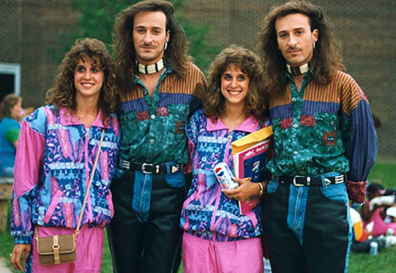
...nope, not a good look.
Of course, it’s a lot of fun. But it’s easy to get over-excited. And as with any business, perfecting our brand is imperative.
So I’ve written this little overview of how we developed our new brand, and the lessons we learnt along the way.
How we work
The rebrand process can be pretty open-ended unless you set yourself a very clear brief and stick to a timeline. The process, as a general rule, would run something like:
Set a brief with goals for the rebrand outlined.
Plan the project timeline, with a realistic but fixed deadline.
Research, research, and more research. Research your audience, your competitors, your clients, your industry, your limitations, your opportunities.
Develop a concept based on your research findings.
Refer back to your brief - does the concept match your goals?
Explore designs around the concept.
Refine those designs.
Refer back to your brief agan - do the designs match your goals?
Refer back to your research - does this align with or challenge your findings?
Refine the designs further.
Finalise the designs.
Output the various applications of your brand.
This is how we would generally run a rebrand process with a client. Of course, this largely went out of the window in our case. We made the mistake of not setting a deadline, and trying to fit our rebrand around our other projects.
Setting your brief
It is important to set a brief for any project - including when you are working for yourself. A simple 1-2 page document outlining your goals for the rebrand will help keep you focussed on the bigger picture.
The questions that you should ask yourself whilst developing a brief might include:
Who is leading the project?
Who are we as a company, and what’s our purpose?
What problem are we trying to solve with the rebrand?
What is working well about our current brand, and why?
What is not working well about our current brand, and why?
Who are our customers / audience, and what motivates them?
What story should our brand tell about our company?
What do we want our brand to communicate, and to whom?
How will the brand be applied? How will it be used?
How will we make the brand authentic, honest and meaningful?
After completing this process, you should have a strong brief that will guide the entire rebrand process. You should return to it regularly; read back through it at every stage of the rebrand and check whether your development is still matching the initial goals.
For us, the brief for our rebrand included a focus on communicating our purpose, and resonating with our audience. Our clients are largely in the non-profit and arts sectors, so we researched these sectors and identified motivations and concerns that decision makers within these sectors might have. We picked out the elements that were working well with our current brand, as well as many elements that weren’t working so well.
Researching and workshopping the idea
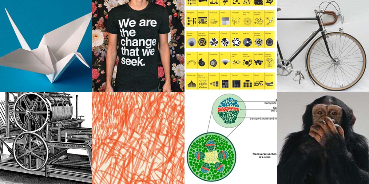
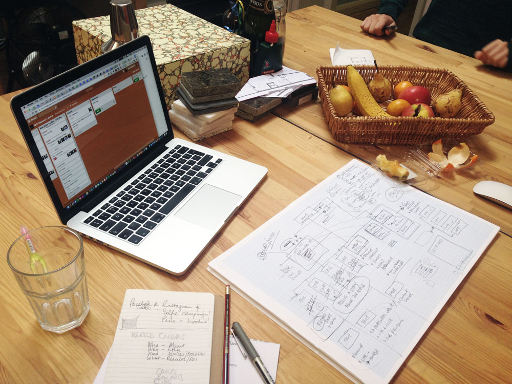
As a team we workshopped the concept from the ground up. Separately we went away and - using a combination of ‘secret’ Pinterest boards, RealTimeBoard and face-to-face meetings - collected a huge stash of random images, graphics and ideas that in some way communicated some aspect of Wired Canvas and our purpose or identity.
Our stash resulted in everything from bicycles (“Simple, functional, environmentally friendly, easy to use”) to Casio watches (“Good value, lasts for ages, reliable”), to penguins and printing machines. There was typography, colours, metaphors, graphics - anything and everything that might spark a flash of inspiration.
Previously when we were defining our purpose, we kept talking about how we ‘increase the impact’ of what our clients are already doing. We don’t reinvent our clients - they are already doing amazing things - but we help them redefine how they present themselves and maximise their results.
During the workshopping stage, we kept returning to the idea of creation, folding, reinvention. With our clients, all of the raw ingredients are there; we just help them present themselves in the best way possible.
A good metaphor for this (bear with me) is a blank piece of paper, and Wired Canvas as the origami masters… see where I’m going here? A lot of our clients are in the arts and creative industries, and we also liked how paper and canvas textures tied together the idea of raw artist’s materials, as well as our name, and the idea of recreation.
Developing the concept
 It was at this point that we went a little bit off piste. Normally at the concept stage you are limited by deadline and/or budget, so you tend to explore and develop a few rough concepts off the bat - and refine from there via discussion with the client. But we were both the designers and the client, so we wanted to try out everything.
(Caveat: this is not normally how we work.)
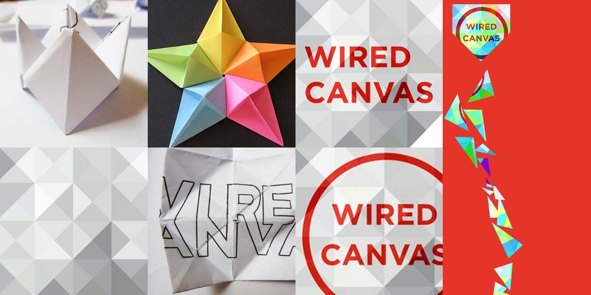
Our small starting point - origami - became the springboard for a lot of research, mind-mapping and idea generation (most of it too bizarre or too ridiculous to share). We found that a lot of the origami and paper shapes that we explored could be broken down - in their simplest form - to folded squares or triangles. This later turned out to provide a fortuitous structure for our logo, and also our branding as we developed it for print and web.
We spent a lot of time exploring origami - literally and digitally. Rob F went down a rabbit hole of online origami tutorials. Rob C started playing with building origami using CSS and HTML, and subtle transitions to suggest movement. Hannah and I broke out our sketchbooks and Photoshop big guns, and before we knew it we were designing all kinds of weird and wonderful experimental visuals.
As we started developing the brand, we found that the triangles + squares + paper + folding was working really well - but it still didn’t feel quite us. We spent a lot of time discussing it as a team until we realised the problem…
It felt too clean.
As a company, we work a lot with artists and creative organisations. We have personal backgrounds in fine art. We work through creative problems every day. We know that the creative process isn’t a clean and tidy exercise. It’s messy, it’s textured and (for us, at least) it’s covered in Rob’s totally incomprehensible doodles.
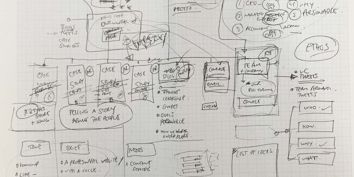
So we went back to the drawing board - literally - and ‘messed it up’ a bit. We added paper textures, added a new brighter colour scheme, and took turns doodling all over our designs.
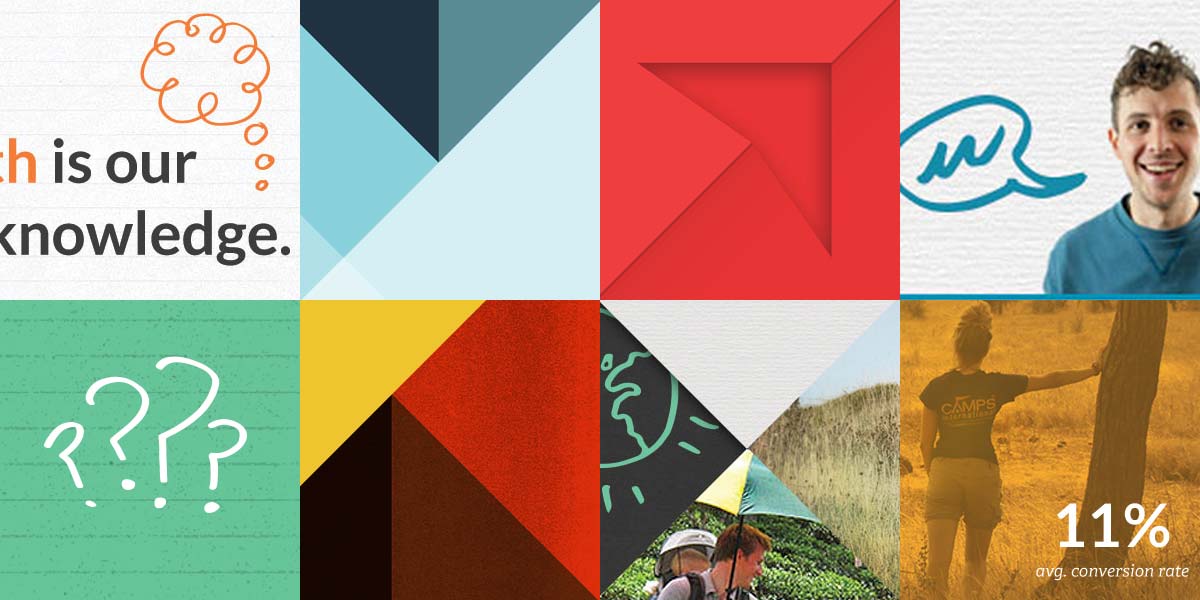
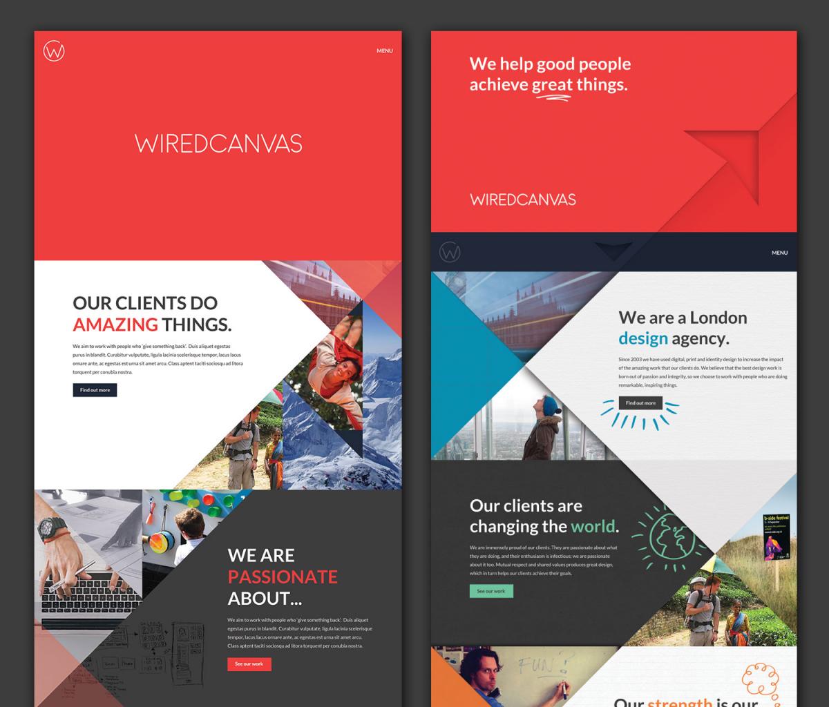
Immediately, all of the designs felt a lot more like Wired Canvas. That’s the thing with developing a brand identity; it needs to be authentic, fit like a glove and - most importantly - you should feel confident wearing it. Suddenly, after days of exploring endless design dead-ends, it will suddenly slot into place and feel right.
Creating our new logo
When people think about branding, they most commonly think about the logo. Branding is much, much more than your logo. It is everything about how people perceive your organisation - from your customer service to your website to what people say about you behind your back.
 But of course your logo is still important. It’s what you’re going to stick on all of your business cards and letterheads. Even though your logo is a small facet of your brand, it is still important to get it right.
We developed our new logo in tandem with our new overall look and feel, and we like to think that the two work hand-in-hand because of that process.
The great thing about triangles and angles is that it works well alongside the ‘W’ of our initials, so we chose to focus on this when developing our logo and identity. We developed a custom type for the text of the logo, using the vertical lines of origami and spheres as a basis for the letters.
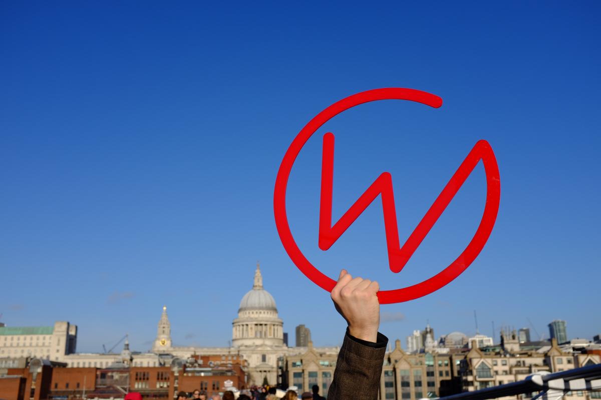
We knew that we wanted some sort of stamp or icon. Our old logo was a simple typographic design, which was fine, but it wasn’t particularly flexible and didn’t stand out in the sea of square social media avatars. Using the ‘W’ from our logo and a circular ‘C’, we managed to create a striking and simple icon that looks great on everything we’ve tried it on.
Trying it out for size
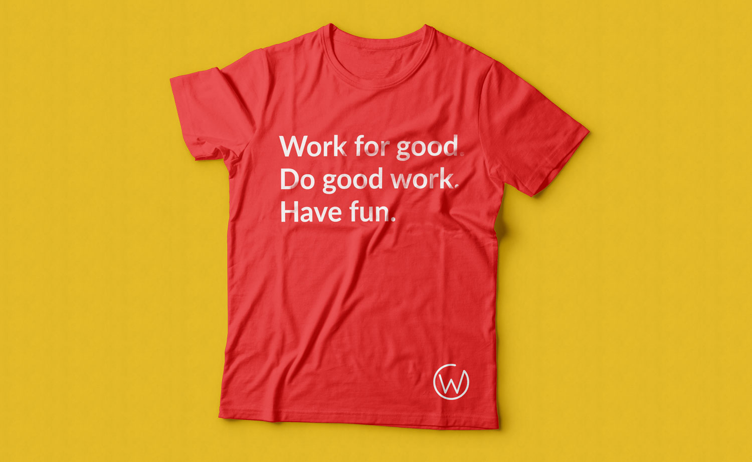
Our new brand has worked extremely well for us. We’ve applied it to our serious brand materials (invoices, contracts, yawn) all the way through to our not so serious brand materials (stickers, coasters, woohoo). Rob F is trying to convince us all to get it tattooed - we might enforce this as a company policy some point in the future.

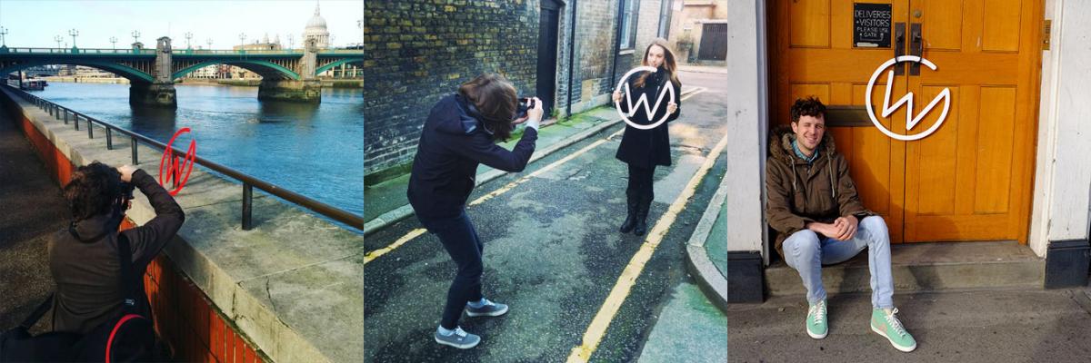
We even had our logo laser cut and took it out for a spin around our neighbourhood. We needed some strong images for our website and marketing, and having a studio right in the heart of London is the perfect photo op. We got a few strange looks as we waved our logo around on the Millennium Bridge and planted it Where’s-Wally-style around Borough Market, but the photos turned out great.
What did we learn?
So, what did we learn from all of this? Our simple rules for a smooth rebrand process would be:
Don’t try to be something you’re not.
Your brand should be authentic. Rebranding might feel like an opportunity to reinvent yourself, and a chance to try out lots of ‘new looks’, but if that look is only skin-deep then it will be obvious to everybody. Be honest with yourself about where your true strengths lie, and build a brand that showcases those strengths.
Set a brief.
We spent a lot of time trying out ideas that ultimately were dead ends. This is fine - it’s good to explore and play with design - but it’s important not to lose sight of the bigger picture, aka. the brief. Write out a brief for your rebrand before you start (just 1-2 pages will do) and refer back to it throughout the process. This will help keep you focussed, and you’ll spot those dead ends much earlier.
Set a deadline.
When you’re designing for yourself, it can be tempting to take your own sweet time. But the unfortunate reality is that paid client work will always take precedent, and you’ll never get round to making the tougher decisions. Set a deadline for your rebrand and treat it like any other scheduled client project. This will help you keep time aside for it, work through the design problems, and reach your final destination much quicker.
Ask for other people’s opinions.
You know your business inside out, but only other people can see your business the way your clients see it. If you are unsure how a brand element might go down with your clients, ask them. We briefly considered changing our company name as part of our rebrand, but a quick poll amongst our friends and clients resulted in a unanimous ‘NO’. We had become a bit bored by our company name but it is apparently very popular amongst our clients - and their clear-cut feedback was enough to help us feel a lot more confident in our new brand direction.
Back to the future

In the next instalment of this blog series, aptly titled Part Three: Our new website and lots of affirmations (YES)! Rob C will be explaining how we developed our new website (you’re looking at it!) including some triangular CSS that will blow your mind.


