6th December 2012 by Rob Foddering
This week (through the haze of our Christmas party) the Wired Canvas discuss blog series continues with an interview (by freelance journalist Amy Oliver) about high resolution images for print. Hold tight, it’s going to be wild…
Rob: Oh God, high resolution images? Surely that’s the Most. Boring. Thing to talk about ever (in the universe)?
Alice: Yes, it is horribly boring. But getting it right can mean the difference between a poster that looks professional and a poster that makes your company look like it’s hosting a church bazaar (in Ringwood).
Rob:GADZOOKS! No one wants that. So what is this crazy thing called high resolution and how do I go about getting it?
Alice: A computer image is made up of pixels. These are measured in inches. So if some smart alec asks you for a 300 dpi image, that means they want a picture containing 300 dots (pixels) per inch. The more pixels per inch your pictures contain, the sharper they are going to appear when printed.
Rob: That seems quite straight forward. Why are we having this conversation?
Alice: Because people need to know that images with a low resolution e.g. ones taken from the internet, will look blurry when printed professionally.
Rob: Why is that?
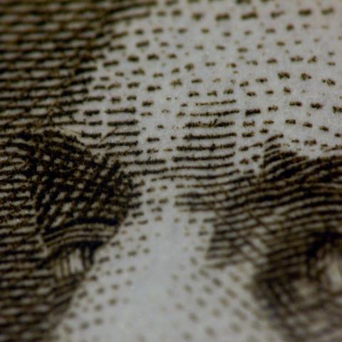
Alice: They may look big on your computer screen, but images on the internet tend to be smaller in size to make them load faster. On the whole, web images are usually 72 dpi or dots (pixels) per inch. When you try to enlarge them in Photoshop those pixels don’t increase, they just spread, making the picture look blurry. Take a look at these pictures of Justin Bieber. One has been printed at 300 dpi and the other is at 72 dpi.
Rob: NO MORE BIEBER, but OK, I get it. So what can you do to enlarge low resolution (72 dpi) images?
Alice: Nothing. The general rule is you can go down in size, but you can’t go up. This is why it’s essential for arts organisation to keep a file of original photos and any graphics i.e. logos they want to use for future promotional art work.
Rob: A logo isn’t normally a picture though is it? It’s usually letters created in a design programme – can’t you just download that from the company website and email it over?
Alice: No, the same rules apply with graphics. For use on the web, logos are usually saved from vector files to low resolution images such as JPGs, PNGs or GIFs. But we need the original, which is usually an EPS, PDF or AI file. Again, arts organisations should have all those original files in a handy folder ready to whiz over to Wired Canvas when we ask for it.
Rob: Yeah but…
Alice: No really Rob, there’s no point in arguing about this. Yes, we are artists, but rules are rules when it comes to resolution.
Rob: Sheesh. How can you tell whether a picture or graphic is high resolution?
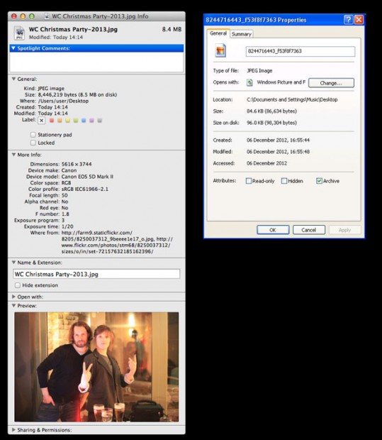
Alice: Each image or graphics file contains a lot of information about its size, although it’s hard to see how many dots per inch it contains without a programme like Photoshop. Luckily, you can make an educated guess. A high res picture will be two megabytes or more, so anything under that is a no no (unless it’s being printed very small). You can find out the file size info by right clicking on the image file and selecting ‘get info’ on a mac or ‘properties’ on a PC.
Rob: All this reminds me of that Father Ted episode when Ted tries to explain perspective to Dougal with plastic cows.
Alice: Indeed. Like the jet engine, resolution is quite hard to explain. But as long as you accept and stick to the rules you can just pretend to know about it.
Rob: OK, good. Before we recap in handy bullet point form, shall we go through the types of pictures and graphics Wired Canvas would like to receive?
Alice: Good idea.
Photographs
- Should be the original picture, taken on a good quality camera. If you don’t have the original pictures go back to the photographer who took them.
- Must be at least 2 megabytes, unless they are being printed small. You can find out how many megabytes the image is by right clicking on the image and selecting ‘get info’ (Mac) or 'properties' (PC).
- Should be JPG or TIFF images
Graphics (logos, tables, illustrations)
- Files must be Vector: EPS, PDF or AI
- Or, if you don't have the vector files, make sure the images are high resolution.
Rob: Shall we recap in handy bullet point form now?
Alice: Let’s:
- The right image resolution can mean the difference between a poster that looks professional and one that makes your company look like it’s hosting a church bazaar (in Ringwood).
- A computer image is made up of pixels, which are measured in inches.
- The more pixels per inch your pictures contain, the sharper they are going to appear when printed.
- Images on the internet are usually 72 dpi or dots (pixels) per inch.
- When you try to enlarge them in Photoshop those pixels don’t increase, they just spread out so the picture looks blurry.
- You can decrease picture size because the pixels are squishing down into their allocated inch.
- But you can’t increase a small res picture because the pixels just spread out in their larger inch.
- This is the same for logos and any other graphics.
- As artists we like to treat rules as we would the Tory party – with disdain. But rules are rules when it comes to resolution.
- Here’s that Father Ted clip again. (https://www.youtube.com/watch?v=dS12p0Zqlt0)
Rob: Is now the time to talk through effective resolution?
Alice: No.


