24th May 2013 by Alice Ralph
Welcome to part six of our Wired Canvas Discuss series, in which we sat down with journalist Amy Oliver and discussed different elements of marketing for the arts. In this discussion we introduce the idea of journey mapping within arts organisations. User Experience (UX) is often discussed within web companies but often largely overlooked in creative industries; we discuss how the journey mapping model can be applied to arts organisations who wish to increase visitor engagement and secure funding…
Rob: Y’know Alice, I’ve always thought that life was a journey, not a destination.
Alice: Actually, I think Ralph Waldo Emerson thought that, but go on.
Rob: …But now I know that if the journey to the destination is rubbish and a bit annoying then the experience is ruined.
Alice: Are you trying to say that arts organisations need to look into journey mapping to enhance their customer experience?
Rob: Indeed I am, Alice. Journey mapping looks at the way an organisation ‘touches’ their audience. For example, if someone picks up a flyer for an event and that flyer is badly designed and confusing, then it’s likely that person will not bother going to the event. By identifying this problem and making the flyer clearer, you will make it easier for your audience to engage.
Alice: Sounds interesting. What else can you apply journey mapping to?
Rob: From where pregnant women can park in the car park to how you’re using Twitter, anything can be journey mapped – it’s like wallpapering. It’s looking at all the points in your company where someone comes into contact with you.
Alice: Oh, OK. Why would you bother?
Rob: Because everything you do will be scrutinised, consciously or subconsciously, by your audience. Whether it’s an uncomfortable seat in your theatre or bad telephone manner from a member of staff – any negative experiences, however minor, will influence your audience’s overall impression of your organisation.
Alice: Shall we look at how organisations can do their own journey map using this rather natty template I made earlier?
Rob: Let’s…
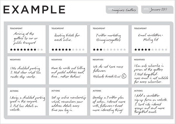
Alice: So, start by making a list of all of your touchpoints. (In case you missed the link above, we have made this free handy downloadable PDF to help you do this!) Your touchpoints are everything your audience will come into contact with when using your organisation. This can start before they’ve even walked through the door and continue after they’ve left.
Here are some examples of the sort of touchpoints an arts organisation might have:
Before
- Advertising (online and offline)
- Media coverage
- Email newsletter
- Website usability
- Word of mouth / reputation
- Social media interaction
- Booking tickets
- Personalisation
During
- Your location / Parking access
- Affordability & ticket price
- Membership schemes
- Disabled access / Baby buggy access
- Cloakroom
- Quality of venue eg. Cleaning, Toilets etc
- Staff manner
- Experience of the event / exhibition
- Signage
- Shop / Merchandise
- Cafe / Bar
After
- Collecting feedback
- Audience sharing their experience with your organisation on social networks or blogs
- Documentation of events
- Encouraging audience to revisit
Download a free Journey Mapping for Arts Organisations guide (PDF)
Alice: Above are some scenarios, which include arriving at a gallery by car or public transport (touchpoint) and finding there is no disabled parking and no clear bus routes (negatives). To overcome these problems assign a disabled parking bay and add a clear map of bus routes on your website (actions).
Rob: Journey mapping is an excellent way for identifying and ironing out the annoying problems that will affect your audience. But when you’re thinking of your own touchpoints you have to be honest.
Alice: Every company has flaws, but telling the boss his car park plan stinks is a bit risky in these stringent times. A good way to get around his wrath is to conduct an anonymous survey among staff and customers. Survey Monkey is an easy way to do this. Its basic model is also free to use.
Rob: Good.
Alice: Can journey mapping help with arts funding?
Rob: There’s no concrete evidence to suggest it does, but it seems common sense to think that if you make your audience user experience better then you’ll increase visitor numbers which in turn may secure or increase your funding.
Alice: Shall we recap in handy bullet point form?
Rob: Let’s:
- Use journey mapping to enhance your audience user experience
- Think about all the ‘touchpoints’ – the moments people come into contact with your organisation – that you could improve
- Identify the negatives associated with these touchpoints
- Take action!
- Be honest when it comes to identifying flaws within your organisation
- Use Survey Monkey to gather anonymous tips about customer experience from your staff and customers


