1st August 2016 by Rob Foddering
Having recently launched a new website for the international charity Worldwide Veterinary Service, we conducted some in-depth research into charity websites and found some effective features and best practices that we absolutely loved. We thought this insight would be really helpful for other charities, so we’ve pulled together some of our favourite examples of charity websites, and why we think they work well.
We’ve divided them into categories, and will be publishing a series of our favourite examples of great charity websites; animal charity websites, health charity websites, arts & community charity websites, human rights charity websites, homelessness & poverty charity websites, and children’s charity websites. You can subscribe to our newsletter here to keep up to date with the series.
This blog is focused on arts and community charity websites. This is quite a wide spectrum, but they often share common features; a need to recruit volunteers online, delivering visitor information, and presenting their collections or projects clearly. We have gathered a collection of great arts and community websites that provide excellent user experience and support the charities in achieving their goals.
Royal Academy
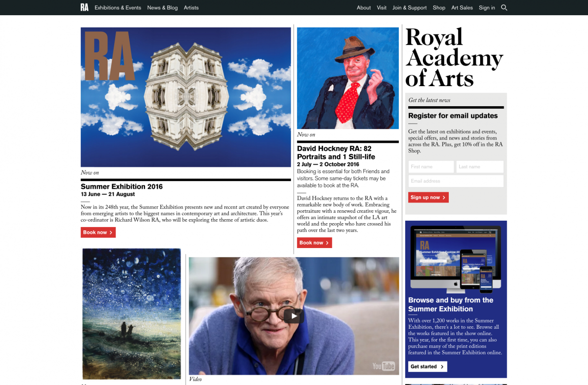
The Royal Academy support artists and the practice of art. They run a 3 year postgraduate course and exhibit art all year round. You can support their work here.
The Royal Academy brand follows an engaging editorial grid format. It feels like an online publication; it pulls in the reader and connects you with the content. It’s a clever strategy. They weave in editorial content (they publish RA Magazine content) amongst their events and exhibition content. This drives people around the site by providing engaging, targeted content alongside events listings.
Our favourite bits:
We love the cascading masonry-style design (ie. the way the images organise themselves into their relevant columns). This is a good way to keep the homepage feeling lively and current. It is also flexible, allowing the site to easily adapt to any screen-dimensions. The columns adapt accordingly to browser width; try resizing your browser size to see this in action!
There is a really well-designed mega menu (ie. the large drop-down section under each menu item). Mega menu’s can sometimes feel cluttered and overwhelming, but this is a really nice example of an intuitive and accessible menu design. It also works well on mobile devices.

Beyond the homepage, we love the full page images on each piece of individual content. It provides a great sense of atmosphere and immersion in the art itself. If you have a good image library, be sure to take full advantage of your content and modern browser technologies to deliver big, striking imagery.
One of our favourite little touches is how they have scattered in little quotes from artists in amongst the ‘current’ content. It provides a very immersive experience.
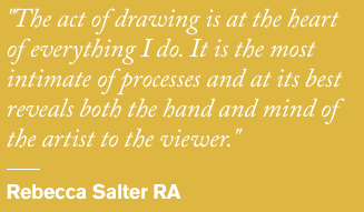
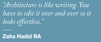
From a design perspective, there’s wonderful use of typography and grid layout on this website. We have a total design crush on this website! This is all part of the gorgeous brand identity designed by Pentagram, which has a distinctly editorial feel. Sometimes identities can be lost a little when used on websites (because of browser limitations), but this is a great example of how brand guidelines can be applied digitally.
The RA have an excellent mix of innovative content for the website. They don’t stick to blogs alone; they also have podcasts and videos, and commission opinion articles from experts. All of this content adds huge value to the website; it is all very ‘shareable’, which is great from an SEO (search engine optimisation) and inbound traffic perspective, and will help build a loyal visitor base. This is a great way for charities to build their network of supporters, and it doesn’t have to take a long time.
The RA have an excellent online shop that utilises Magento in a really innovative way. As we’ve mentioned in previous blogs, Magento is likely total overkill for 90% of online shops, but for the RA who offer thousands of works of art it is powerful solution.
Many arts organisations have ‘Friends’ or 'Supporters' programmes, and Friends of the RA is a great example of how to present and deliver this online. They clearly communicate the benefits, and have created video testimonials (note the text overlaid over the video; most social media platforms auto-play videos on ‘mute’, so always include subtitles on videos that you will share online). The RA also provide multiple ways to purchase, such as Renewal and Gift Options. They offer rewards for Friends such as Friends-only events and special competitions. These ‘VIP’ activities for Friends are a really powerful way to maintain long-term engagement and support.
Almeida Theatre
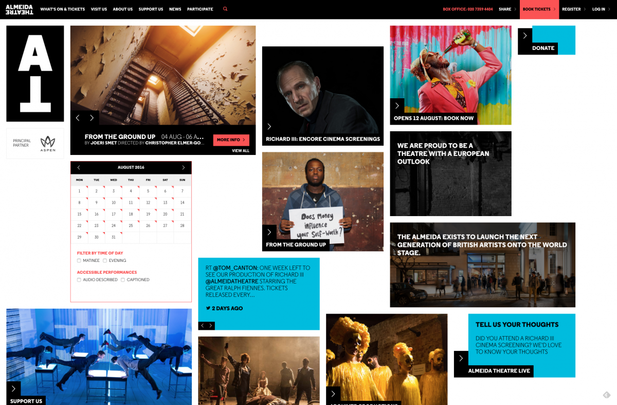
The Almeida Theatre is based in Islington and recently won London Theatre of the Year 2016 from The Stage. You can support their work here.
Our favourite bits:
Like the Royal Academy website, the Almeida Theatre also utilises a cascading masonry layout, which is very responsive to different devices. We really like how it also uses an unusual column structure, with varying sized blocks. It’s a lovely way to apply a unique visual style to the interface, without being overwhelming. We really like the subtle use of colour to highlight calls to action.
We loved seeing that post-Brexit they have responded on their website with a block on the homepage and a statement around the innate European nature of the theatre. We think it’s really important (and encouraging) to see cultural organisations taking a positive stand and speaking up. The Almeida have inspiring copywriting and content throughout their site.
The Almeida have in-depth information about accessibility, including whole pages dedicated to specific access needs such as Deaf & Hard of Hearing. If you are an organisation or venue that is accessed by the public, it is really important to include this information on your website. It’s simple to include and has a big impact for visitors with specific access requirements. Even if your venue/building isn’t accessible, make sure to include that information so that people are informed before they visit.
The Almeida have a great calendar feature, allowing visitors to browse events by date, or by accessibility. This is a neat and user-friendly approach.
Like the RA, the Almeida produce podcasts, which are innovative and engaging. Podcasts are extremely popular, and it’s great to have a different medium of communicating ideas and stories to the public and those in the industry.
Ways it could be even better:
Almeida have a Donation section and offer Membership options. However both of these sections could be improved by more effectively selling the benefits and checkout process. For example, the way that WVS clearly breakdown the value of donations, or the way that the Royal Academy sell their Membership options. It’s powerful seeing these options all laid out in one place (for comparison) and reinforced with testimonials, images and videos. We think this would have a large positive impact on the fundraising conversion rate for this excellent theatre.
National Trust
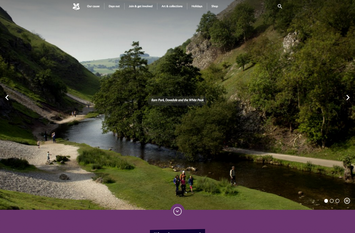
The National Trust look after more than 350 historical houses, gardens, woodlands and ancient monuments across England, Wales and Northern Ireland. They have more than 4.5 million members and 62,000 volunteers… now that is a membership and volunteer programme that every charity can aspire to! You can support their work here.
The National Trust are a very familiar and recognisable charity that most people will be very familiar with in the UK. Because they are so well-known, their website must balance the needs of a huge variety of visitors; from schoolchildren, to educators, to families, to elderly people, to volunteers and historians.
The National Trust website is vast. It is as much a tourism website (for the whole of the UK!) as it is a collection of venue listings. They have cleverly brought in all of their properties under one giant umbrella website, providing in-depth ‘microsites’ for each individual property. They’ve also created a huge bank of editorial content that targets keywords such as ‘dog friendly holiday cottages’ and ‘favourite pub walks’, which will have huge SEO value.
Whilst the National Trust website is so vast and varied that it would be unrealistic for smaller charities to copy them, we do think there are lots of things that smaller organisations can learn from how the National Trust present themselves digitally:
Our favourite bits:
The site ‘lazy loads’. Notice how individual elements of the page only load as you scroll down the page. This means that the page is quicker to load as it initially only shows the top part of the page, and loads the rest as you scroll. This is a clever way of handling pages with huge amounts of content or big images. It also puts less pressure on the server, because the site only delivers the elements that are viewed by the visitor, rather than the entire page.
Each individual property has its own page on the website with all of the visitor information that a visitor might require, such as opening hours, prices and directions. These are formatted in a way that is picked up by Google and displayed in the SERP (Search Engine Results Page), providing extremely good user experience. Each property listing also includes loads of additional information such as places nearby, volunteer opportunities and historical information. Combined, these provide a really valuable and comprehensive guide for visitors. Smaller charities with public-facing venues could learn a lot by studying how the National Trust have achieved this, because it is really is a great example of best practice in terms of content marketing.
The National Trust have over 62,000 volunteers. The volunteer section of their website clearly supports this; it really does provide everything you might want to know about volunteering, and is hugely informative… it made me want to volunteer! It really sells the personal benefits of volunteering, as well as the huge importance of supporting such a great cause. It is really engaging, inspiring and an outstanding example of how to recruit volunteers online.
East London Dance
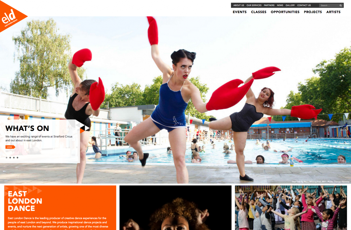
East London Dance produce creative dance experiences involving people of all ages. They put on a range of shows, immersive experiences, and classes. You can support their work here.
Their website immediately grabs your attention as it is full of big, bright images that make you just want to get involved and dance! They site is full of professional-quality photography, and really shows off the vibrant work that they do.
The East London Dance website is a wonderful example of an arts organisation that isn’t over-designed or over-complicated, but provides a great user experience and nice brand application.
Our favourite bits:
We love their excellent video and picture archive showing the diverse range of dances and ages that they cater to. For cultural organisations, it is really important to make full use of your picture archive with big, immersive imagery.
We really like how the brand has been applied around the website, repeating the little triangular elements in a subtle but effective way. Regular readers of our blog will remember that we love triangles! We like how ELD have used the triangles as navigational devices, to push people back up the page or as design elements to guide people’s attention around
 the site.
We particularly like the ‘sticky menu’ that follows you as you scroll down the page. This is an effective approach that works well on mobile as well as desktop.
The site is built in Wordpress (one of our favourites!) Wordpress is a really powerful and extremely popular open-source CMS. This is a lovely example of the flexibility of Wordpress and how it can be used for arts organisations.
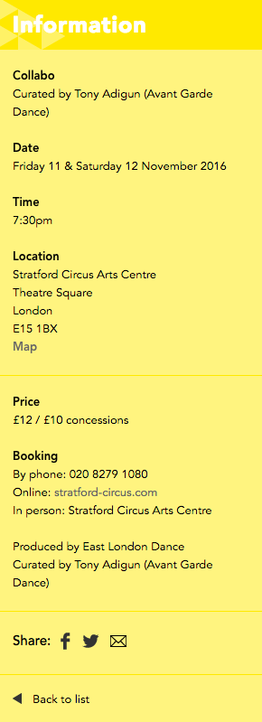
- We like the way that they have pulled out the meta information (dates, times, locations, price, booking etc) into separately designed boxes that draw your attention to the essential info. It makes it very clear and digestible ‘at a glance’.
Ways it could be even better:
- East London Dance have the ability to make donations online, but it is unfortunately rather buried and tricky to find. In the current economic climate, many arts organisations are becoming more reliant on public donations. As with the Almeida Theatre, we’d love to see ELD turn their Support section into a really engaging platform.
Dulwich Picture Gallery
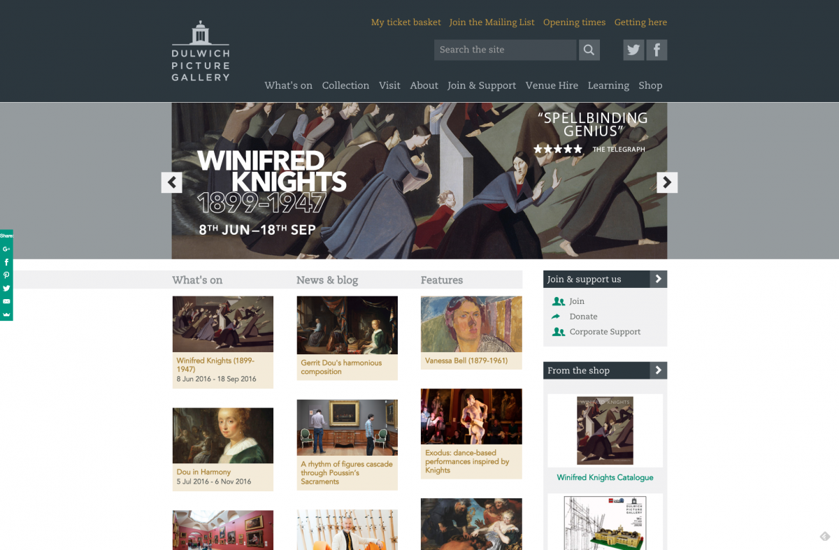
Dulwich Picture Gallery is the world’s first purpose-built public art gallery, founded in 1811. The gallery now hosts leading exhibitions alongside a permanent collection of Baroque masterpieces. You can support their work here.
We included the Dulwich Picture Gallery’s website as it is a very nice example of a more traditional web layout that works really well for their target audience. The site has a more ‘classic’ design than some of the others we’ve featured, but has some really contemporary features and impressive technology once you scratch the surface. We like that the mobile version of the site is clearly targeted towards museum visitors whilst the desktop version is more suited to researchers, supporters and academics. A lot of thought has clearly gone into this, and it makes for an excellent user experience.
The site utilises a great mega menu, pulling in the latest exhibition information. It also works excellently on mobile; it drops down into a hamburger menu, but keeps essential visitor information in the header for quick access whilst you are out and about. In fact, the whole site works really nicely on mobiles and tablets - and essential consideration for venues that are open to the public, as visitors will often be looking up visiting information whilst on the go.
The gallery has an excellent online search tool, allowing you to browse artwork in their collection, using filters to see which paintings they have on display. It’s a nice way to help people plan their visit, but also demonstrates the huge breadth of the gallery’s impressive collection.

The site has some excellent content. We really like the top 6 things to see, and the targeted itineraries such as Family Day Out and The History Buff. These round-ups are very effective and simple to execute. The guides cleverly encourage visitors to take photos with the paintings and tweet them to the Gallery, promoting online discussion and social media reach.
The online collections have excellent media integration. The individual pieces have an online tool that allows you to explore the painting in great detail, as well as online audio guides (SoundCloud) and the option to buy a print of the paintings. The audio guides are a particularly effective; it’s an accessible and highly informative piece of content that adds huge value to the page, and would be an affordable piece of content for smaller organisations to execute.
Canal & River Trust
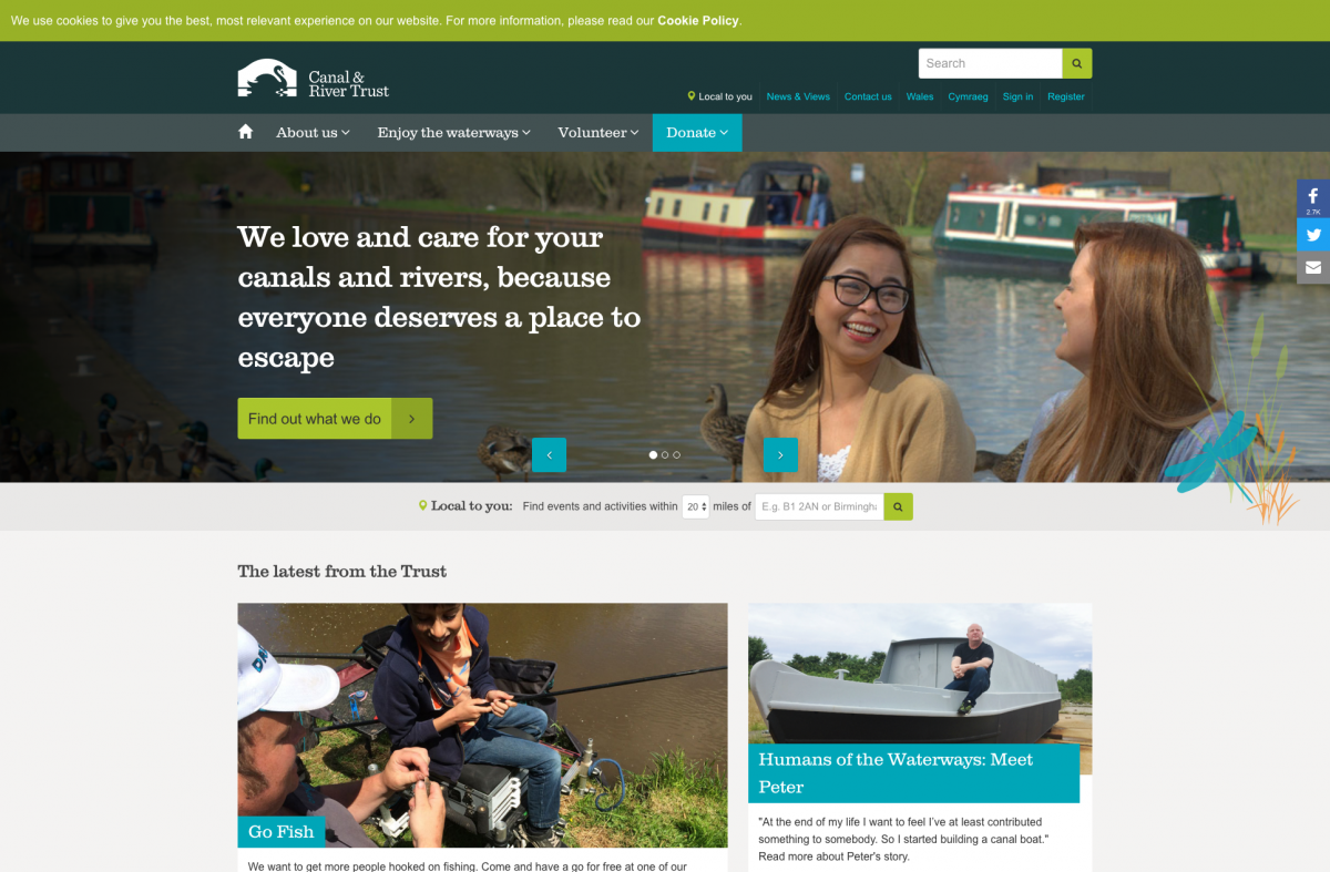
Did you know that the Canal & River Trust are responsible for maintaining all of the canals and waterways in England and Wales? Many people don’t realise that canals are maintained by volunteers and donations; so it is great to see the Canal & River Trust investing in such a clear, helpful and informative website, which in kind will result in more donations and support for the charity. You can support their work here.
Everything about this site reminds you of sitting near the canal and relaxing. The Canal & River Trust have a wonderful brand and it is applied nicely to their website; striking a great balance between usability and brand identity.
We debated over whether to include the Canal & River Trust in this blog, since they are not strictly an arts or culture organisation. However we felt that they were a great example of a charity reliant on volunteers and community engagement, and there’s lots that other smaller charities could learn from them.
Our favourite bits:
Very clear ‘call to action’ buttons and navigation. There are some lovely little ‘hover’ actions (try hovering over the boxes on the homepage to see this in action)! This might seem like a small point but cumulatively these little transitions go a long way to providing a clean and intuitive user experience.
We love the ‘Local to You’ feature, allowing visitors to easily find events and activities in their area. This is a great resource for canal-boat owners in particular, who might be travelling along the waterways and wanting to explore new and unfamiliar parts of the canal network.
We love how the site has clear resources and sections for all different types of canal-users; whether you are an angler, a canal-boat owner, a local authority, a walker/hiker or simply a tourist, there are sections of the site and valuable resources for everybody. Separating your content out by ‘personas’ is a great way to deliver targeted content.
Beautiful imagery and use of photography throughout the site, with big images and header images. They are taking full advantage of this great image archive!
- We love the Humans Of The Waterways feature. What a lovely way to communicate the importance of canals in people’s lives! Canals could easily be dismissed as another boring part of ‘infrastructure’, when clearly they are important to people’s lives and wellbeing. If your charity works in a subject that could be considered dull, it is really effective to tell the human stories around your issue. How does it impact real people? Build advocacy and communicate the emotional story.
The language switcher at the top between English and Welsh is really user friendly - and we particularly like that you are greeted with a photo of the Pontcysyllte Aqueduct on the Welsh page (Alice once nearly had a panic attack at the top of this… don’t try crossing it in a canal boat if you suffer from vertigo!)
The floating social share buttons are very easy to find without being obtrusive or getting in the way.
Some lovely subtle brand application through the use of custom iconography and illustrations.

Some ways it could be even better:
We think that the ‘Explorers’ kids section is a great idea and full of excellent educational content. It’s a shame however that is isn’t responsive for mobile and tablet devices, and the tools/games/resources could be integrated more around the whole website.
We hope you enjoyed part three of our series on charity website design, with this week’s focus on arts and community charity websites. You’ll have noticed a huge variety of websites this week (isn’t it great that arts and culture in the UK are so varied!) but here are some common themes running through all of the sites:
Excellent content marketing. All of these sites featured innovative ways of presenting content, whether it was podcasts, stories, editorial or audio guides. The content on all of these websites really captured the creativity and vibrancy of the organisations, as well as communicating the huge value they bring to local communities. It is also extremely ‘shareable’ on social media, bringing a wider audience to the website.
In-depth and comprehensive visitor and access information. Most of these sites have venues or spaces that are open to the public, and all of them provided extensive information for visitors, such as opening hours, access details and travel information. They also made it easy for people to book tickets online (smaller organisations can still achieve this quickly and easily by using third party tools such as Eventbrite). This is rewarded by Google who will rank you higher if you provide in-depth information; but more importantly will result in more visitors. Many of these sites had also considered how desktop visitors needs will vary from mobile visitors.
Targeted information for different user groups. Most of these arts and community charity websites had separate pages for families, school groups, academics and artists. These landing pages had very targeted information with specific results for those audiences.
In our next blog, we’ll be covering some of our favourite children’s charity websites. Sign up to our newsletter, or social media here, and we’ll let you know when it’s live!
Icons in background top image created by Sergey Demushkin.


