
3rd August 2016 by Alice Ralph

Having recently launched a new website for the international charity Worldwide Veterinary Service, we conducted some in-depth research into charity websites and found some effective features and best practices that we absolutely loved. We thought this insight would be really helpful for other charities, so we’ve pulled together some of our favourite examples of charity websites, and why we think they work well.
We’ve divided them into categories, and will be publishing a series of our favourite examples of great charity websites; animal charity websites, health charity websites, arts & community charity websites, children’s charity websites, human rights charity websites and homelessness & poverty charity websites. You can subscribe to our newsletter here to keep up to date with the series.
This blog is focussed on children’s charities who may need to balance the needs of fundraising and donations with providing a large amount of resources and information for parents and children. We found 4 sites that were able to do this effectively, and provide excellent user experience.
NSPCC
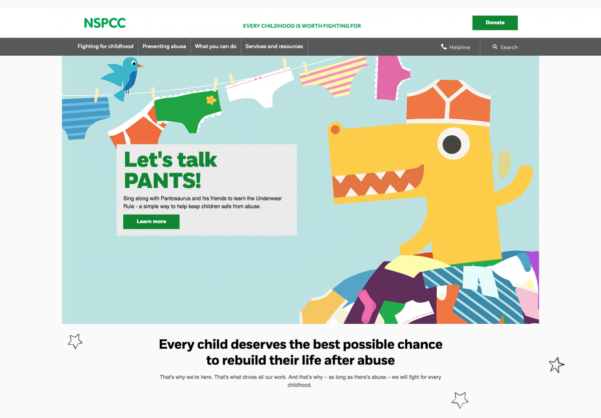
The NSPCC are a charity dedicated to ending child abuse, providing support for those who have been abused, advice for parents and working on campaigns. You can support their work here.
The NSPCC is a great example of a well-designed responsive website. It is clearly designed to work well on mobile devices, with the Helpline/Childline details up-front and a big Donate widget. What we particularly like about the NSPCC website is that it is much more than a ‘charity website’. It is also a huge online tool for parents, children and young people, with vast resources sections and digital guides. We found that it is is exceptionally clear, accessible and easy to find detailed information/advice on a wide variety of topics.
It’s also important that organisations working with young people adapt to changes in social media and the internet. It’s great to see NSPCC have kept up to date; they already have a page about how to keep your children safe while they are playing Pokemon Go (very topical!) currently displayed on the homepage, and whole sections dedicated to general internet and social media safety.
Our favourite bits:
Really informative layout with loads of resources especially for parents on a range of topics including how to stop abuse by helping children to identify when it is happening and how to talk to your children about sexting. The content is very accessible and easy to read.
The NSPCC website is highly targeted for SEO and provides some great examples of optimised content. For example, NSPCC rank #1 for the search term “child neglect”, which delivers you to a highly targeted page around the topic including helplines, definitions, stories and ways to tackle neglect. This is a valuable resource for visitors; adding this level of detail is a great way to guarantee top results in Google, and provide high quality content to visitors.
Lots of really nice imagery, and use of illustrated elements when tackling heavier subject matter. The illustrations and subtle brand application are really effective.
- The Donate button and Helpline (Childline) buttons are extremely clear on all devices, including mobile phones.
Children In Need
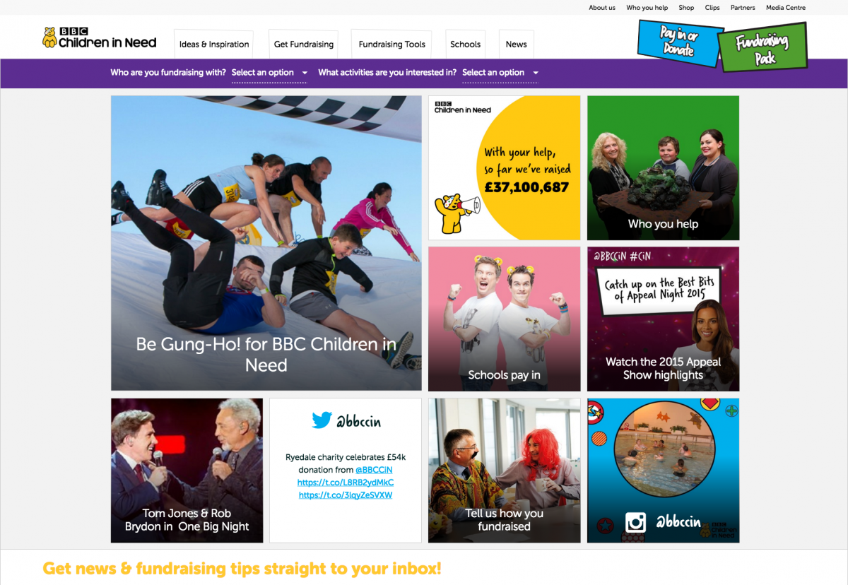
Children in Need helps disadvantaged children in the UK through a range of services such as providing care and support for children who are unwell or disabled, after-school clubs, youth clubs, and grants for similar organisations. They famously hold an annual appeal on the BBC every November to raise a large amount of their funds, as well as fundraising all year round. You can support their work here.
The Children In Need site is visited by thousands of parents and children every year. For many schoolchildren it is a highlight of the annual calendar, and as you might expect, the website looks like a fun fundraising event in itself. It really manages to capture the liveliness and spirit of the television event.
Our favourite bits:
Children In Need have quite an unusual but effective format on the homepage; the squares on the homepage are neat, clear and appealing. This structure gives them a lot more flexibility, and allows the site to change throughout the year, with a bigger emphasis on fundraising preparation during the build up to Children in Need’s annual event, and then a bigger emphasis on paying in your donations afterwards.
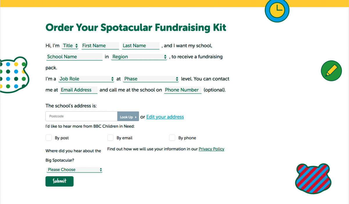
We love the dropdown filters on the homepage, which make it very easy for you to find what you are looking for:

There’s a really nice use of social media integration. Because Children In Need is such a big, shared national event, it has huge social media activity around it - and the site harnesses this in a really nice way. This would work well for any charities who have big social media followings, or who want to build hype around a big fundraising event.
They have some really clever and innovative ways of presenting information in a way that feels very child-friendly but still reliable. For example, this form (which could easily be quite boring!) is actually quite fun and interactive, which will in turn encourage applicants:
Some ways it could be even better:
- They have absolutely tons of resources for people to download and print, such as forms and posters. It is a little bit overwhelming trying to scan this. Perhaps some filterable options, similar to that used by Amnesty or ActionAid would be a neat solution to this.
Rainbow Trust
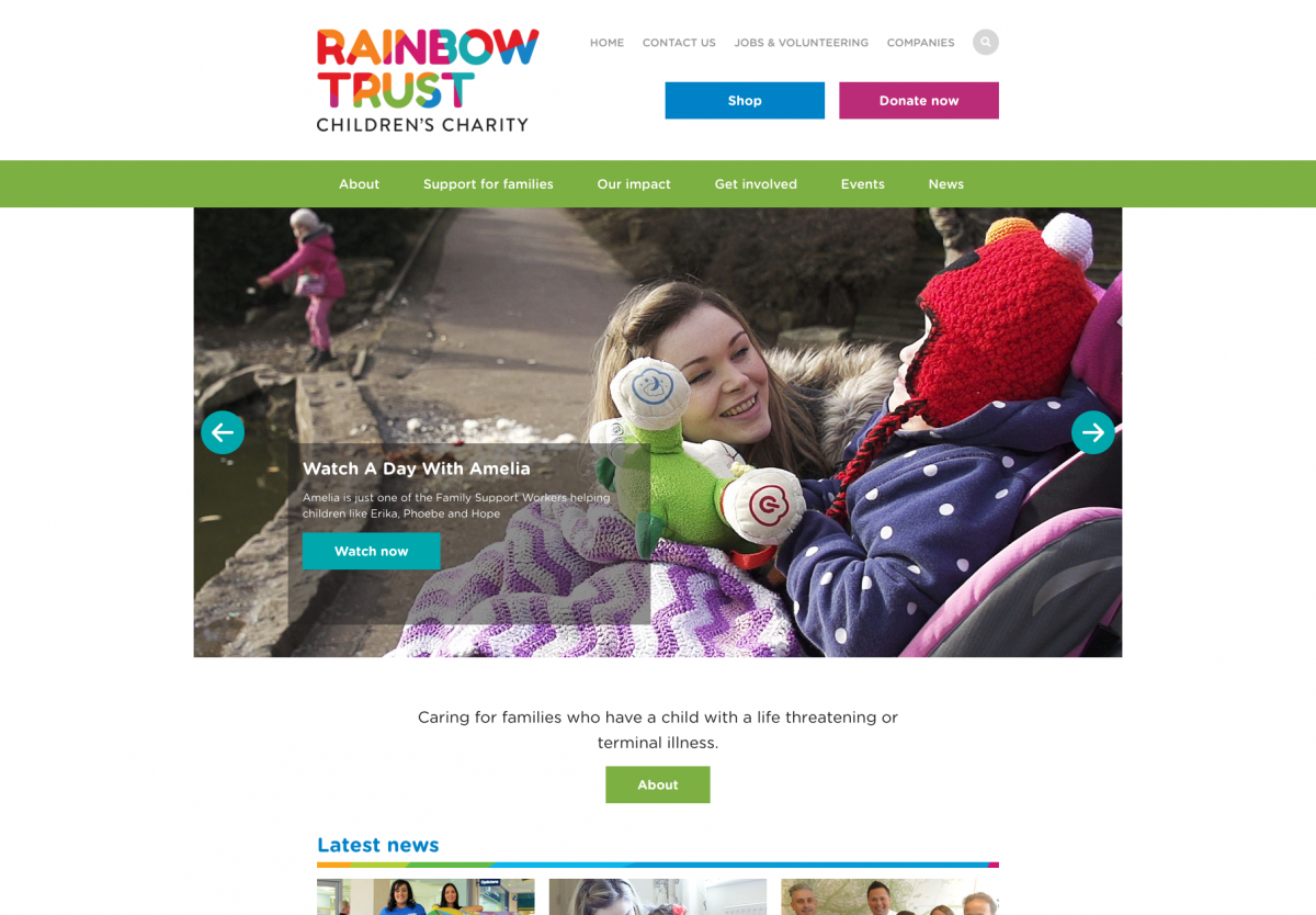
Rainbow Trust helps children with life-threatening or terminal illnesses. They provide a range of services including support workers and bereavement support for families. You can support their work here.
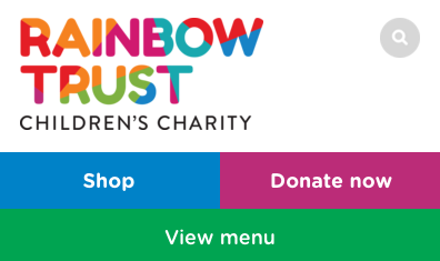
The Rainbow Trust site is a great example of good brand application. Their rainbow brand is applied throughout the site, but not so much that it interferes with the usability of the site, or that it distracts from the work they are doing. The key calls to action in the menu (‘Shop’ and ‘Donate’) are always prominent, even on mobile devices.
Our favourite bits:
We like how all of the support sections include ‘real life’ stories of families who have been through the same thing, making it personal and showing how they can support you or your family. The Family Stories section must be reassuring for other families to know that they are not alone.
We love the 1001 Small Things 2014/15 annual report. This is a really effective microsite that doubles as an annual report. It works particularly well on mobile and tablet devices, and the content is really engaging and pleasurable to read. It is also extremely ‘shareable’, making it ideal for social media. Microsites such as this need not be expensive or difficult to produce, and can be a cheaper (and more widely read) alternative to printed hard copy annual reports.
Like the NSPCC, the Rainbow Trust have also developed extensive practical resources for families who may have a sick child, such as financial support, how to have difficult conversations, or how to help siblings cope. Again, these all include extensive quotes from other families or from specialists, which adds an accessible and reassuring touch.
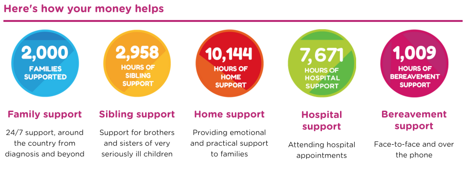
- We love the colourful infographics with detailed numbers of how your donations help. These are displayed on the Donate page, but also scattered around the website. This is a really eye-catching and effective way of visually communicating the importance of donations.
The glossary of terms is a nice touch. Similar to Breast Cancer Now’s ‘Breast Cancer Glossary’, the Rainbow Trust don’t assume that everyone knows all the medical terms that doctors will be using with them. This is a really valuable piece of content for visitors, which would be simple for other smaller charities to replicate in their own fields.
- Bright, positive images all over their site. The Rainbow Trust deals with a very difficult and emotive subject matter, but their website still has a hopeful and supportive feel to it.
Smile Train
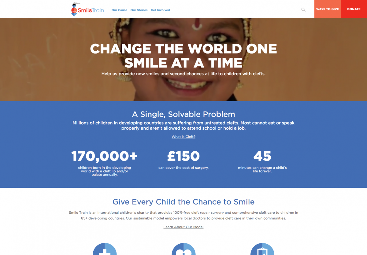
Smile Train raise money to perform surgery on children in developing countries to rectify cleft palates, which can cause problems with speaking, breathing and eating. It costs just £150 to perform life-changing cleft surgery. You can support their work here.
Smile Train is another site full of bright, inspiring images which demonstrate clearly the work they do. The site is full of testimonials and ‘real life’ stories. Telling the human story of the charity’s impact is a very powerful way of generating support from donors, funders and partners.
The website is very clear; straight away on the home page you are greeted with an explanation of their cause as well as their solution (“A single, solvable problem”). For charities who are dealing with a very specific issue, this is a really nice example of how to present your mission statement up-front.
Our favourite bits:
Smile Train have tons of examples of success stories scattered throughout their website, which clearly demonstrate the value of their charity - and the impact that donations will have. We really like how, as well as Patients, they also have stories from their Partners, Fundraisers, Donors and Staff. This gives a really comprehensive view of the charity from every viewpoint, and also provides plenty of great content to share on their social networks.
We like how the donate button is always visible, and is highlighted in red to draw attention to it. The site uses a ‘sticky menu’ which follows you as you scroll down the page. This is a really effective way of keeping your key ‘calls to action’ visible at all times without repeating yourself unnecessarily.
- We really love the animated stats on the homepage. They grab your eye immediately, and highlight the key stats (how many children are born with clefts and how little the surgery costs). This simple animation is a subtle yet compelling way of drawing people’s attention to the figures.
Great visual breakdown of their model focused on training local doctors to be able to perform the surgery these children need.
We really like the video background on the homepage. This is a nice alternative to your usual carousel-style slideshow, which are often bad for user experience. Note how the text overlaid on the Smile Train homepage video is constant and unchanging, so the user has plenty of time to read and engage with it. The video background behind it however tells a thousand words. The video is also not ‘narrative’, meaning that it can loop forever and still be understandable to the user. It also doesn’t require audio for the viewer to get the full impact.
Very clear calendar about how you can get involved in fundraising races and ‘turn miles into smiles’.
- The site is running on Drupal - one of our favourite content management systems! Drupal is ideally suited to a complex site such as this, which is handling multiple content types and displaying them in lots of different ways.
So that’s the end of part four of our series on charity websites, this time focussing on children’s charity websites. A few things that were recurring in the sites were:
Very in-depth useful resources for families and parents, important for assisting adults who may not know how to handle difficult topics with their children. Many of the sites also provided child-friendly guides.
Bright colours and high quality imagery, inspiring positivity through hard times. None of the sites were patronising or talked-down to their visitors; instead they all felt supportive and engaging.
Personal stories from children or families who have benefited from the charity’s support, connecting you in a very personal way. When it wasn’t appropriate to provide details (such as in the case of the NSPCC), they instead changed people’s names and used branded illustrations instead of photography.
In our next blog we’ll be discussing our favourite poverty and homelessness charity websites. Follow us on social media here, and we’ll let you know when it’s live!