
18th July 2016 by Alice Ralph

Having recently launched a new website for the international charity Worldwide Veterinary Service, we conducted some in-depth research into charity websites and found some effective features and best practices that we absolutely loved. We thought this insight would be really helpful for other charities, so we’ve pulled together some of our favourite examples of charity websites, and why we think they work well.
We’ve divided them into categories, and will be publishing a series of our favourite examples of great charity websites; animal charity websites, health charity websites, arts & culture charity websites, human rights charity websites, homelessness & poverty charity websites, and children’s charity websites. You can subscribe to our newsletter here to keep up to date with the series.
This blog is focused on health charity websites. A lot of health charities need to cater to the requirements of very different users on their website. For example, a fundraising marathon runner will have very different reasons for visiting a health charity website compared to somebody who was recently diagnosed with cancer. This is a common communications and marketing problem amongst charities or organisations who might be trying to balance the needs of their service users alongside their donors/fundraisers. The sites we have written about were able to do this effectively and innovatively. Check out some of our favourite health charity websites, and find out what we like about them...
Breast Cancer Now
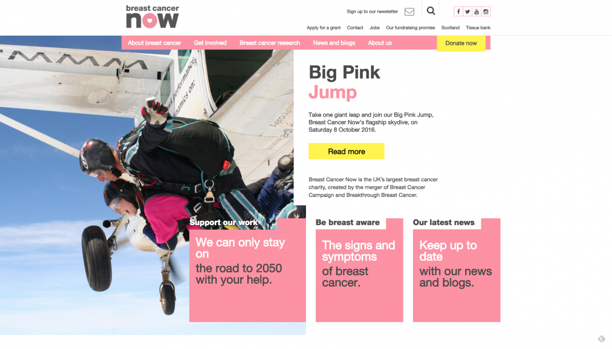
Breast Cancer Now is the UK’s largest breast cancer charity. Their aim is to stop all breast cancer-related deaths by 2050. They run the UK’s first ever breast cancer tissue bank, providing both cancerous and noncancerous breast tissue for researchers to study and analyse. You can support their work here.
The Breast Cancer Now website utilises an unconventional format, with a clever grid layout and lots of strong typography. The branding is bold and iconic but not overpowering. We particularly love their use of illustration and graphics. Many charities struggle to find good imagery (especially for sensitive topics such as health issues, where it would be inappropriate to use photos of real patients), and resort to cheesy ‘stock images’. Breast Cancer Now have an excellent solution to this, with strong branded graphics that complement their brand. If you are stuck for photography, working with a graphic designer or illustrator who can develop graphics to communicate your message is a great solution!
Our favourite bits:
The site is very easy to read with big clear writing and a donation button in a different colour, so it stands out.
There’s a good balance of what they do and useful resources, with their fundraising campaigns.
There are a lot of pages dedicated to the research they are doing, so you can read about the scientific ways they are trying to stop cancer. It is written in a way that you don’t need to have a lot of medical knowledge to understand, so it is not daunting or confusing.
It also breaks down all the treatment options and uses honest language to explain the processes, also giving definitions to more medical terms and not assuming everyone knows what certain things are e.g. prostheses and radiation.
Very informative in terms of information on how to reduce your risk of breast cancer and what symptoms to look out for - clear diagrams accompanying this, and a video showing female breast examinations to explain how to do it. This comes in contrast to the campaign shown here, where a man was used for an examination, to stop the video being banned from social media. As noted in the article, ‘It’s disheartening that, even when showing a woman’s breast for health reasons, people fear the importance will be taken away due to sexualisation.’
- Breast Cancer Now rightfully point out that a small percentage of men do get breast cancer too and there is a very thorough section dedicated to this on the site. It's good to see charity websites providing resources for all audience demographics.
Macmillan
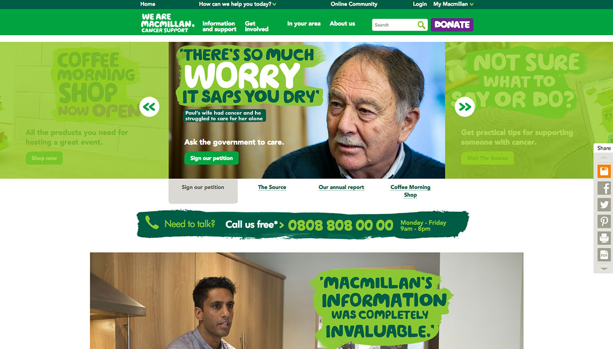
Macmillan provides support to people suffering from a range of cancers, through helplines, support groups, and Macmillan nurses. They also campaign to influence government policy to make sure the needs of people affected by cancer are represented in parliament. You can support their work here.
Macmillan has colour coded routes on their homepage, which is a really nice solution to the different reasons people will have for visiting the site, with information and support still taking priority.
Our favourite bits:
Love the Donate page and it’s easy to use walk-through process. It makes it very simple to see how your donation will benefit the charity. This is a particularly good example of an online donation form.
We love the use of imagery and excellent tone of voice throughout the site. It feels upbeat, empowering, supportive and informative. When they are tackling such an emotive subject as cancer, it is good to see them focusing on the positive impact of their work.
The use of location sharing and postcode search within the In Your Area section, which provides visitors with highly targeted information within their area.
Excellent fundraising resources section which gives loads of fundraising support and online guides.There is a very large and powerful online community, which is clearly popular and I imagine provides an extremely valuable support network for people living with cancer, or those who have loved ones diagnosed with cancer.
We like how it loads a different mobile version of the site for mobiles. The mobile homepage immediately asks you “How can we help you today?” and directs you to the appropriate part of the site. Normally (for smaller sites) we would recommend having a single, responsive website. However, in this case, it is a nice way of distilling a huge complex website and improving the user experience on mobile devices.
Some ways it could be even better:
- The Macmillan website can, in places, be an example of ‘information overload’ or ‘too many options’. If you land on an internal page there are sometimes 4 or 5 menus just within the header alone, each with loads of drop-downs. A clearer navigational system and fewer (but clearer) calls to action would help a lot with this.
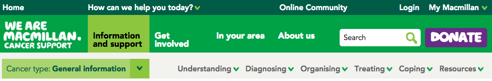
Where do I click?!
Marie Curie
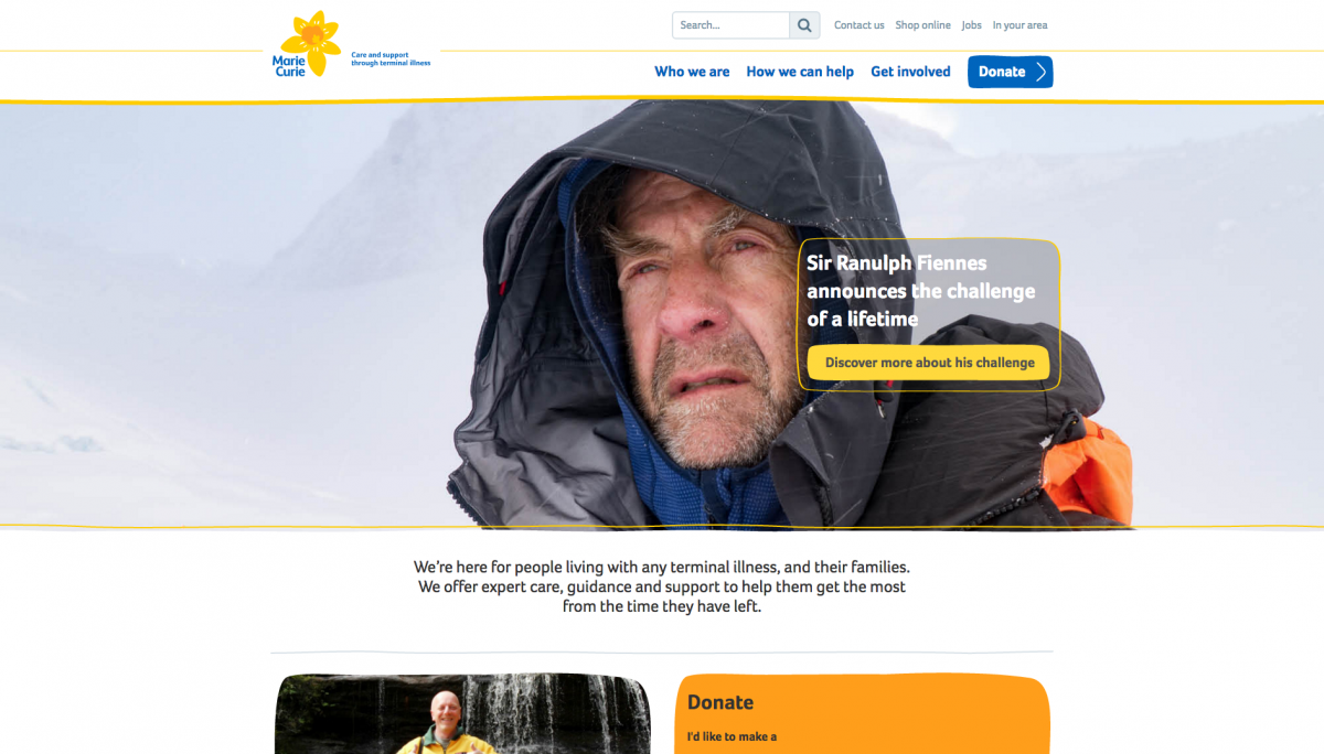
Marie Curie provide care and support for people living with any terminal illness, and their families. One of the most familiar charities in the UK, Marie Curie have been carrying out this vital work for over 65 years. You can support their work here.
The Marie Curie site is another nice great example of applying your branding and visual identity in a way that is very recognisable, but not overwhelming. The site still has a very simple user experience and clear layout, but is still unmistakably ‘Marie Curie’; even their cookies information box is styled to match their brand! Like many other sites on this list, they have opted for a very simple navigation with just 3 key headers (Who we are, How we can help, and Get involved), which each take you to specific landing pages that make it very simple to find what you are looking for. It’s a lovely simple (yet informative) website that works extremely well for their demographic.
Our favourite bits:
The How we can help section is particularly user-friendly with really prominent ways to contact Marie Curie for support, including online chat and opening times. This is an excellent example of how to present contact information if you are a charity who provides advice and support directly to your users.
They have a lovely online shop powered by open source e-commerce system nopCommerce. There are lots of good online options for integrating an online shop. We would particularly recommend Shopify, which is one of our favourites, but there are lots of e-commerce options out there to suit your charity's specific requirements.
The website is really focused on telling individual’s stories, so you can get an insight into the stories behind the medical staff and people who have been supported by Marie Curie. We’d imagine this is a huge comfort for people dealing with terminal illnesses, as it shows that they are not alone.
We love the brand application around the site. There are little illustrative elements and decorations which have been applied really nicely and provide a subtle but consistent user experience, whilst also building brand recognition.
Sightsavers
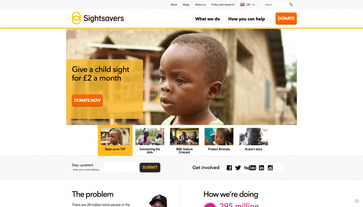
Sightsavers help visually impaired people all over the world with sight examinations, access to treatment, supporting equality in education and the workplace, and working to tackle the problems that cause blindness, such as lack of access to clean water. You can support their work here.
As you might expect from a charity working with visually impaired people, their website has excellent accessibility standards and is a great example of good online accessibility practice.
The site is running on Wordpress, and while we can’t speak for the developers or the back-end, this site does seem to really push the boundaries of the Wordpress core and likely has a lot of custom development and content types. This website would likely lend itself perfectly to Drupal, which would provide a lot more flexibility and ease of development ‘out of the box’ than Wordpress does. Having said that, this is a very impressive use of Wordpress, so hats off to their development team!
Our favourite bits:
We love the simple menu and how it’s broken into just two sections: “What we do” and “How you can help”. This makes the routes into the site very targeted and creates a powerful user journey.
Compliant with WCAG 2.0 ‘A’ accessibility guidelines.
Strong imagery and presents the issues that they are tackling in an understandable and accessible manner.
There are separate sites for each of the countries that they work in, with an easy drop-down to switch between them. This is a neat way of presenting a language switcher, as well as keeping content targeted to different regions, and ideal for larger international charities.
The stats are very powerful and visual, and communicate the charity’s huge impact clearly.
The personal stories section is excellent; visitors always respond strongly to stories that they can relate to and empathise with.
Big clear donate button is in the corner on every page of the site, including on mobile.
Looks like Sightsavers are using SMXi which has a great CRM that can integrate directly with your website - ideal for charities and membership organisations who are receiving donations online.
Sightsavers spend 91.8p per pound on their vital work. Research published recently has shown that the public’s trust in charities has decreased in light of recent news stories (eg. the recent Kids Company headlines), and one of the main reasons cited was transparency around charitable spending. Being this upfront and open about your income and expenditure is a great way to build trust amongst your audience.
Mind
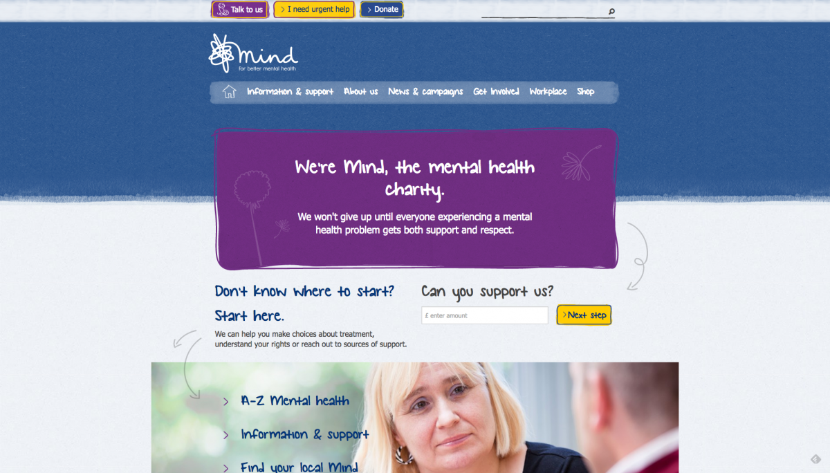
Mind are a mental health charity offering advice and support for anyone experiencing a mental health problem. They campaign to improve access to mental health services and remove stigma in society surrounding mental health. You can support their work here.
Any client that we have worked with will know that we talk a lot about defining your purpose and goals for a website. It is important to understand a user’s priorities and design with the hierarchy of those goals in mind. What we love about the Mind website is that it is really focussed on a user’s priorities and goals. Immediately up-front are clear buttons ‘Talk to us’ and ‘I need urgent help’, with clear arrows pointing out ‘where to start’. The site is very much about advice and support, with other aspects (such as fundraising, news and membership) easy to find, but ultimately secondary options. Mind clearly acknowledge that their core purpose is to cater for those who may be struggling with mental health issues and in need of immediate help. It is an excellent example of a website working for users, rather than simply for the charity’s goals (such as fundraising).
Our favourite bits:
As we mentioned, we love the ‘Talk to us’, ‘I need urgent help’ and ‘Donate’ buttons at the top of the page. They are very clear 'calls to action' and do not disappear into the menu when viewed on mobile devices.

The ‘Your Stories’ section of the site is a great idea; anyone can submit a blog related to mental health or about the charity, and there is a long list of topics you can filter articles by to find exactly what topic you would like to read about. This is a lovely way of building engagement with visitors and giving a voice to people who aren’t always listened to.
Mind have some lovely digital campaigns. One of our favourites is the campaign allowing users to submit a postcard of a place that makes them feel good. It is a great way to collect user-generated content for the website.
The A - Z of Mental Health has a huge list of useful resources on a range of topics from antidepressants to money management. This ‘A-Z’ format is a very user-friendly and accessible way of presenting a lot of information.
We really like the arrows on the homepage which direct you to the most important parts of the page - a really nice little design touch!
As well as supporting people struggling with mental health, Mind also provide training and support for workplaces, schools and employers. Their online shop features loads of really nice branded publications (we love their branded illustrations!)
Mind have an entire page about how they spend their money. As we mentioned in our previous charity blog, research shows that the general public’s trust in charities is currently at a record low, with transparency around charity spending cited as one of the key reasons. It’s great to see Mind tackling this up-front with a very detailed and reassuring page.
We also love the downloadable strategy of their plan for the next five years. Mind are very up-front about their long-term goals and mission statement. Being clear about your company’s long-term goals is known to be a huge factor with long-term donors, supporters, and legacy givers.
And that concludes the end of part two of our series on charity website design, this time focussing on health charity websites. Some of the common elements that were present in all of the websites that we thought were particularly successful were:
Clear routes to the donation section of the website. The ‘donate’ button was clearly displayed (usually top right) on every page throughout each site.
Very clear and informative ‘help and support’ sections. Many health charity websites are intended to be accessed by those struggling with health issues, or by their loved ones. Many of them had very welcoming and helpful sections, with dedicated helplines, online live chats and community forums. This is a valuable source of comfort and guidance for people struggling with health concerns, and all of these websites are good examples of how to do this successfully.
Excellent web accessibility standards. Obviously, this is essential for a website such as Sightsavers, which supports people with visual impairments. But it is equally essential for all health charity websites, which are more likely to be visited by older people or those with disabilities and/or poor health. It is important to remember that many people may visit health charity websites from places such as hospitals or care homes, or in emergency situations; so it is vital that health charity websites are fully accessible on mobile and tablet devices.
Very simple user journeys into the websites. Often these websites had just 2 or 3 ‘top level’ menu items, making it very easy for visitors to quickly find what they are looking for.
In our next blog, we’ll be discussing our favourite arts and culture charity websites. Sign up to our newsletter, or social media here, and we’ll let you know when it’s live!
Icons in background top image created by romzicon.