
6th July 2016 by Rob Foddering

Having recently launched a new website for the international charity Worldwide Veterinary Service, we conducted some in-depth research into charity websites and found some effective features and best practices that we absolutely loved. We thought this insight would be really helpful for other charities, so we’ve pulled together some of our favourite examples of charity websites, and why we think they work well.
We’ve divided them into categories, and will be publishing a series of our favourite examples of great charity websites; animal charity websites, health charity websites, arts & community charity websites, human rights charity websites, homelessness & poverty charity websites, and children’s charity websites. You can subscribe to our newsletter here to keep up to date with the series.
It made sense to start with animal charity websites, considering our recent work for the Worldwide Veterinary Service. Animal charities face criticism from the press about the amount of donations they receive, but evidence suggests that they only receive 7% of all charitable donations. As well as providing essential support for animals and wildlife, many of them also provide valuable online resources and guides for animal lovers and pet-owners. Check out some of our favourite animal charity websites, and find out what we like about them…
RSPB
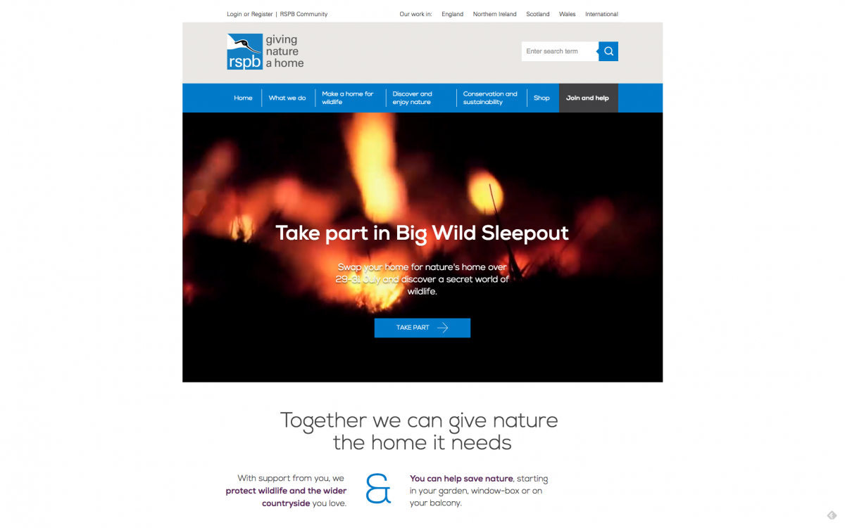
RSPB (Royal Society for the Protection of Birds) is ‘the country’s largest conservation charity’ focused on protecting birds and the environment. You can support their work here.
This site makes excellent use of video backgrounds and big imagery. The RSPB have a wonderful image archive, as you’d expect, and the website takes full advantage of this. There is a lot of complexity buried ‘beneath the surface’, with a number of custom features and online tools. Including all of these features in your navigation, whilst also keeping a simple user journey, can be a difficult balancing act. We think the RSPB have managed this really well, and have created an enjoyable online experience.
Our favourite bits:
There are some nice online tools, guides and features, such as the Bird Identifier, Garden Activities and the Bird Guide. Tools like this will be very popular amongst their target audience, and this is a great way of building enthusiasm for their subject, encouraging donations/actions, and bringing repeat visitors to the website. It’s also great for SEO!
RSPB membership is at the core of their fundraising, and the joining process is excellent. This is a wonderful example of how to on-board supporters, even managing to seamlessly integrate some trickier features such as buying membership as a gift, or using promo codes.
The website presents the benefits to visitors first, focusing on their membership options, events and allowing users to browse by their location.
They have an integrated online shop powered by Magento, which is an excellent ecommerce option for large complex online shops such as this (although to be honest, using Magento would be overkill for 95% of small to medium sized charities! Shopify or WooCommerce would be a lot more suitable).
We like the clean user interface; it is clearly branded but not overwhelming and the web font, Nexa, is wonderfully simple and easy to read.
- At the bottom of every page, there is a banner which says they spend 90% of net income on their work. It's great to see them highlighting this impressive stat so strongly, as it is builds confidence and trust amongst visitors.

The RSPB are a member of Easy Fundraising, which is a browser plugin that prompts visitors to raise money for good causes (for free!) whilst they are browsing the internet. If you are a charity, you can register and your supporters can start raising money for your cause whilst they shop online.

Some ways it could be even better:
We’d expect that a lot of people access the site from mobiles when they are out and about, especially interactive tools such as the Bird Identifier, so it’d be wonderful to see these more prominently displayed on the mobile view.
There’s an active online community. It would be great to see the community features integrated around the site so that members could add their own comments and contributions to the amazing selection of guides/tools around the site.
Dogs Trust
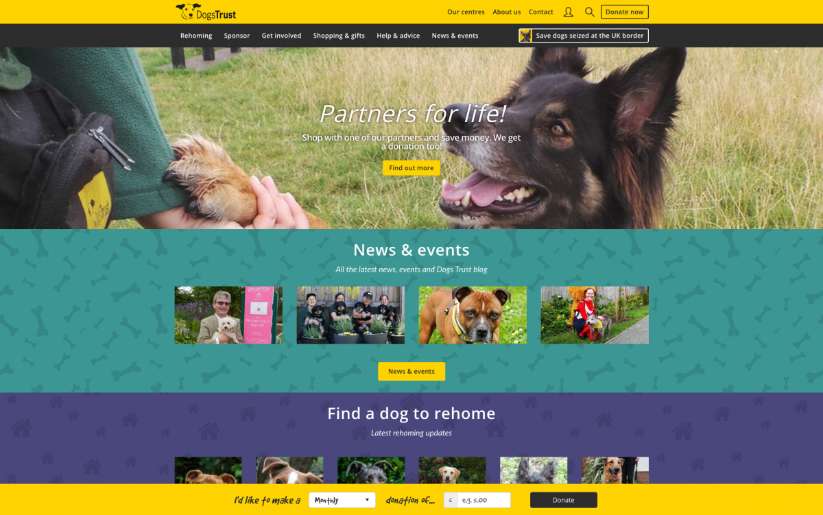
Dogs Trust have several centres around the country for dogs without homes, and work on rehoming these dogs. You can support their work here.
Since we started writing this blog, Dogs Trust have updated their website! We loved the ‘cosy’ feel of the old website; it felt like a blanket that you could wrap a dog up in. However, the new website does look a lot tidier and feels a lot more organised.
The Dogs Trust site makes excellent use of listings, in a way that is informative but also browsable. They have listings for dogs for rehoming, dogs for sponsoring, opportunities to get involved and ‘help and advice’ for dog owners. They strike a really nice balance between information for funders and supporters, as well as helping dogs that need homes.
Old website
New website
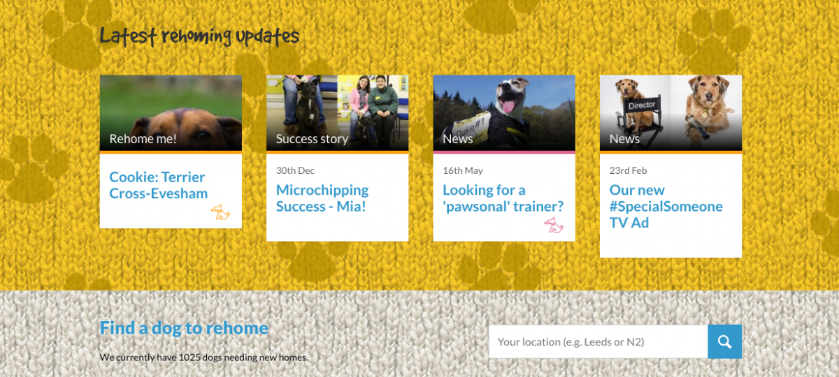
The user interface has been tidied and refined, but they have kept the colourful welcoming feel that we loved. Dogs Trust have highlighted their resources for existing dog owners, which is a great way to keep people returning to the website regularly, and increase long-term engagement from supporters and donors.
Bee has gone! To a good home, hopefully. But there are many more adorable dogs that need homes. 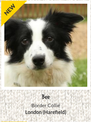
Our favourite bits:
Obviously all the cute pictures of dogs! They have some really high quality imagery, even of the dogs available for adoption. Using high quality images makes a massive difference. The dogs for rehoming have some great images that capture the dogs’ personalities and tug at the heart-strings. If you can afford to invest in a professional photographer, or have a volunteer who is good at photography, then take full advantage of this as it really makes all the difference.
The ‘sticky’ menu is excellent, as it follows you as you scroll down the page, meaning you don’t get lost around the website. This is a great navigational tool.
We love the colour coding for each individual section of the site. This is another helpful way to help users navigate your website by providing a consistent experience, and making it clear when you are within a defined ‘section’ of the website.
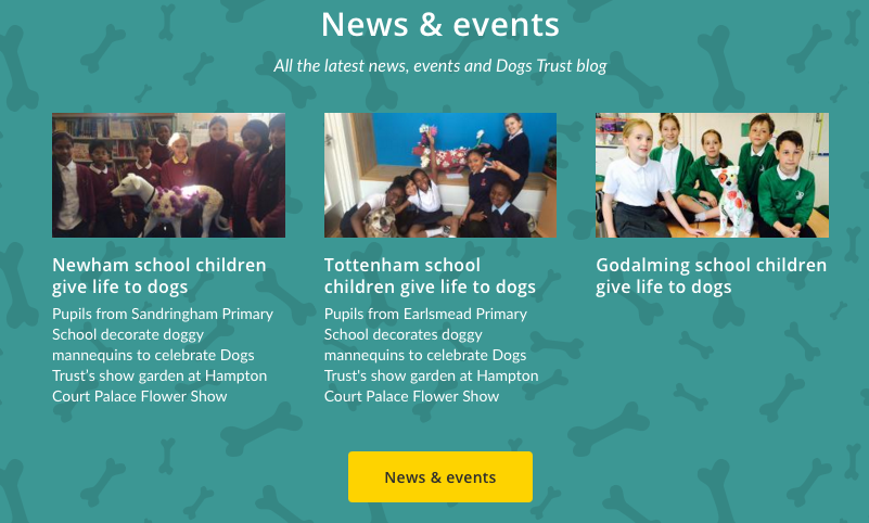
Dogs Trust have a very detailed and informative Help & Advice section on their website. This is a really valuable tool for new (and existing!) dog owners. Strong content such as this is also a good way of increasing your search engine traffic, and by providing a helpful resource for dog lovers, they are in turn likely to increase donations and repeat engagements.
The Dogs Trust have some lovely digital campaigns. We love their recent heartwarming TV ad campaign.
The search filters for a dog to rehome are detailed and you can now search by centre, breed, size and age, or search without preference(s). This is great for visitors, as each potential rehomer will have their own specific requirements.
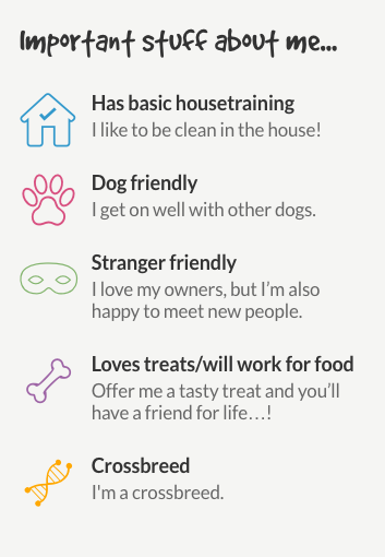
Every dog has detailed information about them, including Likes, Breed, Age and Type of Home needed, presented within a visual information box, so you can make a more informed decision about whether they are the right dog for you. Again, this is really helpful for online visitors!
Some ways it could be even better:
- On the previous site there was a way to search by your postcode in order to find your nearest centre. Sadly this has gone now, so you have to scroll through the centres and work out which is closest to you. Presumably there is a good reason behind this decision, but we thought this was a nice feature.
WWF
WWF are a leading international charity whose ultimate goal is “people living in harmony with nature” and to protect our planet. They work towards protecting and restoring endangered wildlife, sustaining our forests, oceans and rivers, and encouraging environmentally-friendly sustainable living. You can support their work here.
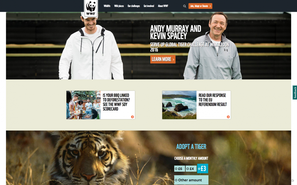
As you might expect from a leading wildlife charity, the WWF website is filled with absolutely incredible imagery of animals and nature (many of their images could be contenders for the Wildlife Photographer of the Year award!) They also have a lot of high profile campaigns and celebrity endorsements. Having said that, there’s still loads of great techniques adopted by the WWF website that other charities can learn from.
Our favourite bits:
- They have some excellent, shareable pieces of content that are designed to be shared on social media and accessed via mobile devices - such as this helpful guide about the EU and the Environment, or this fun interactive quiz. (I’m not sure how accurate it is though. I got ‘Tiger’ and I am definitely more of a Baloo than a Sheer Khan!) Making your content this shareable and accessible is a great way of spreading your message virally and building brand recognition.
We love their Soy Scorecard microsite, which tells you how companies fared in terms of responsible soy production. It is very informative, explaining how much soy is used in animal feed and can contribute to deforestation. There are detailed filters to easily see how your country’s companies performed, and it was eye opening to find out that several UK supermarkets are very much below standards. An excellent example of valuable content marketing with a purpose!
WWF have loads of very targeted ‘microsites’ - one for almost each one of their campaigns (for example, Save Belize’s Endangered Reef and Stop Forests Being Erased). This is a great way to create an immersive and very focussed experience for visitors - and perfect for sharing on social media. Microsites aren’t necessarily expensive to build, and can have huge benefits to your online campaigns.
The resources on each endangered animal’s page are great too (take a look at the Polar Bear page), with interactive maps, audio samples, and lots of easy to digest stats. This level of detail is impressive and also incredibly valuable to visitors; it demonstrates authority and means people will use the site as an educational resource.
Some ways it could be even better:
They have some really cool little features that are quite buried, such as the video background on the Giant Panda page, or the ‘Tiger updates’ on the Tiger page. It would be great to make better use of these features, and see them rolled out on every animal page for consistency (and cuteness).
WWF have grouped all of their donation and membership options into one page (Join, Adopt or Donate), which works fine, but we love how some charities such as ActionAid split these options out onto multiple detailed landing pages, and think this approach would work excellently for WWF.
The Blue Cross
The Blue Cross are a charity helping to rehome animals, including dogs, cats, rabbits and horses. They offer fostering for those that cannot commit to long term rehoming. They also run workshops for schools and youth groups to prepare people for owning pets in future. You can support their work here.
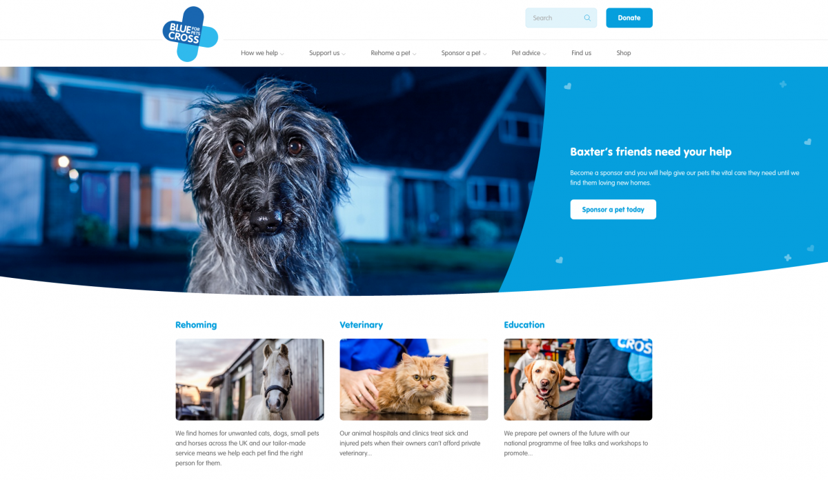
The Blue Cross website is very intuitive, clean and easy to use. The branding is iconic and recognisable, and the simple layout means there is no confusion with navigating the site and finding what you are looking for.
Our favourite bits:
A vast and informative pet advice section. They also have some great resources for animal lovers, such as an entire service focussing on how to deal with the bereavement of a pet. There are also articles on specific issues that are well targeted to niche search engine queries, such as how to keep your toddler safe around a dog and what to do if you have lost or found a dog. This is a good way to increase organic traffic from search engines.
We love the little plaster and hearts icons used throughout the site - just showing off a little of their brand without overload.
The box at the bottom of the homepage allowing you to scroll through their last three tweets is a creative way of embedding social media.
The site is running on Drupal - one of our favourite content management systems!
There is a big donate button at the top of every page, making it easy for people to find.
The ‘Our locations’ tool at the bottom of the home page is very useful. You can just type in your postcode and it show you a map of your closest rehoming centres, animal hospitals, pet care clinics and charity shops.
Once again, there are lovely animal pics throughout the site. These charities tend to use cute pictures of animals, rather than animals in distress, as sometimes that can be quite shocking to the viewer. The sweet pictures inspire you to make a donation or rehome an animal, as it’s very hard not to feel a desire to support while looking at these adorable faces.
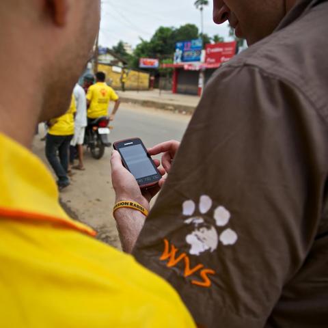
WVS
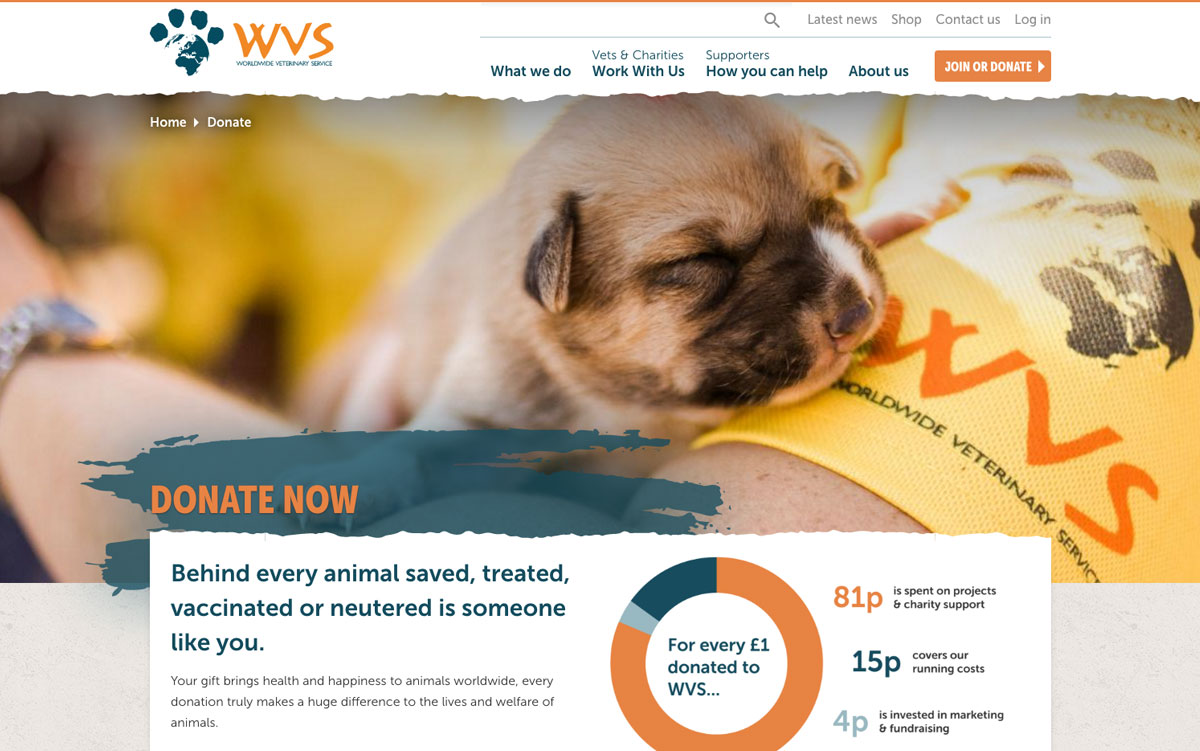
The Worldwide Veterinary Service (WVS) are a charity that supports animals internationally by helping provide animal welfare, veterinary training and resources in areas that don’t have consistent access to veterinary care. You can support their work here.
Okay, so we know that it’s a bit cheeky to include a website that we built, but we think it stands alongside the other charity websites above, so let’s give you a totally unbiased view of why we love it so much (ahem).
Our favourite bits:
Performing in depth user research gave us a clear understanding of the needs and goals of the many different users that were using the website. We planned a very clear journey for each user type and kept the navigation simple, with a large ‘mega menu’ which expands to give you all of the navigational options within each section.
During the site design, we developed the existing logo into a full fledged and consistent brand. We designed new style guidelines for the website, providing a flexible set of design rules which provide consistency and structure. The site has a rustic paint-splattered ‘travel’ feel to it, which reflects the international places where WVS operates.
For WVS, we designed a bespoke donation system, having researched the best practice for user donations. The donation system allows visitors to flick between ‘one off’ and ‘ongoing’ donations. Donations are integrated throughout the site, allowing visitors to donate to specific campaigns and causes, or start the donation process from the website footer.
A key feature of the WVS website is recruiting volunteer veterinarians, which is a core part of their work (sending volunteers abroad to work on projects). We designed a custom system to present volunteer information in an informative way, and collect more applications. We built clear listings that allow visitors to easily browse volunteer trip opportunities using filters.
WVS have a lot of excellent media, including amazing photography and videos. We integrated this throughout the website, immersing you in their work and giving you a taster of what you can expect to be doing if you volunteer and the work that WVS are doing.
So there you have it, part one of our series on charity website, this time focussing on animal charity websites. A few things that were common throughout all of the websites were:
Well designed, clear navigation, such as drop-down mega menus and breadcrumbs.
Powerful donation systems, with big donate buttons that are consistent and easy to find, and easy to use online payment processing.
Very clear and informative listings that allow users to easily browse content and get clear information ‘at a glance’ (whether it’s animals for rehoming, volunteer trips, or endangered animals).
Helpful resources for visitors, including donors and visitors from social media. All of the sites had great online tools such as the Bird Identifier and the Dogs Trust Help & Advice. These are great for SEO, keep visitors returning regularly, and provide a helpful resource for animal lovers who are more likely to become online donors.
Of course we also loved looking at the amazing photography and videos across all of the websites. They had all invested in high quality professional imagery and this makes a huge difference. Did you know that not only can looking at animal pictures make you happier, apparently it can also make you more productive?!
In our next blog we’ll be discussing our favourite health charity sites. Sign up to our newsletter, or social media here, and we’ll let you know when it’s ready.
Icons in background top image created by iconsmind.