1st June 2016 by Rob Foddering
As a design studio, we regularly ask for feedback from our clients to ensure our work achieves the project goals. However sometimes the feedback that we receive is not always useful to the design process.
Why? Sometimes there’s confusion as to what a designer’s role is. The core of what we do is to fix problems in a creative way, within the constraints of a project. Fixing problems can be difficult if it’s done only on an aesthetic level, as we're then fixing problems based on taste, and not for the end user.
You should trust your designer, you employed them to do the job, but if things don’t look right to you, query them - your designer should have an answer to why something's been designed that way.
This blog is dedicated to how your feedback can help us design the right website/brand/print for your project and how your feedback is essential, not hindering, to the project’s success.
Here are our top tips for giving us great feedback:
1. Be specific
A running joke within the team is that some people like lime green (Alice). A lot of other people don’t like lime green (everyone else). You may think that it is helpful for us to know if you don’t like lime green before we start the design process, but actually this is feedback based on your taste and unless we’re making a website that is solely for you (what website is solely for you?) then we need to think about your users and your stakeholders in this design too.
For instance, it could be that a competitor's brand uses lots of lime green and you need to differentiate yourself. This would be good feedback.
We can’t fix the problem unless we are presented with feedback that has reasoning behind it. Feedback needs to be specific, have a purpose and thought behind it which should be tied to the project goals.
It’s much more useful for us to hear practical reasons as well.
‘This image is too small’, is not particularly helpful, but ‘this is something we would really like to emphasise, so it needs to be bigger’, is feedback that will help guide our revisions.
It’s just as useful (and quite common!) for us to receive positive feedback and, again, the why is also very important. You love what we did for you? Great! Why do you love it? What did you love about it? Why do you think that your audience will love it? This can help us design the best outcomes for you, and continue to design things that you (and your users) will love in future.
2. Be honest
Don’t be afraid to tell us that there is something you aren’t happy with. We won’t be offended! Ultimately our job is to work with you to achieve the best possible result. But if you are not honest along the way, we may get to the end and find we are on different (web) pages (sorry).
Every good designer should be able to present their design, and tell you the reasoning behind it and why it’s designed the way it is. (Use your words, designers!)
It could be that you want to see the design with a slight amendment - but we’ve already tried that amendment and it didn’t work. Or, why is the text so high contrast? Maybe because a proportion of your audience has visual impairments and we are designing to high accessibility standards.
3. Be patient, we’ll get to the good stuff
We never jump blindly into the design phase. First we will work through research, testing and ideas generation, followed by sitemapping and wireframing, which are the blueprints for the website. It is essential that, first and foremost, your website is functional, user-friendly and achieves your goals, and this will only be achieved if we both have the same understanding and are working towards the same goals.
We know that you are keen to jump into the visual styling, but the key here is to plan properly and ensure we have the complete picture first. Our process works because we know that if we design to your goals, then the project will achieve the best possible results. We encourage you to be patient and embrace this process; you will most likely discover solutions (or sometimes obstacles) that you hadn’t considered.
4. Explain what you are trying to achieve
It’s good to assume that we don’t know what you are thinking (thank goodness!), or what you’ve got planned in the next year. Give us as much insight as you can and this will be rewarded in the design process.
At the outset of the research phase, you’ll know your business and target audience better than we do. Further understanding of your audience and organisation goals means that we become informed designers. Informed designers deliver design that rocks!
5. Trust us
When we design, quite often, we design for the end target audience, not for ourselves (or even for you!). Sometimes you have to go beyond your own personal taste and think about the user/person who will be visiting your site or looking at the designs. Try to imagine what their personal tastes might be. What device/browser are they using? Where, when and why would they visit your website? What other websites do they like to visit? What are their goals when they visit the website? All of these elements, and many more, will influence our design choices.
If we have made a certain design decision, it may be because we know it will work best for your end users. We conduct research for all our design projects, so that we can make informed design decisions.
It’s also good to take into account cultural bias when it comes to taste too, and there are some interesting articles about designing for different cultures and countries, and how that can affect the style.
If you give us feedback by suggesting solutions to us, you have to bear in mind that it may not be the best solution, or the only solution, and there may be solutions that you haven’t thought of.
It’s our job as designers to come up with the best solutions. As Mike Monteiro says in his book Design is a Job, prescriptive feedback is unhelpful, “If something isn’t working, tell us why and we’ll fix it.“ You’ve paid us to be designers. Let us design.
6. Stick to the deadlines we give you (or keep us informed)
If we ask for feedback by a certain date, we really need feedback by that date. It’s easy to procrastinate, but if you need more time to look at something, talk to us - we’ll be able to help clarify things further. A shorter project timeline means that we have less time to deliver the perfect solution for the project goals.
7. Pick up the phone
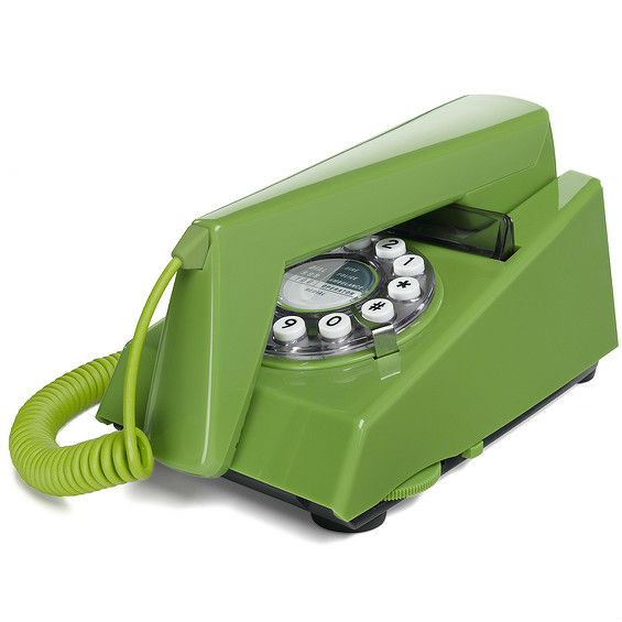
With everything online nowadays, people don’t communicate by phone as often as they used to. Sometimes email communication can make it hard to tell exactly what you mean and why you are asking for something. Verbal communication can often be the best (and quickest!) way to explain. Pretend you are in the 90s and call us on our landline. Alternately we may pick up the phone and call you to get a better idea of what you are trying to say.
So there you have it, seven tips for giving the best feedback ever. As we don’t want to have to give you feedback on the way you give feedback.
In summary, our tips for design feedback in order to get the best results:
- Be specific: Designers need a detailed brief, and to understand the reasons behind those details
- Be honest: We’re not mind-readers, and we won’t be offended
- Be patient: Embrace the full research and design process, and you will get the strongest results
- Explain: You know your business and plan better than we do
- Trust us: Be open to ideas and you may discover a better solution
- Stick to deadlines: Deadlines need to work both ways, and means your designer can stick to your schedule
- Call us: A chat through over the phone is usually much quicker and clearer than emailing feedback
As you’ve come this far, you have earned a reward - here is a small excerpt of our group conversation about giving feedback:
Rob F: My mum doesn’t like lime green.
Hannah: My dog doesn’t like lime green.
Rob C: I showed the lime green flyer to my dog and he died.
Carmen: But lime green, that’s an offensive colour isn’t it? It's a bit out there.
Alice: It's not!
Rob C: It's all about tomato now. Tomato’s the colour.
Alice: Laugh all you like but you're the one wearing green.


