
9th May 2016 by Rob Foddering

Over the last few months we’ve worked with Bow Arts to help deliver the design for two of their education workshops. It’s important work for us for two reasons.
The current proposals to the New English Baccalaureate to remove the compulsory study of creative subjects will be a huge loss to the creative sector in England. Design and the Arts are a much loved and strong part of our national identity (and economy) and it seems to be a real oversight that these subjects will not be adequately represented in schools. Find out more and sign the petition by visiting the bacc for the future website.
The other reason is that you need to keep pushing your experience and skills by delivering work for a wide variety of clients. Designing for young people presents a whole set of different challenges. We’ve worked hard at developing our design process over the years and it’s good to reinforce that our process is still universal, and applicable to any client, young or old. So, how did our design process hold up? Well read on...
Project 1: Bow School
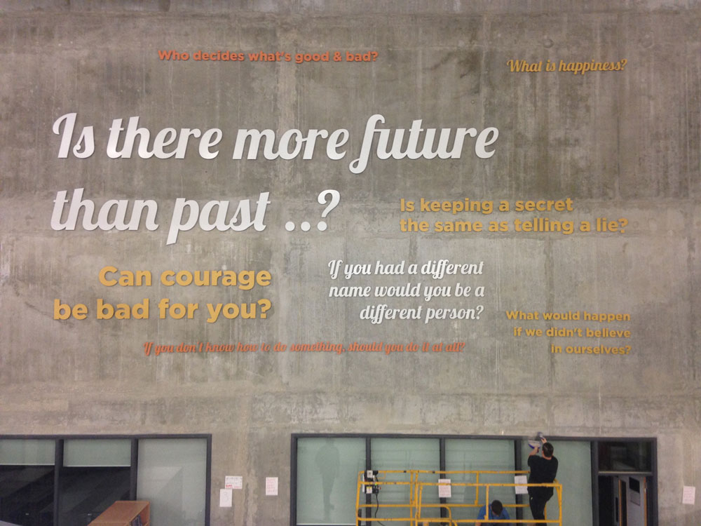
Bow school received funding from the Building Schools for the Future Programme and moved into their new building in 2014. They commissioned Bow Arts to work with the students to help add some personality to their bare walls. Their library space consisted of a large atrium and lots of natural light and was earmarked as a perfect space for a large installation.
The school teaches Philosophy and it made sense to use these classes for the creative process because of the link between language and reading. Personally I think it’s great that Philosophy is being taught in secondary school. I wonder if I would I be a different person today if I had studied Philosophy at school? Anyway...
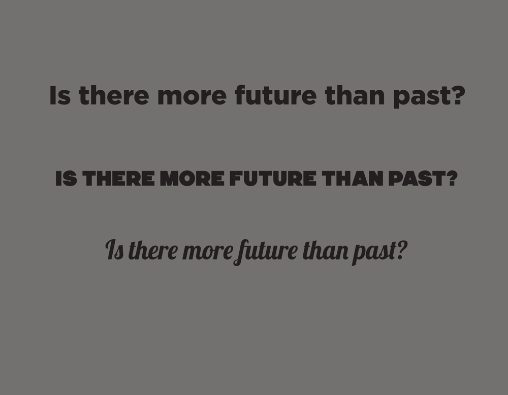
The school conducted workshops with the students to come up with philosophical phrases. We've helped Bow Arts deliver various aspects of their design over the last five years so we were poised to help. Bow Arts highlighted the phrases that would work best and the school sent us the palette of their colours. The rest of the brief was open for us to design what we thought would work best. It made sense that the phrase ‘Is there more future than past?’ was going to be the biggest, as it was the most open ended question that could promote discussion.
Rob based getting the right font right around this, trying out a range of different fonts, he selected three to work with: Gotham black, VIM and Lobster.
Font selection is a blog in itself, however in short he tried to match the font to the tone of the phrases, Gotham black looked formal, the VIM looked a bit like shouting, and Lobster was softer and more inviting, like a line from a poem.
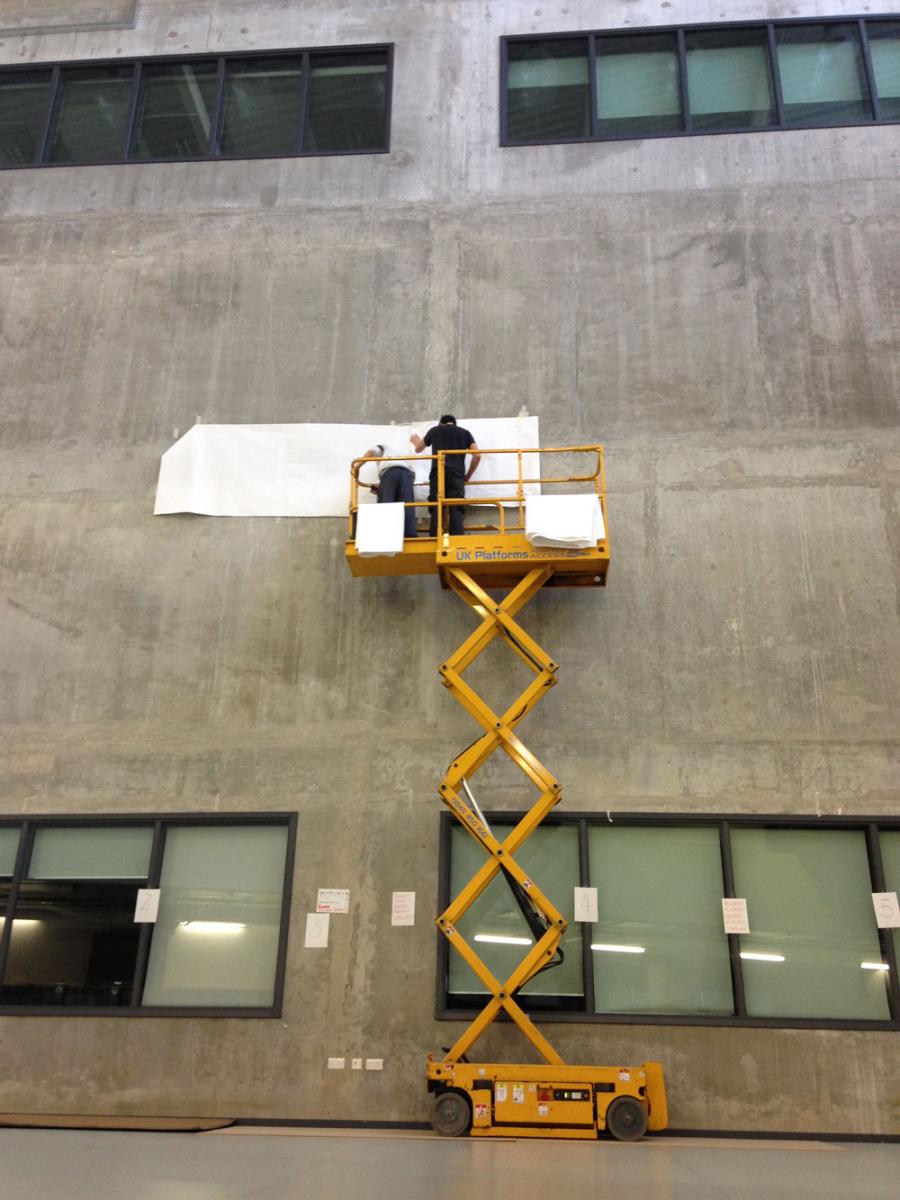
These font choices also had to take into account that we were designing something physical, something that someone would have to be cut out of a material and stuck on the wall. So we had to balance what would look good with how easy it would be to install. We knew that using script fonts would be easier, as you could mount them in groups instead of individual letters, however having all the phrases in the same font, didn’t work, as the impact of the different phrases as a whole was lost.
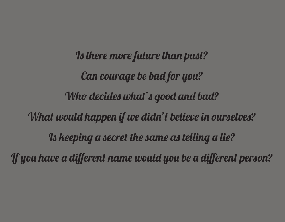
The Lobster font we kept for other phrases that were most abstract or didn’t have a clear answer, such as ‘What is happiness?’ as using the script font has the appearance of human writing, creativity and open mindedness, whereas the non joined up letters feel more factual.
In terms of colours, it was also key to consider which colours were going to stand out most on the grey cement background of the library wall. After going through the range of colours we had been given, we presented some options and agreed with the school which ones were most effective. The whites and yellows looked particularly striking, whereas the blues tended to disappear too much into the grey.
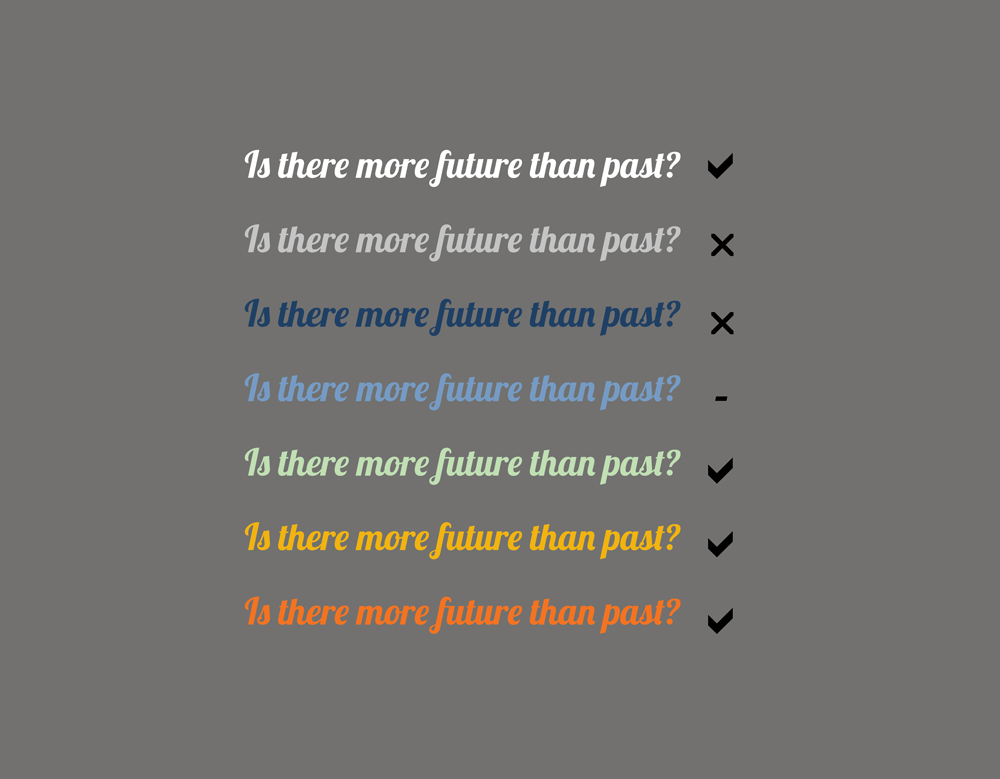
To keep things simple the mint green colour was also dropped (sometimes less is more), and Rob mixed up the spacing of the phrases around the wall in a coherent, but artistic way.
Here is the final result:
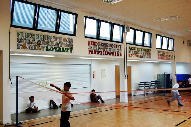
Project 2: Stebon School
What do school halls make you think of? Long assemblies? Sitting on the floor? Dull colours? My school hall only became creative when there was a play or a concert on.
Caroline, the lead teacher at Stebon School in Tower Hamlets worked with Bow Arts previously on a typographic workshop, and thought it would be great to introduce a similar idea to the classrooms and hallways of Stebon School. Bow Arts teamed up with artist Emily Tracy to deliver the workshops and Bow arts contacted us to help deliver the final artwork.
Our goal is always shared with our clients; so in this case, helping encourage the creativity of the children at Stebon School was a no-brainer. From a design perspective, it was to make the letters bright and colourful, ultimately using our skills to help Emily and Bow Arts make the most out of the opportunity to inspire the students.
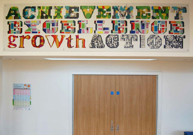
Emily chose a list of inspiring words to use in the workshop.. The children sketched big individual letters, and patterns that would be used to decorate the letters. Our Graphic Designer Hannah scanned in both, and photoshopped them together, boosting the outlines and making the colours pop.
Some of the patterns were duplicated for the same letters on a word e.g on participating - the ‘t’ was kept the same.
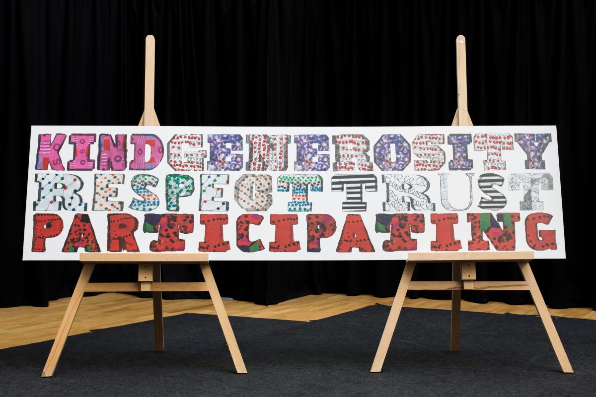
“...sometimes simple is very effective…” (student)
What were the challenges with this project from our perspective?
We didn’t want the style and feel of the children’s artwork to become lost in the design process. It had to retain their hand in the creation of the artwork.
In terms of the technical challenge, it was important to make sure the contrasting patterns complemented each other on each of the boards without the colours clashing, whilst at the same time ensuring all of the designated words fitted onto the individual boards. Emily worked hard to assign each board's words, the letters used for each word, and the associated patterns that would go onto each letter.
The results are below and you can see how the words add brightness to the space. Hopefully these kids won’t grow up to write a blog about how boring their school halls were!
‘...thanks so much for your help on this project! The help you provided was exactly what I needed, and the final result was just as I envisaged’ (Emily Tracy)
“I have learnt that if you just let your hand flow, even though it may be messy, it may look creative and nice... messy can be beautiful” (student)
‘...sometimes it’s great just to give children time to explore and create without any teacher/adult support...’ (Caroline, the Lead Teacher)
In summary
With both projects, there was a physical space in the school that needed a bit of creative inspiration. Bow Arts had an idea of how they could use a workshop format to deliver something for these spaces, however the outcome was entirely down to the children and retaining the balance of the children's work in both projects was key.
What continues to be rewarding about these designs, is that they will have an impact both on current and future students. With funding and time for creative subjects being limited from the curriculum, we feel it is important for children to experience more creativity in their lives, especially with projects that they themselves have worked on, as this gives them a sense of achievement and value. Despite proposed Ebacc legislation, and prohibitive higher education costs, we hope that more time will be given to children to participate in projects such as these and they will be inspired to embark on a design or arts related career.