17th August 2016 by Alice Ralph
This blog is continuing our series around Charity Websites, identifying effective features and best practices. We’ve pulled together some of our favourite examples of homelessness and poverty charity websites, and why we think they work well.
We have divided this series into categories:
- Animal charity websites
- Health charity websites
- Arts & community charity websites
- Children’s charity websites
- Homelessness & poverty charity websites (this blog!)
- Human rights charity websites (coming soon!)
You can subscribe to our newsletter here to keep up to date with the series.
This latest blog is focussed on poverty and homelessness charities, who may have to balance the needs of people who are looking for immediate help with the visitors to the site that want to get involved either by donating, fundraising or volunteering. We found 5 excellent sites that struck the perfect balance between the two, and were able to highlight the work they were doing as well as providing excellent user experiences.
Shelter
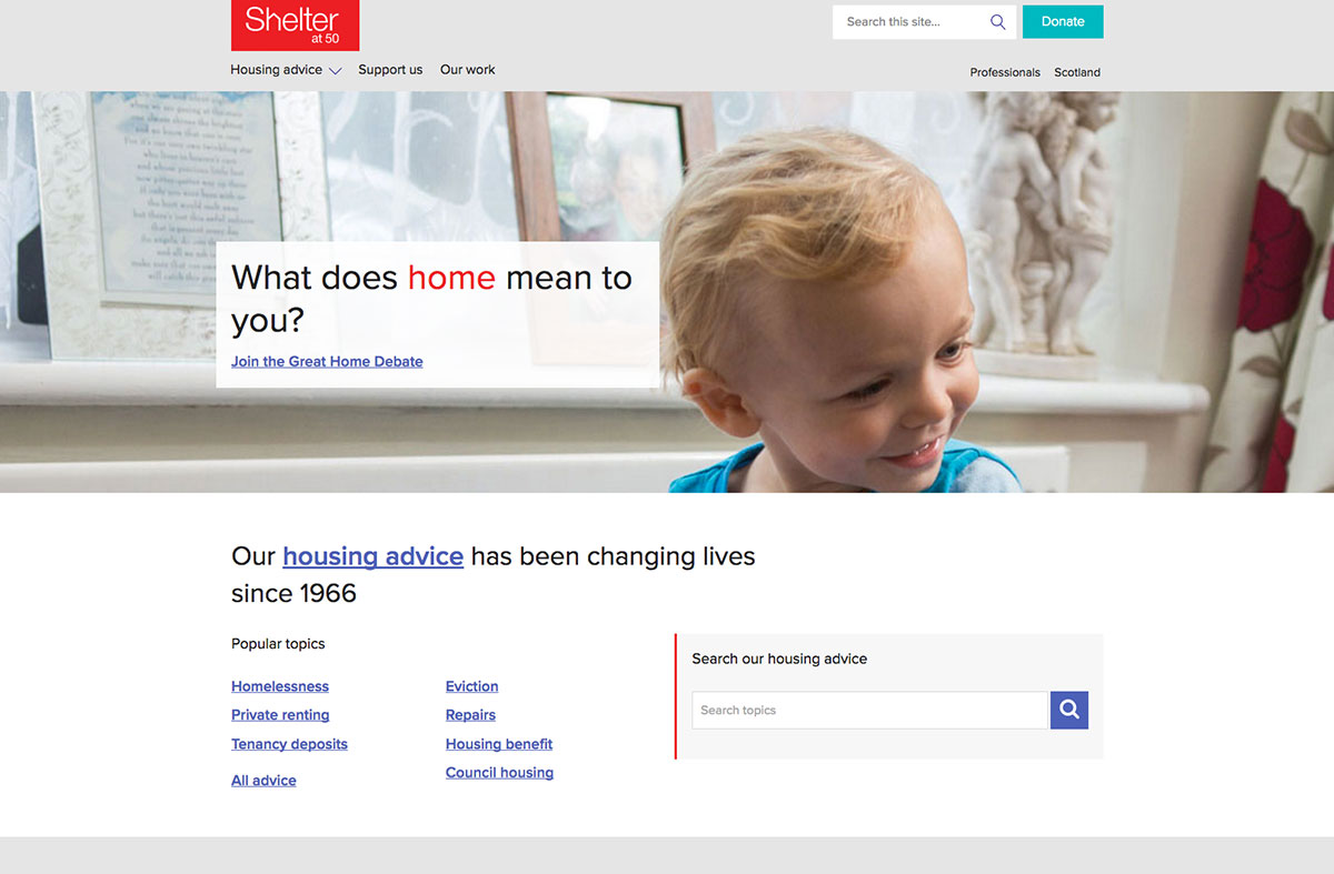
Shelter is a charity dedicated to preventing homelessness, by offering help and resources for where to stay and how to be rehoused. You can support their work here.
This is a nice example of a Beta site being rolled out in stages. Parts of the site are clearly using a new design, whilst other background areas still seem to be using the “old” design, but prompt you to provide feedback throughout with a simple questionnaire. It’s a really nice way of involving your audience in the redesign of a new site, and to keep the gradual relaunch process as seamless as possible for visitors.
In terms of the “new” design; we love the use of very clear Gov.uk design principles and easy-to-read typography. The navigation is very clear with just three sections in the menu, and it’s easy to quickly find what you want. The ‘Popular Topics’ feature is a nice solution for a site that needs to present a lot of complex information. It also adapts really well for mobile. We really like this site and can’t wait to see the new design rolled out throughout!
Our favourite bits:
Extremely clear user experience design. We like how the brand has been applied; the small bits of red which draw your eye to important elements and calls to action. It has clearly been designed with usability in mind.
Great use of imagery, it focuses on the ‘human’ story behind homelessness and gives an overall positive, reassuring vibe for visitors. The imagery never feels like “stock photos”, yet is high quality throughout. Shelter have clearly invested in their photo library and the results speak volumes.
The home page and navigation are both very simple but make it easy to access a huge archive of information. Visitors can easily access appropriate support based on their situation. Clients often ask us to include “everything in the menu”; however this can often conversely make things much harder to find. Shelter have a well designed menu which, despite being very minimal, makes it very easy to find things.
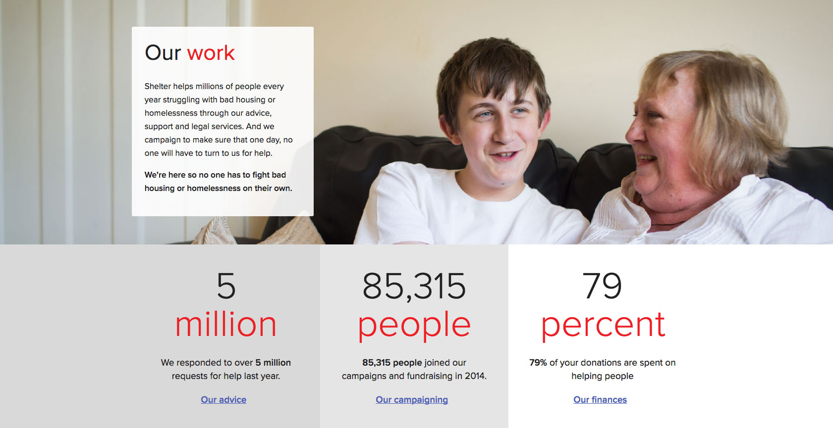
- We love the nice clear statistics on Shelter’s About Us page, and how each stat links to the relevant section of the website:
Donate button is always at the top and the bottom so you can’t miss it, even on mobile or tablet devices.
The Beta information and audience questionnaire is a great way of balancing good user experience alongside a complex site relaunch. By involving your audience in the
The site has some great microsite features such as the Great Home Debate, which integrate nicely with the site and work excellently on mobile.
All in all, an extremely well designed and user-friendly website for an excellent charity!
Oxfam
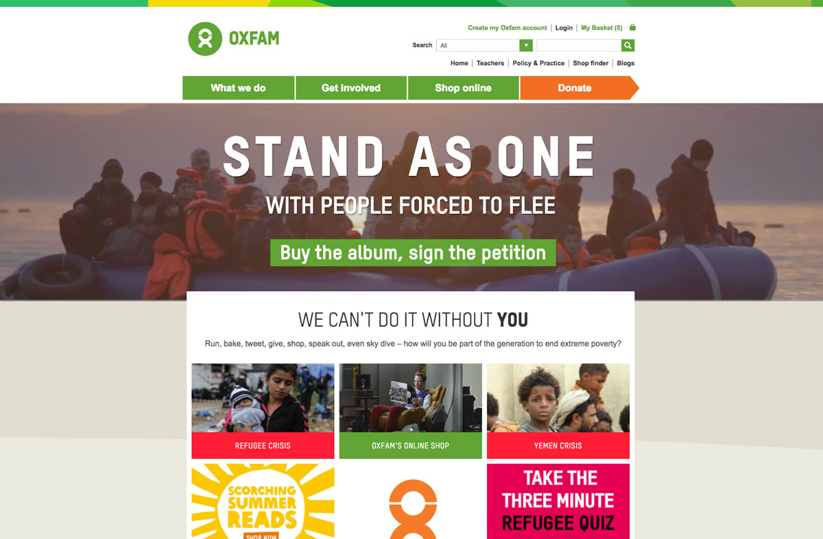
Oxfam is a global charity, fighting to end poverty in 90 different countries all over the world. You can support their work here.
Considering the huge variety of their work, the Oxfam website is just as vast as you might expect. Despite this, they have managed to maintain a surprisingly simple user experience. The Oxfam website is colourful, lively and engaging, and makes nice use of modern web technology on the homepage (video backgrounds and interactive filters). Oxfam have a wonderful brand designed by Wolff Olins, including a recognisable custom typeface that they use occasionally around the site as a custom web font. We’d love to see more of this around the site, because it works really well in the places where it is currently used.
We particularly like the leave a gift in your will section, which is a really nice example of a legacy giving page. It provides all of the information that potential legacy givers might require upfront, and very clearly.
Our favourite bits:
Love the video background on the homepage, and we were impressed at how quickly it loads! This is a really powerful way of utilising a header ‘carousel’ format, as the video speaks volumes - and there is lots of evidence that image carousels are bad for user experience.
The online integrated shop is excellent and a great way of tying together their charity shops with their online presence. Oxfam is very much associated with charity shops and their ‘high street’ presence, so the online shop is an excellent way of continuing that online.
Oxfam always have excellent video content. The videos on their ‘Impact of our work’ page are particularly good, and very shareable. Note how all of the videos have subtitles; most social networks now have an ‘autoplay’ function where videos automatically start playing without audio. This means much higher engagement, but also means that many people will watch your videos without sound. Subtitles are a great way to encourage them to watch the video in it’s entirety.
We like how the sections are colour coded, and the way that the crisis sections are highlighted in a bright red colour to communicate the urgency.
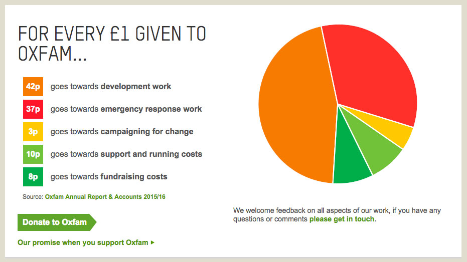
Eye-catching colour coded pie-chart that shows where donations are spent. As a website visitor, it is reassuring to see where your donations go, especially as this is a common criticism of large charities. This is a nice example of how charities can tackle this issue on their website and marketing:
The site is optimised well for search engines and social media sharing, with excellent open graph optimisation (which improves how shared content appears on social media).
We love the campaign microsite ‘Stand As One’. This is actually an entirely separate website, powered by Wordpress, that is sitting on a subdomain of the main site. However it is styled to match the main website, giving a consistent experience, and is designed to work well on mobile devices - so it is ideal for sharing on social media. It links back to the main Glastonbury online shop (powered by Shopify!) where people can preorder the fundraising album. We think it’s a very simple yet effective example of a microsite that has a clear focus, well integrated and highly shareable.
WaterAid
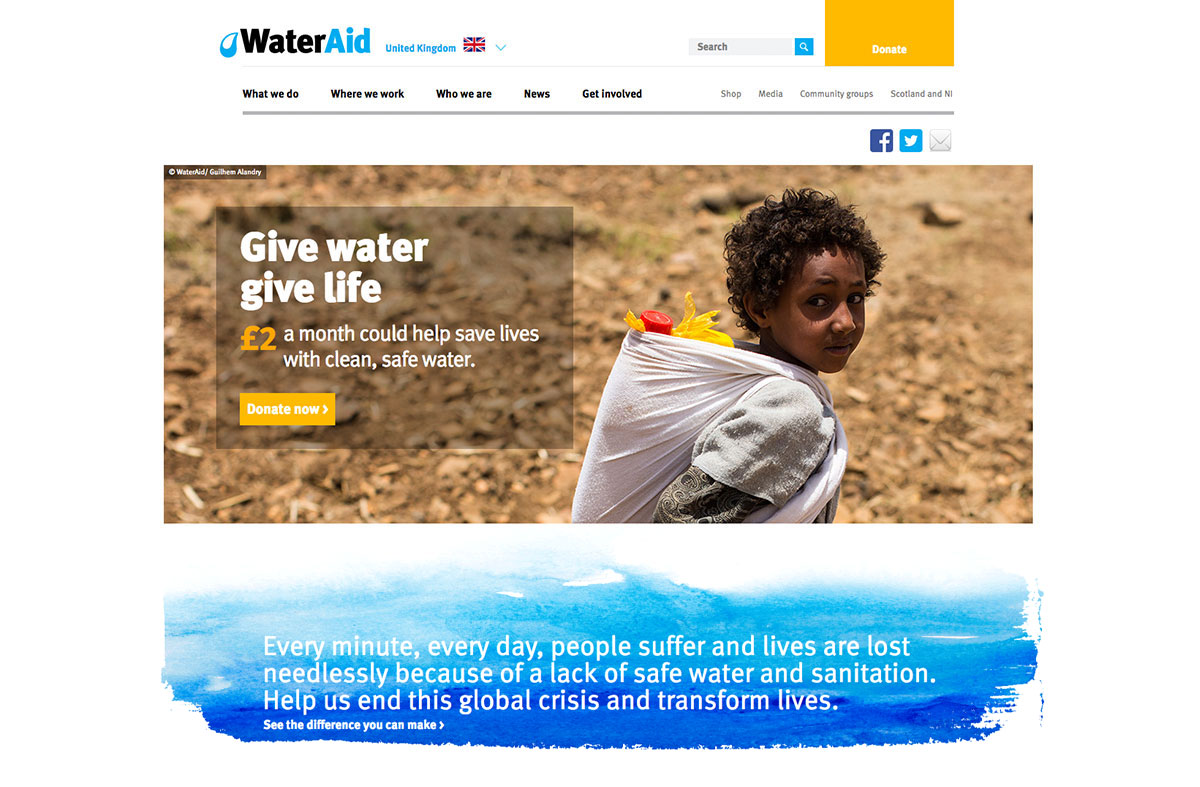
Wateraid work to provide clean water and sanitation in 37 countries in the world to prevent diseases and poverty caused by dirty water. You can support their work here.
The iconic WaterAid branding is applied throughout this site making it incredibly distinctive and unmistakeable. The light blue brand colour and font is unmistakably WaterAid. We particularly like the textural ‘watercolour’ blue splashes used around the site. They are applied sparingly but to great effect as they highlight the most important elements of the page.
Our favourite bits:
We absolutely love the interactive Where We Work map, which allows you to hover over each country and see the work they are doing in that area, whether it is direct work or where some of their offices are based. This makes it really transparent; to see how and where the charity works worldwide.
The statistics for each country are really helpful. They allow you to see in detail, but at a glance how much more work there is to be done. It’s powerful, accessible and visually engaging:

Like some other charities, WaterAid sell charitable gifts online, e.g. £20 for a pair of taps; your money is send to WaterAid and a card is sent to yourself or the person you wanted to buy a gift for. This is a common feature of charity websites and WaterAid handle it really well with a Shopify powered online shop that integrates seamlessly with the rest of their site.
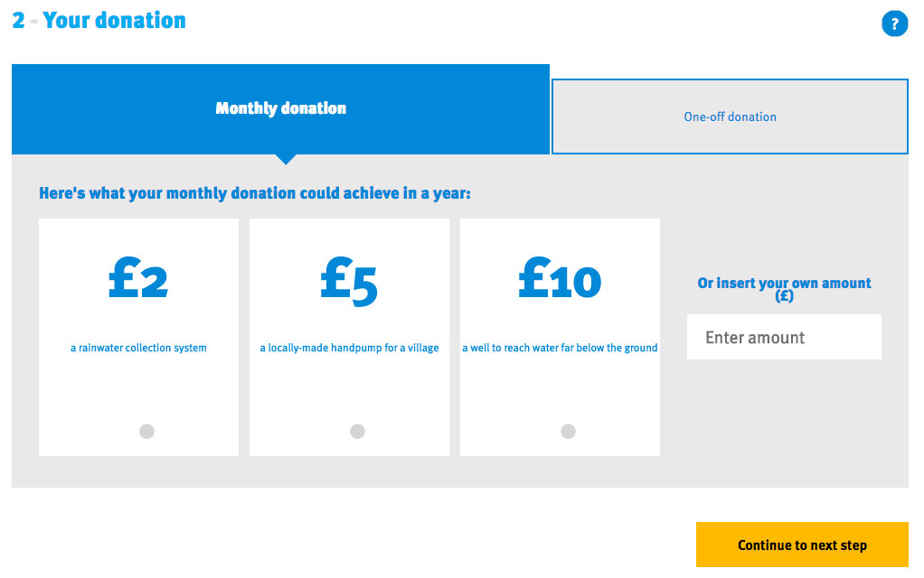
The Get Involved page breaks down exactly what a specific amount could achieve, so you can get an idea of how much of a difference your donation is making. For example, just £15 one off donation could help give one person access to safe water:
WaterAid have some very clever campaign microsites, such as this excellent ‘How Much Shorter’ online tool. This is a really nice example of viral content marketing; quizzes and games are always popular on social media, and it’s a clever way to both educate people on a serious issue, make the issue ‘personal’ to the individual, whilst also collecting people’s contact information for future marketing.
The Running Charity
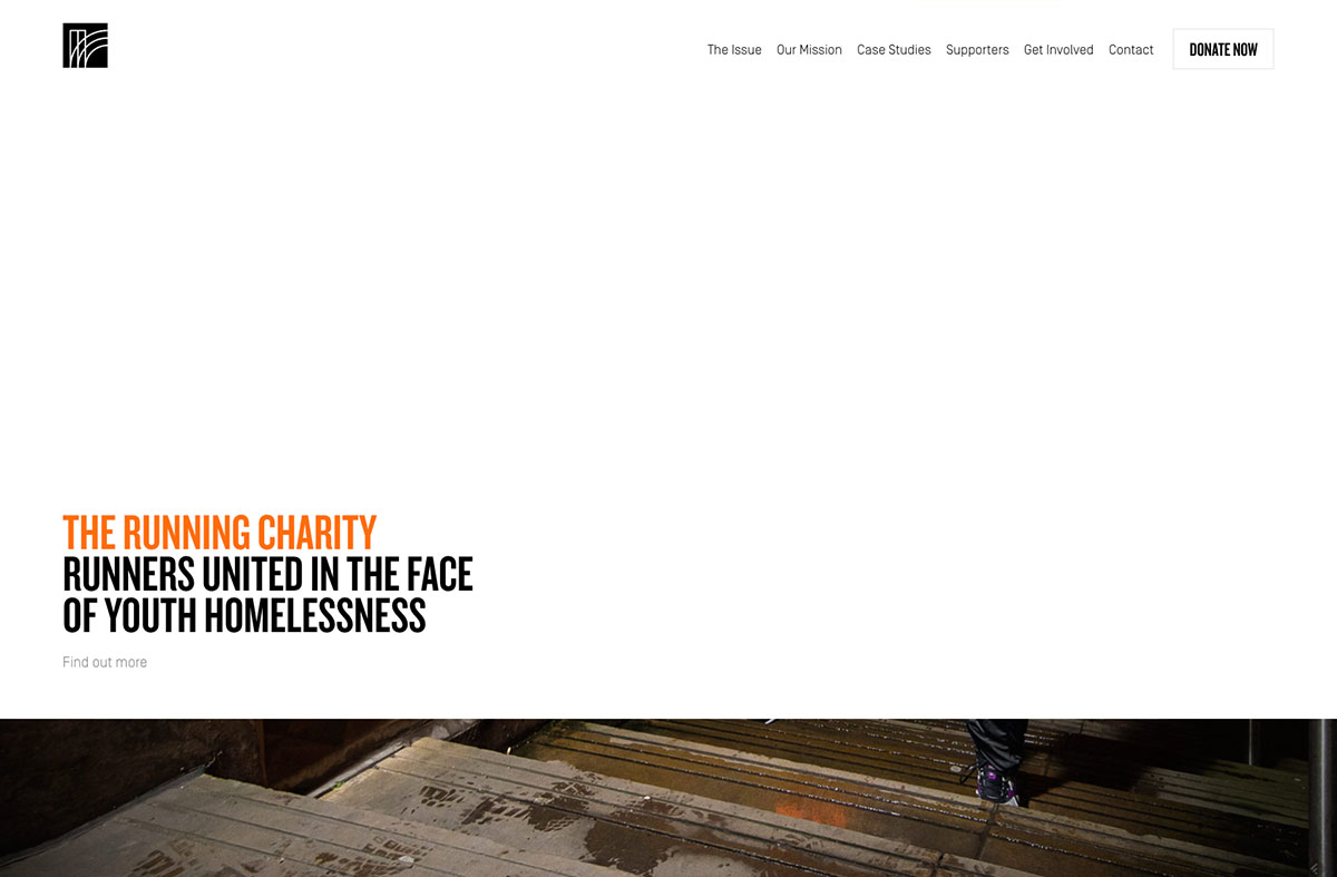
The Running Charity is the first running-orientated programme for homeless young people aged 16 to 24. They partner with existing homeless charities and provide a diverse training programme that improves physical and mental health, and provides homeless young people with opportunities for fundraising and employment. You can support their work here.
The Running Charity websites is quite different to the other charity websites that we have featured, but we have included it because we think it’s a really wonderful example of a simpler ‘alternative’ approach. Unlike the other sites in our blog, The Running Charity uses a simple one-page website. The menu takes you to different points on the page rather than different pages, with the exception of the Blog (a standalone Wordpress site) and the Donate page (which takes you to their Virgin Money Giving page). Utilising secure 3rd party systems, such as Virgin Money Giving, is a great way to deliver more complex web functionality in a secure and cost-effective way.
By removing the complex requirements of donation and blogging, the Running Charity website is focussed purely on communicating the mission and goals of the charity. We feel that it does this very well, and goes to show that sometimes ‘less is more’.
Our favourite bits:
We love how the Running Charity website is not over-engineered. There is no contact form; it just links directly to an email address. There is no complex news functionality; instead they use a standalone Wordpress blog, a 3rd party donation tool, and utilise Facebook, Twitter and a Mailchimp newsletter to communicate with their followers.
The Running Charity have a very recognisable and professional brand designed by She Was Only. We love how the colour scheme, logo, typography and application have all been carefully thought through. Again, it is simple and easy to apply, but provides a consistent and impactful brand framework.
The content and copywriting is stripped back to it’s bare essentials. They still have all of the core elements of most charity websites (about the Issue, their Mission Statement, some example Case Studies and stats, their Patron, their Trustees etc). However, nothing is over-engineered. It makes the site very simple to digest. For any small charities, or charities focussing on a single issue, it is a really nice example of how a website can still be highly effective (or often more effective!) when the content is stripped back to it’s simplest form.
We like the bold use of white space and ‘parallax’ transitions. Parallax is when the images appear to ‘slide’ behind the content, giving a very smooth motion. The site is typographically led, and uses some professional photography. Whilst the design is simple, there are some very modern browser technologies powering it.
The Trussell Trust
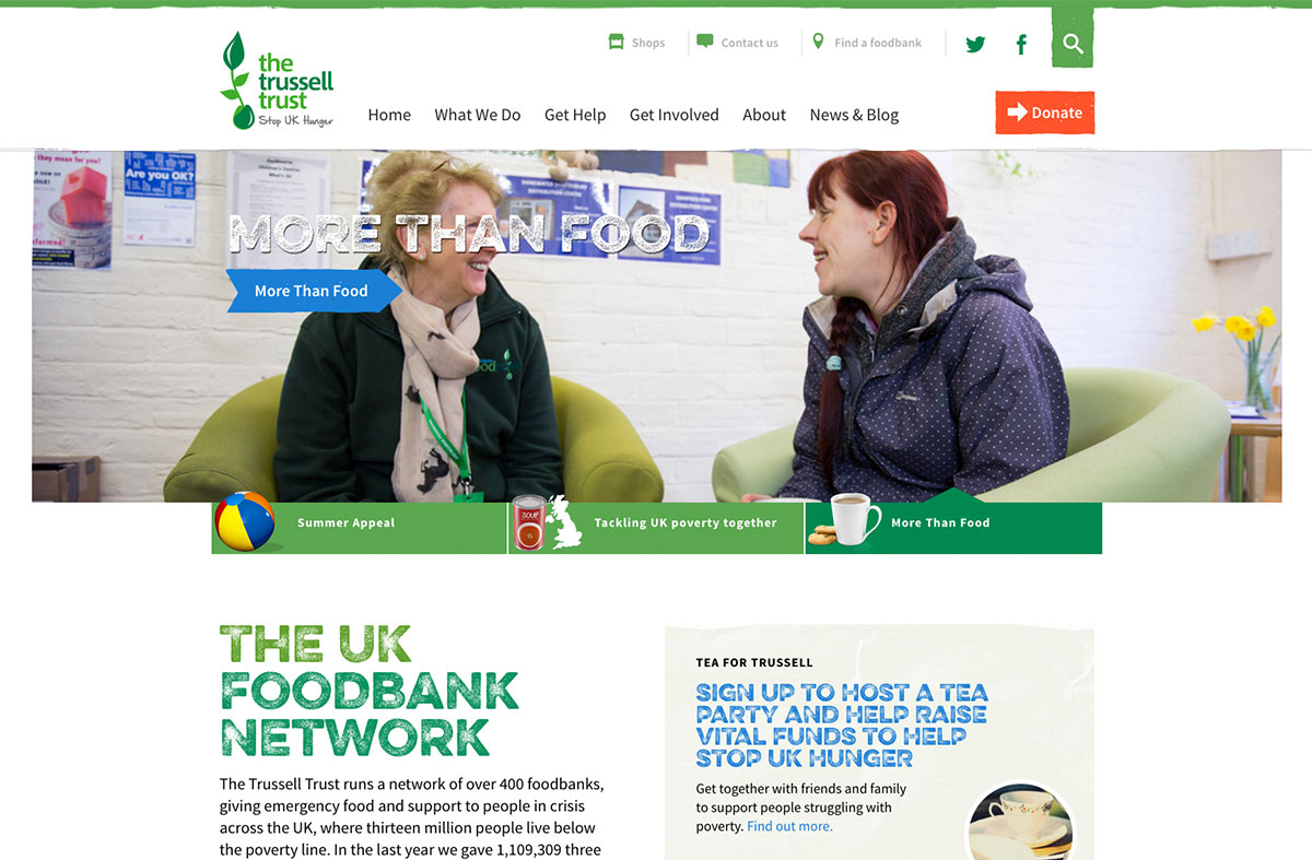
The Trussell Trust run Foodbanks in the UK, campaign to stop hunger, and also run overseas projects, in particular in Bulgaria where the charity was first founded. They are working towards breaking the cycle of poverty that causes hunger. You can support their work here.
The Trussell Trust site has a nice welcoming approach, with a real ‘community’ feel to it. There are small bits of brand application, but the content is still really clear and accessible.
The Trussell Trust are particularly good at ‘telling the story’ of their charity. Their website very clearly explains how foodbanks work, the impact that they have, and why they need to exist in the first place. By weaving personal stories, videos, photos and testimonials in amongst their ‘facts and figures’, they communicate their story really effectively and powerfully.
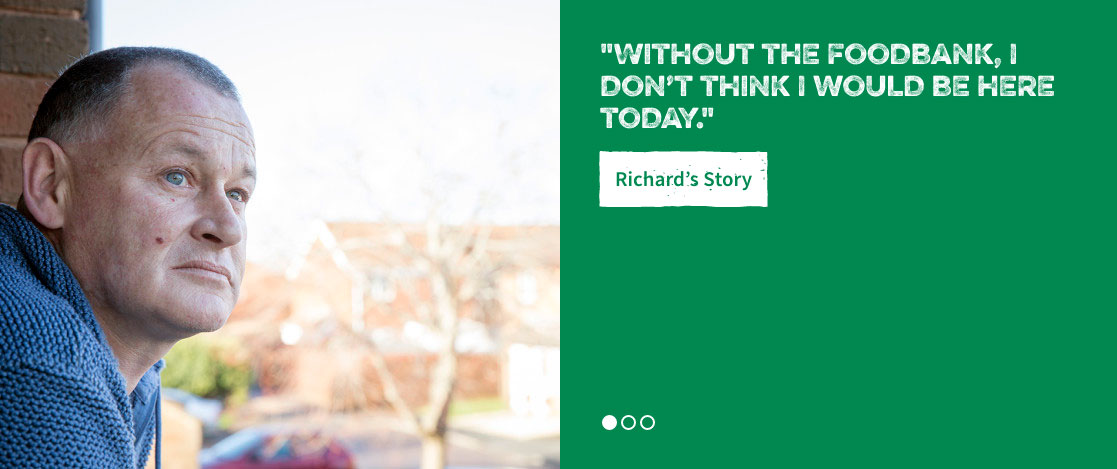
We particularly like the rustic webfont that they have chosen (Eveleth). The advancements in webfont technology, with webfont libraries such as MyFonts, Google Fonts and TypeKit, have made it easy for websites to now use a huge variety of typography online. This is incredibly exciting from a design perspective, and it’s great to see a charity website being bold in their choice of typography.
Our favourite bits:
We really like the use of videos to tell the stories of the foodbank users and volunteers. The videos really help to explain the work they do and their aims. Video content does not always have to be costly or time-consuming to produce. In most cases,
Find a foodbank tool is really useful and easy to use, and also works well on mobile devices.
We love the ‘Real Stories’ section. As a charity, it is really important to put a face to your cause when you are dealing with an issue such as food poverty, which is an ‘invisible’ crisis that many people are not aware of. The Real Stories will encourage foodbank users to ask for help if they need it, but also encourage volunteers and donors to support the charity.
The Trussell Trust have included some really useful tools on their website, such as the Benefits Calculator. In this case, they have partnered with another charity Turn2us (who also have a great website!) to share a digital tool that is useful to both of their audience bases. Building these partnerships with other charities is a great way to share resources and spread your reach.
As many charities do, the Trussell Trust rely on volunteers. They have a whopping 40,000 volunteers in the UK. To support this, they have provided lots of information on becoming a volunteer, allowing potential volunteers to make an easy and informed decision.
The individual regional foodbanks have their own dedicated websites, usually powered by Wordpress. These individual websites are unique, but they all use the same custom Wordpress theme. For example, you can see Bournemouth Foodbank versus Hackney Foodbank. The content and logo changes, but the design stays the same. This format works really well because it provides a detailed and informative site when people do a Google search for ‘Bournemouth foodbank’, but it also keeps a professional and high quality brand style that matches the main Trussell Trust website. Many charities with smaller regional branches could use this approach to great effect.
So that concludes part 5 of our series on charity web design. We focussed this time on charities working towards breaking cycles of poverty and homelessness. Here are some of the common features that we noticed that worked well:
Excellent ‘story telling’. Many of these charities had excellent visual displays of statistics - how many people they help, how their money is spent etc. But they also had more engaging ways of telling stories; through video, written case studies and amazing photography. This really told the true human story of their individual causes, and made it easy to see the impact and value of the charity’s work.
Subtle but well executed brand application. None of these websites had gone ‘OTT’ on the brand, but all felt consistent and recognisable.
The websites that would be directly accessed by service users, such as Shelter and The Trussell Trust, all had very accessible help and advice. They both had large resources to help support people who are in need, and included free online tools that people could use to access advice. If you are a charity who provide support directly to your users, these sites are both great examples of best practice.
All had brilliant use of microsites. Whether it’s Oxfam’s ‘Stand As One’ campaign, or the Trussell Trust’s use of microsites for their individual foodbanks, they all took advantage of expanding their mother brand to their sub-projects.
In our next blog, we’ll be covering some of our favourite human rights charity websites. Sign up to our newsletter, or social media here, and we’ll let you know when it’s live!


