
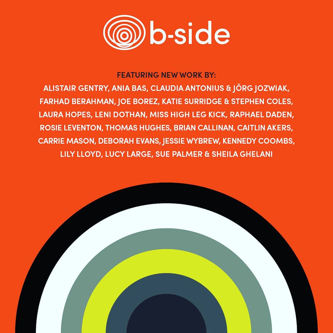
20th December 2018 by Alice Ralph

Back in 2009, we pitched a new brand identity and website for b-side Arts Festival. We won and since then it's been an amazing journey and we haven't looked back. At the time, they were a new organisation with a debut arts festival under their belt. Every two years, they plan and deliver an arts festival in Weymouth & Portland, Dorset. Since their beginnings as a small biennial arts event, they have grown into a very impressive and well-regarded National Portfolio Organisation, funded by the Arts Council England.
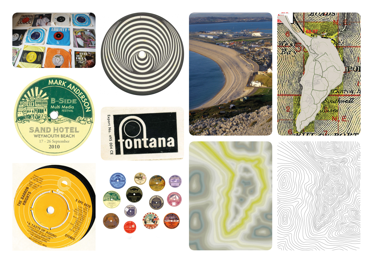
For the original b-side branding, we explored the idea of 78 records; quite literally the ‘flip side of the sea side’. This involved a trip to a few charity shop vinyl bins, for ‘research purposes’, obviously. Record sleeves and labels provide a rich history of bold typography, iconic design and circular imagery. The whole b-side brand was developed from wanting to communicate how the art was rooted in a sense of place. The logo was inspired by rings radiating from a central location (eg. Portland, or an artwork).
This original branding worked really well for b-side for a number of years. It stood out amongst other local arts organisations, and conveyed the quirky, subversive nature of the festival programming.
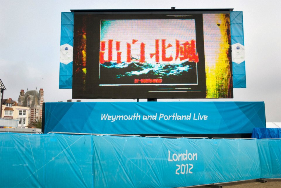
The 2012 Olympics arrived in Weymouth and Portland as the sailing events were held there. This coincided with the b-side 2012 festival, and a huge influx of visitors to the area. Competing with the huge amount of events and activity in the area was a challenge for b-side in terms of marketing, but the brand stood up well and drew in visitors to see the art.
Like a lot of new organisations and businesses, it takes a while to define exactly what you do. Sometimes you can only find out by doing and sometimes your brand needs to evolve with you. The core of the brand was routed in a concept sympathetic to the objectives of b-side, so this meant we could continually add, take away or evolve the brand without having to reinvent the wheel each time.
In 2015, we decided that the brand needed to be tightened. It had served b-side well, but the festival had outgrown its original starting point and needed something brighter and bolder. The Olympics had been a test and, while the brand stood up very well, it also highlighted opportunities to make it stand out even more. The original brand was playful, but dark. The festival had grown into something more confident, reflective and thoughtful - and the brand needed to reflect that.
With that in mind, we redeveloped the brand guidelines with more iconic typography, a fresher colour palette and a stronger grid layout. We introduced more white space and breathing room into designs, and a more confident visual style throughout their marketing materials.
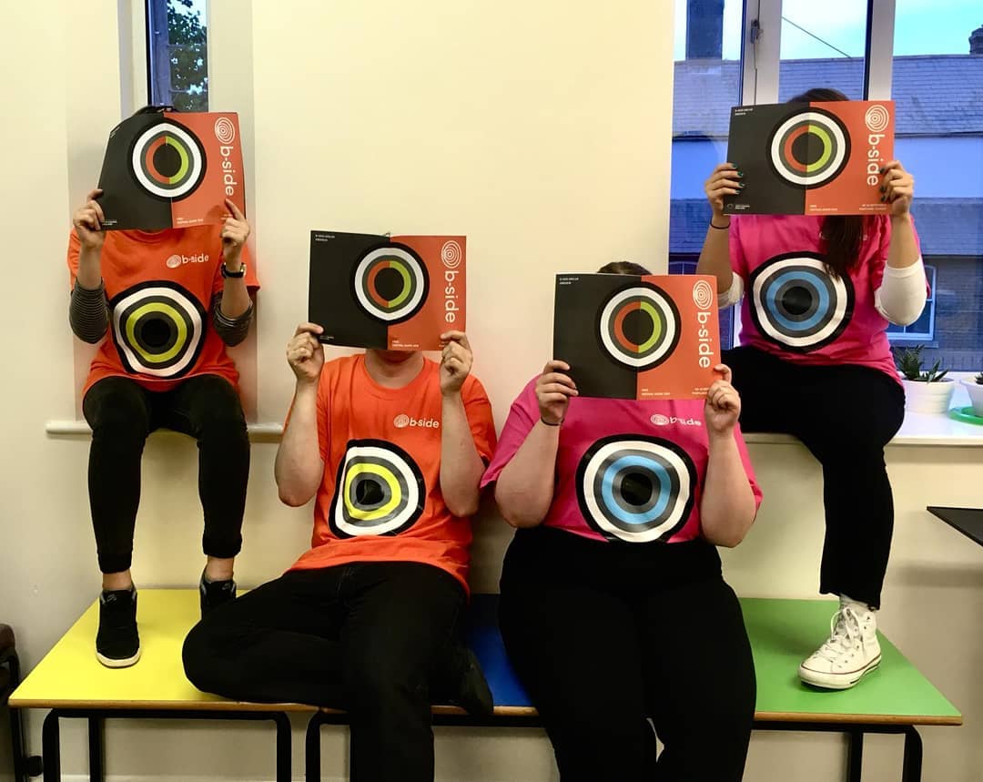
We also refined the logo into a simpler mark that retains its original message but works at all sizes. It still retains everything that makes it b-side, but it feels tighter and stronger.
One of the uniquely tricky challenges of the b-side brand was always imagery. Every festival we struggled to find a suitable image that could represent the festival across the variety of marketing. Because the work is site specific it doesn’t actually exist until the festival itself. As we were working a few months before the festival took place it meant that we didn't always have an image that represented the festival adequately. This also made it difficult to make a consistent identity across festivals. There is no ‘one size fits all’ image that can really do it justice.
For this reason, it was always a challenge to find a suitable and eye-catching image or graphic that would work across all materials. It needed to be flexible, simple and bold.
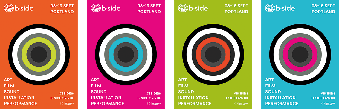
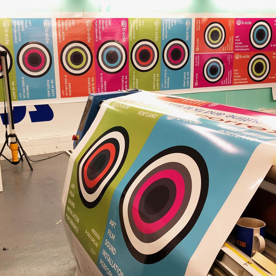
Therefore we developed a visual device that could be used across a huge range of locations. The ‘bullseye’ is inspired by the rings of the b-side logo, and the powerful sense of place that b-side is rooted in.
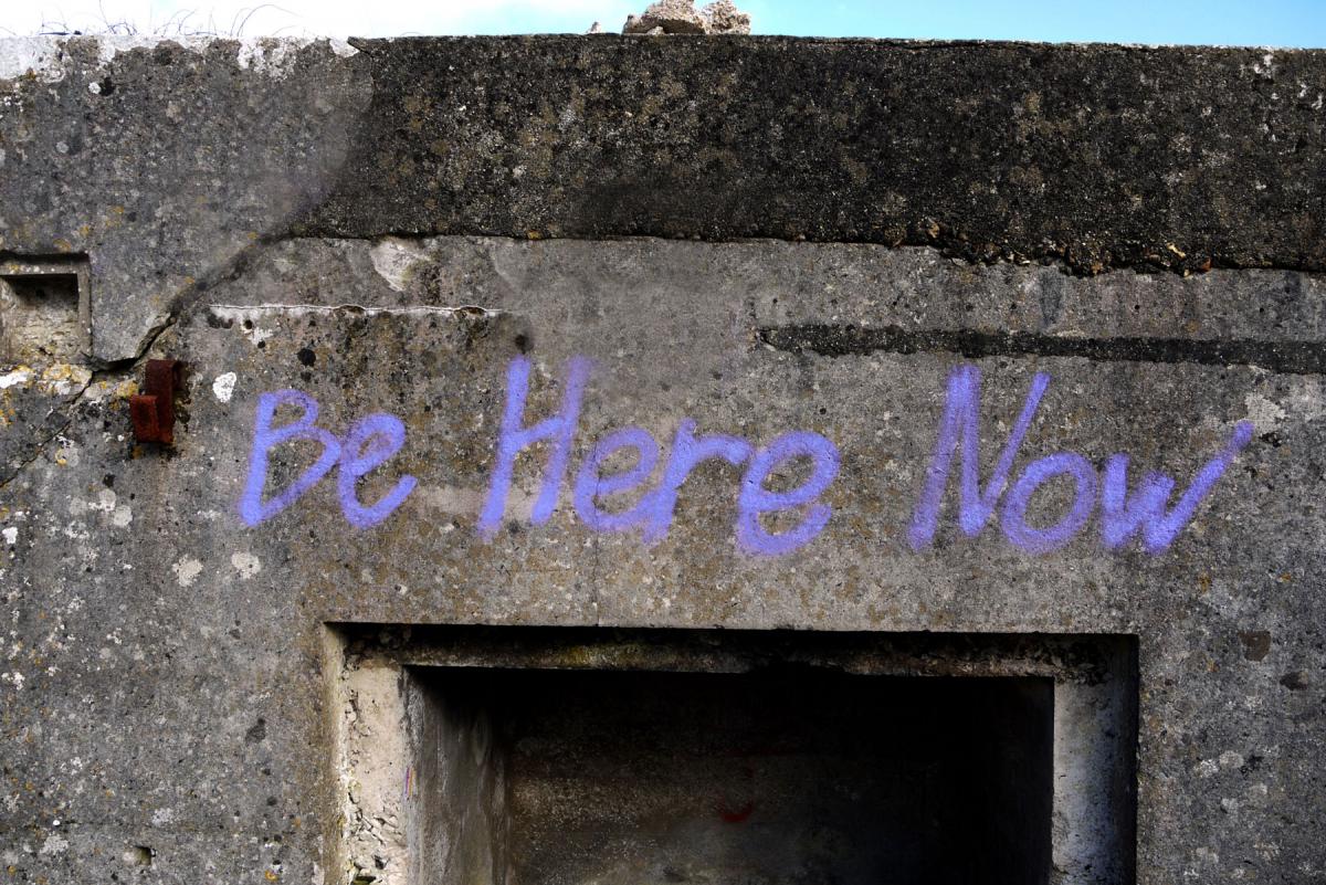
A vandal had graffitied the words ‘BE HERE NOW’ across the Portland High Angle Battery. Although we decided not to use a photograph of the graffiti, we were inspired by that sense of urgency and locality. The bright neon rings of the bullseye manage to convey that. It stands out equally strongly as an advert in the pages of a magazine or a social media icon, as it does on an A-board, or even a billboard.
This part of the rebrand happened amazingly quickly; we were able to develop this device in just a couple of days, after years of trying to solve the problem. However this process was only quick to produce after years of knowing the festival, and understanding what they were trying to achieve... and a lot of trust on both sides. Lots of trust!
Over the years, the b-side brand has evolved with the festival itself. As the organisation has become bigger, more confident and a stronger sense of purpose, the brand too has grown and adapted - and now represents b-side in 2018 and onwards particularly strongly. Will it adapt and evolve again in future? Probably - such is the nature of branding.