4th May 2016 by Rob Costello
I know some of you have been going crazy waiting for part three of our rebrand blog, so we have decided to put you out of your misery. The two Robs are now going to explain how the new website was made. Think of them like the Two Ronnies. But taller. We can pretend they are a tribute act and call them the Two Robbies.
Rob F: Okay. So we're going to have a chat.
Rob C: About...
Rob F: This is part 3 of our blog. How our rebrand was made into something, into code, into images…That's disconcertingly vague.
Rob C: Yes.
Rob F: So, previously we've discussed how we've changed our positioning and where we've come from, and then as a result how you change the language and the visual element. The final stage was us putting that into a website.
Rob C: Yes. Well what I like about this is that there has been a number of blogs recently about how web design is becoming more monotonous.
Rob F: Yes.
Rob C: Generic.
Rob F: Homogeneous design. I've read a lot of discussion about that recently. “The Dribbblisation of design”.
Rob C: I love this tweet by Jon Gold asking which one of the two possible websites you are currently designing
Rob F: I've seen that, it's really...
Rob C: Have you yes?
Rob F: Why don’t we retweet it?
Rob C: Yes.
Rob F: Is that a bad thing though? I was reading a blog by Paul Boag which was for it. I don't know if you've heard of him. He's that British UX guy. He was saying that actually a lot of websites looking the same means that there's a standard there.
Rob C: That's true.
Rob F: All books look the same and function the same. It's the content that sets them apart.
Rob C: Morgane Santos talks about the idea of a local maximum. You want to get to the highest point (the best solution). So imagine you're in a mountain range. You might think the best way to get to the highest point is to find the nearest slope and start walking upwards. So you do that and you get to the top of a hill and you're like, “Yay!” But what you haven’t realised is that somewhere nearby is an even taller hill and you've missed that because you've just gone to the closest possible route.
So, without innovation, without people who are willing to go “Well actually I'm going to walk over here for a little while,” you never know if you've actually hit the best solution or not.
So we can keep refining this 3 column website forever and it might work well but there may be a better solution out there. Also, there may be a better solution for your particular use case.
Rob F: Yes.
Rob C: So we're different I think. Or at least we like to think that we're different from other firms out there in terms of the kind of clients we work with. A lot of firms are making these kinds of websites because that’s what their clients need or have asked for. Financial firms, selling an app, these patterns have become the standard for those.
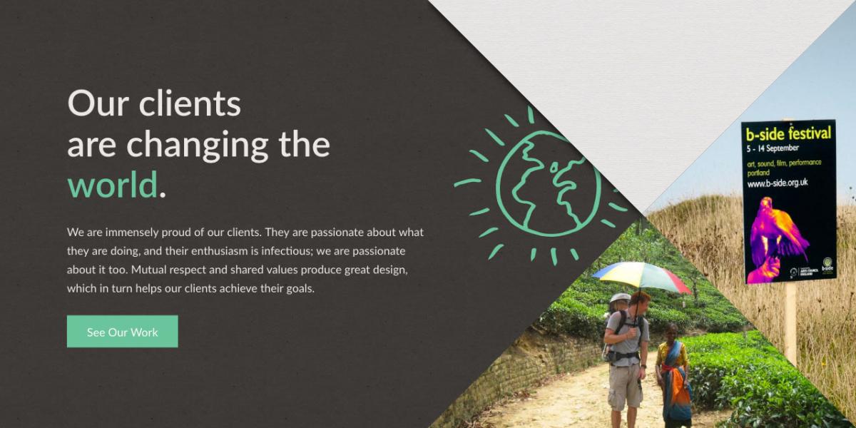
However, we generally deal with clients who are in more creative fields, more feet-on-the-ground clients who usually want something a bit more ambitious in terms of design. I think our website caters to that. It doesn't take the easiest possible route, and the triangles are a microcosm of that.
Rob F: Yes.
Rob C: The standard division on the web (the <div>) is a rectangle, so when we decided to go with the triangles I was bricking it a bit and thought, “How do you do that?” Obviously you can create these things as PNGs and just drop them on the page but that's not what we wanted to do. We wanted to be able to change these and add new pages that look like this, so these groups of triangles had to be generated programmatically from images in the back end. There were a number of technical challenges involved in doing that.
Rob F: So you were presented with this design, you'd been feeding into it as well. I remember at that point having a conversation about how the triangles would be difficult and to further complicate things we'd already decided on a cut-out element as a key part of the brand and it had gone quite far down the line before we actually considered if triangles were sensible because they would be quite difficult to build in the website.
Rob C: Yes.
Rob F: But actually on reflection of what you're saying, a lot of websites have this single look or one or two looks. I think the fact that we pushed back against that and said actually they're a part of our brand, we've gone this far with the brand and this needs to translate into the web. I think the fact that you did that means that we've come up with something, there's a different look to it and feel.
Rob C: Yes.
Rob F: So I think maybe that's the key to this. With a lot of websites, there's a clear route with what they're trying to achieve.
Rob C: Yes.
Rob F: They’re trying to sell an app or trying to get some information out of people, whereas probably why our website took so long to achieve is that we were exploring as we were going along, like the people that walk along a bit and see there's a bigger hill.
Rob C: Yes, yes. Often these designs are made in Photoshop or Sketch and that doesn't really have any connection with how HTML works. So in ways that's kind of a good problem to have because you're not thinking about HTML when you're creating this. I would argue that these kind of websites are too focused on how HTML works.
Rob F: Yes.
Rob C: And the rules and the recommendations and all this sort of thing about HTML, whereas this website takes a step into the unknown and that obviously presents new challenges but it also presents an opportunity for innovation, to create new ways of doing things.
Rob F: Yes. So in terms of when you were presented with this design, you mentioned there were some technical difficulties with doing triangles. To me it's just like hey let's just put a triangle on the web. What makes it difficult?
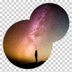
Rob C: Well you can make a triangular image in Photoshop by importing an image and putting a triangular mask on it.
Rob F: Yes.
part of the image
Rob C: And exporting it as a PNG which gives you the ability to export transparent sections of the image. The issues with that are that PNGs are big and that's not great for the web.
Rob F: Yes.
Rob C: You can use GIFs to do the same thing but they tend to be a bit clunky and they don't look great and by the time you've...They're not really meant for representation on images.
Rob F: They're meant for animating humorous cats.
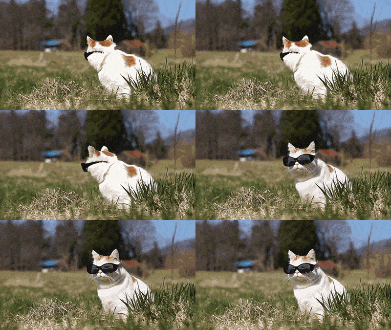
Rob C: Yes and people falling over.
Rob F: Yes.

Rob C: And there's a third issue, or there's another issue in which we don't want to have to bring every image that we want on the website into Photoshop and mask it out, export it again and then if we decide, “Oh actually we don't want it in this position,” we'd have to do that over again so if we wanted to move one of these images from the bottom to the top, you'd have to import and export etc. So we had to step outside the comfort zone a little bit and look at how we can use Scalable Vector Graphics (SVG) to mask out images in the browser. Normal images use pixels, so if you scale them up they start to look pixelated, whereas SVG is built in a way that the graphics will look sharp in any size. You can also embed images in them and use masks and shadows, which is what we did in this situation.Rob F: Yes. Because a key part of the website is that we can change those images individually. We can say which position we want them in, whether we want them top, left, bottom.
Rob C: Yes.
Rob F: And change the colours, so it's all interchangeable and it's triangular.
Rob C: Yes.
Rob F: So how did you get this to work?
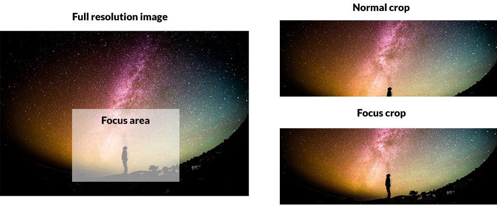
Rob C: We are using a content management system called Drupal in the backend, so there's fields for these images. You add the images to the field and we use Focus Crop as well so that we're focusing on particular parts of the image so that you don't end up losing an important part of the image when it gets cropped down. So that's step 1. Step 2 is that we display the image on the front end, we wrap it in an SVG (which can pull in images via a URL), and then we can add a mask within the SVG to mask out the image into a triangular shape and you can also add stuff like shadows that we have.
Rob F: Yes. So these are responsive as well aren't they? They scale down well for mobile.
Rob C: Yes
Rob F: So would you do it the same way again on reflection? Would you go back, given the option, and change the design?
Rob C: No, definitely not.
Rob F: Would you change the way you've produced it? Would you do it the same way?
Rob C: There are some aspects of the back end UI that I think we have done better on subsequent sites, but apart from that, yes.
Rob F: Well great. I think there's an underlying conversation there about how websites are designed and the problems that you experience through the process, like life, make you stronger or make the design more interesting.
Rob C: Yes, yes definitely.
Rob F: A lot of the websites that seem to be being produced, I don't think people are going through enough hardship, so maybe we should develop an app which electrocutes people whilst designing something.
Rob C: That's a good idea, yes.
Rob F: Excellent.
Rob C: Or just scrambles everything that they've done.
Rob F: Yes, yes. There is an app actually for a book, a writing app, where if you stop writing for longer than something like 5 seconds, it deletes everything you've done.
Rob C: That's horrible.
Rob F: But if you've got writer's block then...
Rob C: Yes, I know what you mean. Terrifying.
Rob F: Great, anything else you'd like to add about this that we haven't....
Rob C: I like it.
Rob F: I like it too. Everybody likes it. Do we want to talk about why we use Drupal?
Rob C: No not yet. I'm not ready for that conversation.
Rob F: Come back to me in 2 years.
Rob C: Yes.
If you would like to see the triangles in action, you can check them out here.
If you would like to try extreme writing (which should be a new sport), here’s the most dangerous writing app.


